Posts Tagged ‘wireframe’

XXL Iteration Views

Wednesday, March 18th, 2009


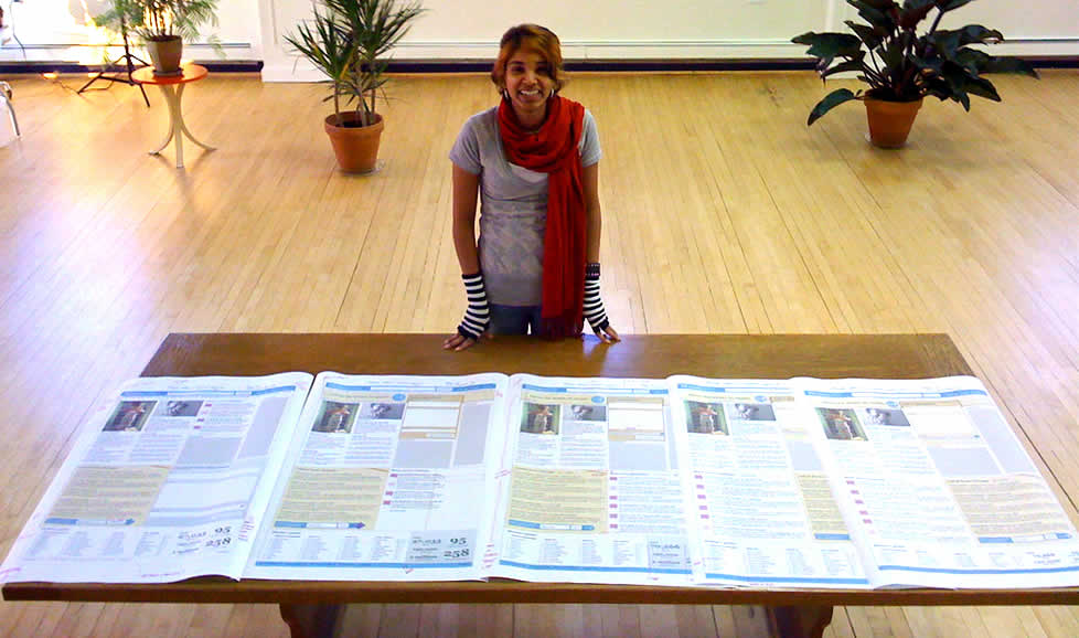
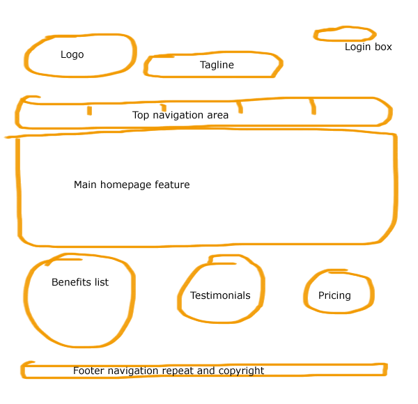
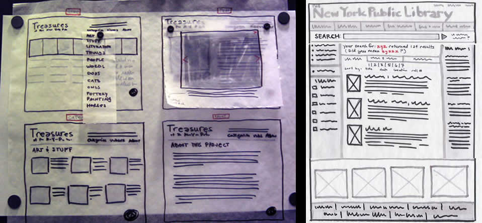
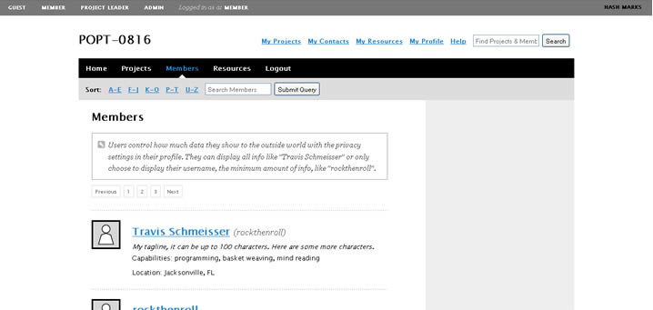
Juhan printed out all historical iterations of a single super sized screen. The awesome thing about this perspective is the quick overview one gains of the exploration performed. One can see very rapidly what has been tried, rejected or accepted, and how the design has evolved through the markings. In comparison to the world of programming, developers also have views such as these and in particular they rely on “diff” tools to highlight changes between code revisions.

Speculating here, another thing which comes out from seeing this (at least to me), is the desire of some designers to communicate a degree of completion. It has been noted in a previous post that it is desirable to control the amount of feedback a presented view affords (ex: by using sketchy styles more comments can be generated). Here perhaps the multiple revisions of a design lined up in such a way can give the feeling of greater completion to the viewer, and thus afford less feedback. If someone was to look at this and see a fifth iteration building on top of the past versions, perhaps they’d think twice before asking to shift the header another 10 pixels. This is not to say that affording less feedback in our deliverables is negative. Contrary, sometimes it is perfectly valid to begin shutting voices out. Otherwise, we’d spin our design wheels and wouldn’t move forward.

Here is the real image on flickr, and Juhan writes:

Rani stands next to the 5 iterations of a single screen we designed (and re-designed) over the last 48 hours. We mark up all the prints and show early adopters for feedback.

We’re close enough to roll to stage… and starting using the damn thing.

Every funky pixel, grid, and design jumps out on big prints.
Print big or get out!

Credits: Juhan Sonin

Bubble Frames

Monday, March 16th, 2009


Bubble Frames – crudely rounded content areas with labels. Perhaps a merger of sorts between Rough Interface Sketching and Generic Content Labels. Chris explains it best:

Whenever I start a new web project, I want to conceptualize, and fast. Ideas seem to flow at a rapid pace in short intervals, making it hard to capture everything. I’m a huge proponent of rapid prototyping. I want to take as many of those ideas as I can, build a quick prototype, take a step back and then carefully analyze everything.

The best ideas are born in those critical few moments that you rapid prototype. And over time, those ideas can be melded into something that is truly incredible.

A tool that I use as part of my rapid prototyping process is what I call “bubble frames.” It sounds kind of stupid, I know. And it might not be all that unique. It’s really a mesh of things I’ve seen and read. But I thought I’d share it anyway to those who need some inspiration for their own rapid prototyping exercises.

The bubble frame is a watered down version of a wireframe. Instead of constructing exact boxes and labels as a skeleton for the web site, I use quickly drawn circles to represent what types of information will go where. I vary the size of these circles to represent the importance of the information they will contain.

Credits: Chris LeCompte

Sticky Note Pulldown Menus

Friday, March 13th, 2009


While sketching a user interface with the client, in this example popup overlays or pulldown menus have been drawn up using sticky notes. This technique has been around for a while (as probably seen in a lot of paper prototyping sessions) since it makes perfect common sense. Sticky popups stand out from the background noticeably and also can be easily removed and reattached as desired, which makes them ideal as a solution.

Credits: Hans Nieuwenburg

Tracing Paper Layers

Friday, March 6th, 2009


Here is an interesting technique which uses multiple pieces of tracing paper combined with sketching and scanning. It kind of reminds me of Photoshop layers except these exist in the real world. First, Jennifer drew various interface elements separate from each other on tracing paper and overlaid them together to form full page screens. These various combinations were later on also digitized using a scanner and then shared with others.

This technique shares some similarities in terms of flexibility with sticky frames. Just as with stickies, the designer can undo and rearrange elements very flexibly. Also, similarly to the sticky frame example where the designer used photography in order to reuse the various elements (and speed up the design process), here a scanner performed the same function. Tracing paper however has an additional characteristic of allowing to represent interesting transparency effects as is visible in the top right example suggesting an overlaying lightbox image. Tracing paper perhaps also affords a little bit more change and rearranging than sticky notes. All in all, such awesome tactics provide us with more speed and agility.

Jennifer writes:

We’ve also found that sometimes taking your design out of the computer screen forces your audience to focus on the concept rather than the execution, which is very helpful if your audience gets hung up on colors and buttons and the like. Frankly, it’s helpful to everyone involved: good design, I feel, serves the content, and all the flashy Flash/AJAX/JQuery what-have-you won’t save a poor design. I also believe that while good web design does not translate into good book design, etc., every designer should learn to use paper and pencil. Like the codex, it’s worked for 500 years; it’s not going anywhere soon.

Credits: Jennifer L. Anderson

Wireframe-Sketch Hybrid

Wednesday, March 4th, 2009


Sometimes the designer wishes to focus feedback and discussion only to certain areas of the interface. Knowingly that firmer and more defined styles suggest completion, while empty spaces and sketch styles invite discussion, the designer here has utilized this knowledge to channel feedback. This sample is a hybrid between a wireframe and a sketch. It has been started off using the computer and then printed out, while leaving a central area blank for sketching with the stakeholders. This interesting combination suggests to the stakeholders very clearly that the computer based areas are more defined and less open to feedback while the empty and sketchy areas are in need of refinement and more open to input.

Credits: Hans Nieuwenburg

Computer Based Sketchy Wireframes

Monday, March 2nd, 2009


Jumping over to the computer does not necessarily mean that the wireframe ought to look rigid and clean, suggesting a higher degree of completion. Occasionally, the designer still feels the need to communicate the interface with a style which invites change by suggesting incompletion. One way of doing this is by means of a more sketchy style. Here is a sample of Hans using Visio loaded with a sketchy stencil designed by Niklas Wolkert. Jonathan Abbett has later on revised the stencil here.

Credits: Hans Nieuwenburg

Graph Paper Layout Sketch

Wednesday, February 25th, 2009


A sketch drawn up by an interaction designer and a sketch drawn up by a visual designer will emphasize slightly different things. An interaction designer likely will focus more on multiple element states, and events (or links) which glue them together. Whereas someone with a more traditional visual or graphic design background will put extra effort on sizing, alignment, positioning and visual priority, which all work together in establishing proper visual relationships between elements. This second case is perhaps visible in a sketch submitted by Mike. The sample here makes use of graph paper, straight lines, and explores block and element relationships.

A sketch like this is just more evidence that the wireframe overlaps greatly with graphic design – a case made earlier. This overlap suggests once again that the wireframe can be grounds for collaboration between information architects, interaction designers and visual designers.

Craving more graph paper? Konigi provides a number of awesome stencils aimed at IA’s and visual designers which can be downloaded. Of course writing about graph paper and wireframing, one could not overlook another awesome blog about a similar subject matter over at graphpaper.com.

Credits: Mike Rohde

Multiple Element Changes Using Miniframe References

Thursday, February 19th, 2009


Here is a sample revisiting the problem of exploring multiple element changes all over the screen as a result of an interaction. Traditionally a full wireframe would have to be redrawn in order to document such subtle and multiple changes. Here is a quick solution that avoids having to wireframe the full page and thus decreases effort and increases document flexibility. Fabian has achieved this by combining state based wireflows with miniframes which act as references for the elements which do change. Overall, this document reminds us of an important consideration relevant in wireframing richer interactions. This being that one interaction can have multiple element reactions. Just to recap, Bill Scott has used an alternative method of documenting a similar case with a multiple elements & state conditions matrix.

Credits: Fabian Nöthe

High Level Layout Alternatives

Tuesday, February 17th, 2009


Here is a sample exploring the possibilities of various layout approaches in the early stages of a design process. Consecutive lettering has been used to suggest multiple interface alternatives. The variations however only explore very rough structural or navigational alternatives. The level of fidelity is very much devoid of detail. I continue to wonder what other designers do when they want to explore numerous alternatives of more detailed interface elements or screens which are a bit further in the design process. Would you have samples of something like that? If so, please submit.

The source of the file can be found on flickr.

Credits: Bram Pitoyo

User Type Views & Annotations with Polypage

Friday, February 13th, 2009


Here is another very good Polypage HTML wireframe submitted by Joey Marchy from nGen Works. Two interesting uses of Polypage make themselves visible in this sample. First, on the upper left hand side, all of the various user types have been defined. Toggling them gives a good sense of what all of the various wireframes will look like for that particular user. Secondly, Polypage has also been used to annotate the wireframes and this is accessible through the upper right corner by means of such tags as “user roles” and “hash marks”. The really nice thing about this annotation technique is that no longer are the actual annotations separated somewhere in the right hand side from the main wireframe, but instead are contextualized right in the wireframe itself. This allows people reviewing the wireframe to read the annotations quicker as opposed to having to translate number references into actual notes, as it is done traditionally.

Joey writes:

We created a functional HTML prototype to accomplish two goals: get client signoff on all application interaction and provide a roadmap for the development team building the application. We used a combination of PHP and the awesome Polypage jQuery plugin to show the myriad of states between differing user levels and application states.

Credits: nGen Works