


Inpage Requirements
August 27th, 2009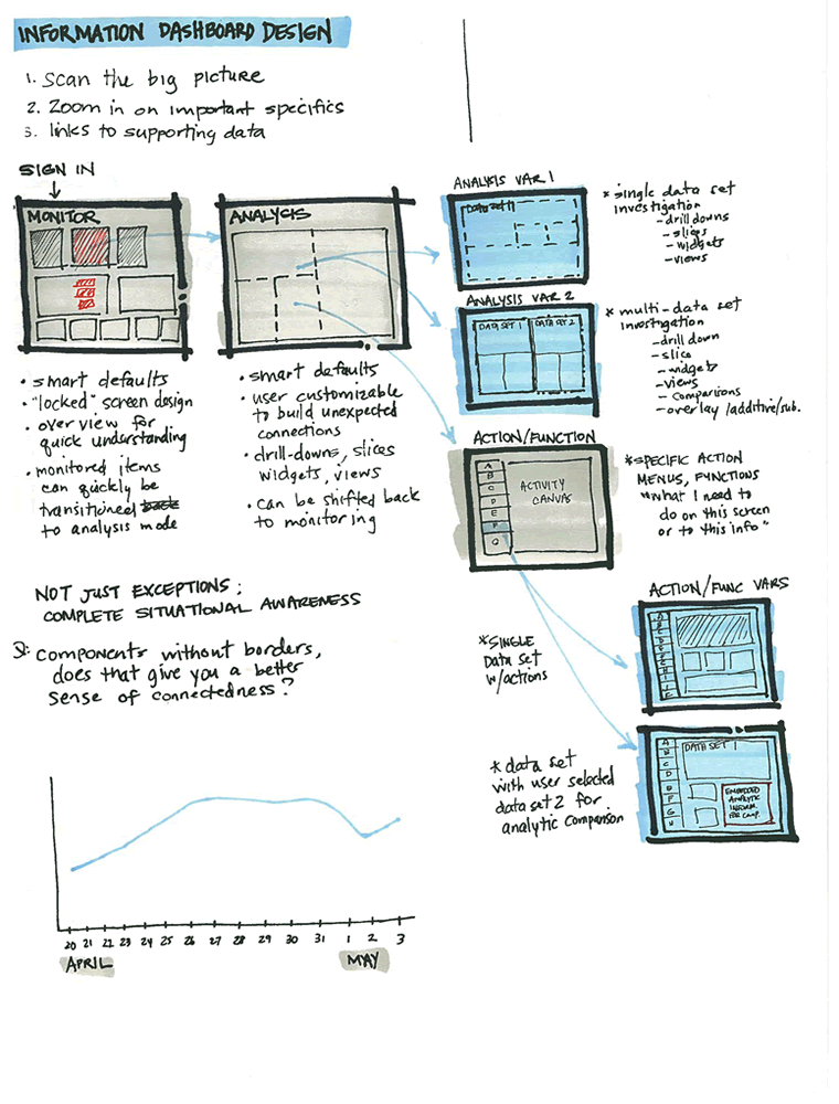
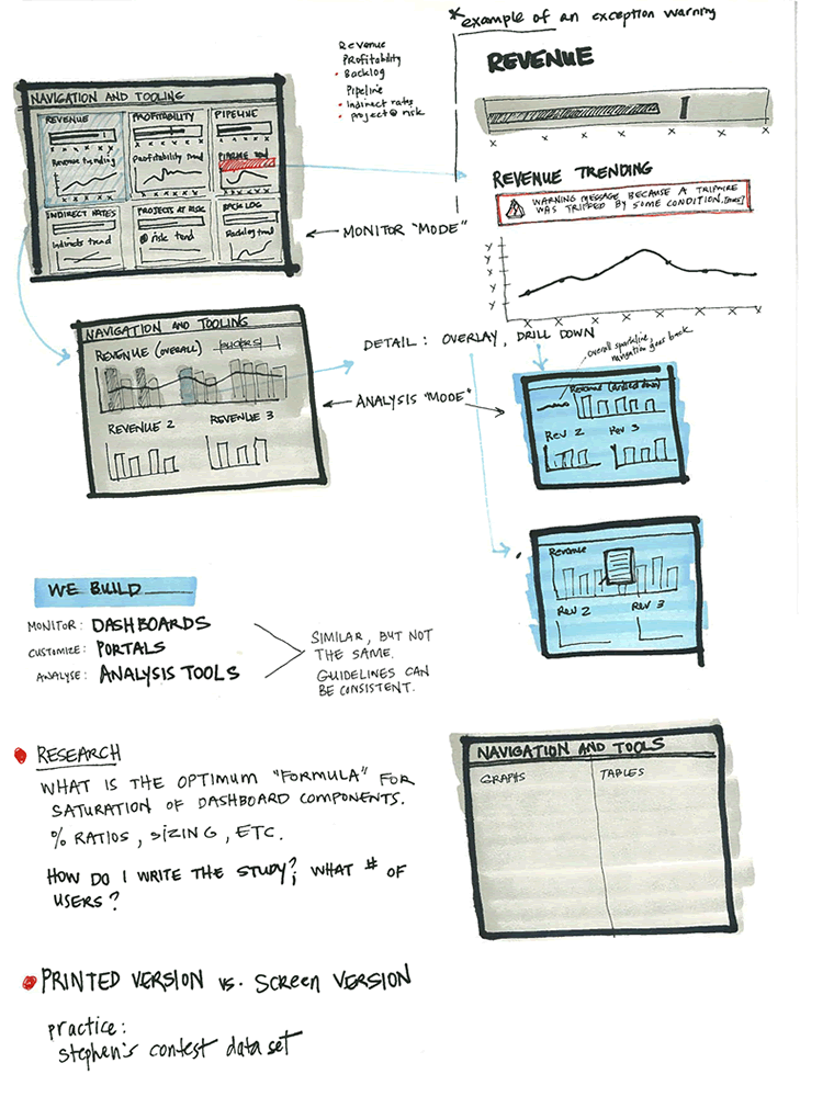
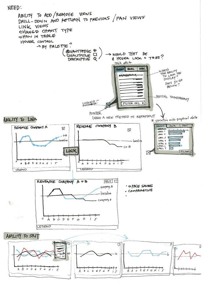
Ben just sent me a sketch which uses a number of techniques seen previously. One thing which is a bit unique perhaps are some of the short lists of requirements or goals which he combines with his sketches (seen on page 1 and 3). These seem to guide his thought process at the outset, and are often at the top of a page in the form of a list. Another cool thing he does is break up his ideas into some conceptual chunks with distinct titles that are highlighted. He also emphasizes his sketches similarly to some approaches listed earlier. To draw attention to certain elements, the thickness of borders is varied and some of the screens use colour overlays. Ben’s sketches are also occasionally loaded with question marks – something I’ve noticed to appear in my own drawings as well. Here is how Ben describes his process:
1. I usually lay down a 10% cool grey field where I am going to show “the screen” (or whatever object I am going to sketch)
2. I then draw in the frame of my screen, usually with a Sharpie. I like the effect of the bold border, and it helps me to set up a hierarchy within the sketch with different line weights (Staedtler 0.1, 0.3, 0.5, 0.7 mm black pigment pens)
3. Once I have the screen set up, I just sketch as needed, showing different levels of detail depending on what I need to document
4. I use a wash of blue (very light blue marker) to set off anything that I want to emphasize, red pen for interactions or to call out areasSometimes I use a light color pencil to add dimension or texture if I feel it’s important for the design, beyond that, it’s pretty free form.
Credits: Ben Rossi
4 Responses to “Inpage Requirements”


September 2nd, 2009 at 9:52 pm
Those wireframes look awesome. I love the combination of markers, pens and pencil. Please excuse this newbie question, but do you know what kind of drawing tools he uses? I'd like to know how to get those shades of color. Thanks!
September 3rd, 2009 at 2:04 pm
Hi Nicolas,
Thank you for the kind words :) I have sent Jakub a photo of my drawing tools, but here's a quick rundown:
The background colors are from AD markers or Prismacolor markers. The blue is a Prismacolor Ceruelean Blue, the gray is AD Cool Gray #1
I studied Architecture long before I became an UX designer, so a lot of the techniques come from my rendering classes. I can recommend the book "Drawing and Designing with Confidence: A Step-by-Step Guide" by Mike Lin if you are interested in learning more about the styles.
http://www.amazon.com/Drawing-Designing-Confidenc…
Feel free to contact me through Twitter (b_rossi) if you have any questions — I enjoy talking to others about design :)
September 5th, 2009 at 6:03 pm
I actually just ordered the book and picked up those markers at my local art store ;) I'm pretty excited to learn more about different rendering techniques. Is it weird that I've always found sketches more interesting than the final pieces of art/design?
I went to school for New Media Design, which is what I've done ever since, but when I enrolled the program was in a "guinea pig" stage. They didn't have very good foundation art classes at the time, so I've felt lacking in that department. Hopefully some solid technique books and perseverance will improve my sketching ability, though.
Thanks again for the tips!