


Coloured Interface Sketches
March 27th, 2009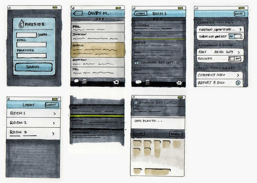
I think the technique of using colour combined with interface sketching has a great deal of strength. In this sample from Harold, amongst other things one can really see some awesome explorations emerge. The colours in this work really help to gain a richer understanding of the various interface elements across the screens. It also makes association easier and thus similarities and differences begin to stand out more so than in simple grey scale terms.
Traditionally, the general consensus around the use of colour in early interface design work was to avoid it. Early conceptual design, at least in wireframing, has typically focused more on things such as basic interface structure, flow, functionality and more general interaction. Seeing detailed colour on a computer screen too early was (is) perceived by many as detrimental from these more important issues. Myself included, I have resorted to the use of colour in wireframes for purely functional reasons. Could this constrained view be breaking down? According to agile approaches, it is completely valid and even desirable to “spike” forward with explorations. This sample does just that perfectly well in the context of colour exploration. Perhaps a coloured fill using the paint bucket on a computer is too rigid and too perfect for early design phases. However, such renderings as seen above still resonate with open and inviting incompletion which makes them more than suitable for conceptualization.
Here is another link of the evolution from sketch to final visual, along with an explanation.
For those thinking of spending some money, Harold has mentioned that he used Copic Markers, which are quite expensive but refillable. Amazon carries quite a few different sets amongst which include a greyscale set and a coloured one as well (they have other ones too). Jennifer has also stated here that she uses Prismacolor ones which are a bit cheaper and available in color or greyscale. I personally might just pickup and try a few colours first from a local art store, as well as compare Copics to Prismacolors.
Credits: Harold Emsheimer
13 Responses to “Coloured Interface Sketches”


March 27th, 2009 at 4:24 pm
I'll do this every once in a while and I think this technique works great. I'll draw out the chrome of the application and make a bunch of copies on a copy machine. Then I can freely explore different UI ideas and color them in later for emphasizing/de-emphasizing things that make sense. Takes me back to the days of using Prisma Color markers and Bienfang for creating product renderings.
March 27th, 2009 at 11:20 pm
Juan, what a great idea, the photocopying. I could see using this in a workshop with clients or users.
Harlod, these are really lovely. I thought it was water color at first! That would be a very Zen wireframe.
Color seems to be on a lot of peoples minds today. I just blogged about using color instead of connectors in my site maps.
March 27th, 2009 at 11:40 pm
Jaun, wow, great idea. I like the idea of using photocopying to explore different directions.
Tyeshasnow, Thanks, yeah I really like how Copic markers go down. It's in a moleskine for these so it bleeds a bit. I don't mind it though, does look a little like water color :)
March 31st, 2009 at 4:17 pm
I just bought my first Copic markers a couple of days ago. They are comfortable, have a nice double-tip, and seem to have only a fraction of the chemical-fume-headache factor of PrismaColors and the like. I recommend them. Very nice renderings, and great post!
March 31st, 2009 at 4:24 pm
Thanks for the review, Ryan. I also managed to find people discussing Copics vs. Prismacolors in a forum thread here: http://forum.deviantart.com/galleries/traditional…
March 31st, 2009 at 4:24 pm
Thanks for the review Ryan. I also managed to find people discussing Copics vs. Prismacolors in a forum thread here: Jakub Linowski Says:
March 31st, 2009 at 4:24 pm
Thanks for the review Ryan. I also managed to find people discussing Copics vs. Prismacolors in a forum thread here: http://forum.deviantart.com/galleries/traditional…
April 2nd, 2009 at 11:18 am
i have to put in another voice recommending the Copic markers over Prismacolor. the initial cash layout is greater, but you can refill them and replace the nibs when those become worn. the colour choices are great and as Ryan pointed out, the odor is much less (and what odor there is seems a bit more pleasant as well). i've found it much easier to lay color down more evenly with the Copics than i ever did with Prismacolor. sure, you can still oversaturate the paper, but the overall look is much nicer and more precise with less effort. i highly recommend the Sketch marker version.
April 12th, 2009 at 12:09 pm
I prefer Tombow markers to sketch. They come in all shades of colours and the best thing: they don't bleed as opposed to Copic markers.
September 7th, 2009 at 8:49 pm
It seems to me a big issue is simply helping the client (stakeholders) manage their attention.
Many people have a harder time using their imagination in certain ways. And, along with us using *our* imagination well, our job is to help the client manage theirs more.
So, what I've seen is that if I make the design look too finished before it's ready, they will SEE it as finished, and not want to explore other possibilities.
On the other hand, I might *want* to use, say, color, to help their imagination go in certain directions where a B&W sketch might not take them.
As long as the wireframe did not look too finished, it might actually help them spark their imagination in good ways.
April 15th, 2010 at 3:59 pm
yep is to help their clients