Archive for the ‘Samples’ Category

Streamline – 1640 Vector Icons

Friday, December 13th, 2013


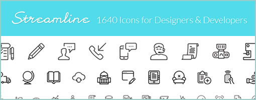
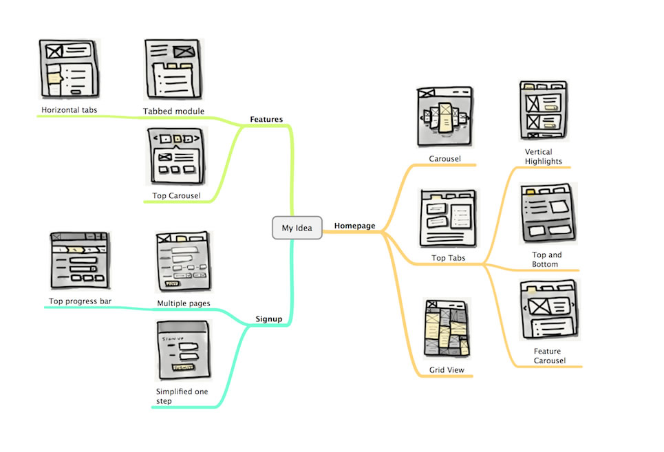
Streamline, by Vincent, is a new vector icon pack that is packed with goodness, extremely flexible, and designed with love. Here is what the new set contains:

A Quite Broad Set

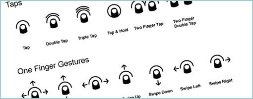
There are 1640 icons inside that have been carefully designed. That’s iOS7 and Android icons spanning such themes as: alerts, gestures, people, business, weather, and on and on.

Super Flexible

These icons have also been designed on a variety of grids ranging from: 24px, 30px, 36px, 48px to 60px. More so, these all assets being done in vector form (EPS and AI), are all ready for additional modification in various ways. Need a drop shadow, color change, or line thickness adjustments? All that can be done easily.

Other great products by the same author with a solid track record on delivering quality work, include: Minicons and Vectorian. Hope they are useful. :)

Purchase & Download

Credits: Vincent Le Moign

Sketch Map

Tuesday, February 12th, 2013


What do you get when you mix mind maps and sketches together? Well, Sketch Maps, of course. Catriona of InspireUX just shared an interesting approach to organizing your sketches around a central idea. Awesome big canvas sketching! I’m a firm believer that your workspace affects the way you think. How you structure your screens will affect what you end up with. In the case of these Sketch Maps, it’s clear that the structure guides the designer to maximize the number of alternative ideas. It forces the designer to explore more alternatives in a playful way as opposed to thinking about a concrete unified solution. Two thumbs up. Thanks for sharing.

Credits: Catriona Cornett

Blueprint Wireframe

Wednesday, October 24th, 2012


Here is a something a little different while drawing inspiration from the past – a blueprint wireframe. It definitely looks like a traditional architectural or engineering diagram with a clear conceptual look. Derek has done up the piece in Photoshop (debatable whether the best tool for wireframing or not), but nevertheless the white on blue colors and jagged lines surely make this piece feel like it’s an abstract representation of lower fidelity. I thought it was pretty interesting that someone has found inspiration from 19th century diagramming. Thanks for sharing.

Credits: Derek Clark

Large Canvas Flows + With References

Tuesday, September 4th, 2012


I like spacious canvases with non-linear flows, and here is a work sample from a fellow designer which shows just that. If one can move away from the outdated convention that interaction designers create screens, towards what Bill Buxton calls the stuff “in between the screens”, then it doesn’t take long to realize that larger workspaces are the way to go. In this example of a mobile app, Anton used Omnigraffle and some inspiration from UML to pull off a few interesting things which I thought might be worthy of highlighting:

  • Merging of wireframes with flows. As the above artifact mixes readable screens with flows or user actions, the element of time and narrative begins to emerge. Since the flow diagram is inseparable from the wireframe, it also saves the designer from the extra effort of synchronizing multiple documents.
  • Transition references. Although not visible in the sample, the blue circles are actual links to .mov files that show short video demos of the transitions. Wires plus video feels fresh!
  • Screen references. All of the screens have an ID tag, and occasionally actions lead to screen references instead of full screens – a way of reusing and again minimizing duplication efforts. Also each screen links to a folder with source PNG layout files.
  • Action references. Most user actions here also have an ID with a distinct style and can therefore also be referred to.
  • Starting Point. Since the canvas is quite large it has a clear starting point to guide the viewer.
  • Layout structure. In the top right of the canvas, the core structure of the layout along with some popular components are explained.
  • Toggle-able layers. Various information is kept separate on distinct layers and so that it’s possible to toggle it on and off for various audiences.

In comparison to the above, I have to say that the way in which I do my work is very similar by relying on cross document references. This hierarchical documentation structure (where wires cover the widest scope and prototypes the narrowest) allows designers to focus on what’s necessary at a particular level of fidelity. Below is how I reference visual design mockups within wireframes or sketches (with an “Also See” + filename tag). Again, keep in mind that in my case, only certain screens need and/or have references to more detailed assets.

Anyhow, thanks Anton for sharing!

Credits: Anton Volkov (main sample) & Jakub Linowski (second sample)

15 Dribbble UI Sketching Designers

Monday, April 23rd, 2012

Dribbble UI Sketching Designers
There are those who design, and then there are those who design in the open – enter dribbble.com. Although sharing a 300 by 400px image perhaps might work if you want to show off a shiny button style, maybe it isn’t always the best constraint for interaction type of work (flows, multiple screens, scenarios and stuff in between the screens). Nevertheless the other day I was looking through dribbble.com out of curiosity for some designers who might be doing a bit of UI sketching type of work. I guess I always find it interesting to look at how others sketch. Here is a bit of a list (including myself at the bottom) for those who might be interested. :)


Speech Bubble User Flow

Thursday, March 29th, 2012


The Speech Bubble User Flow by Barnabas, is a hybrid representation that combines a sitemap, persona and user flow all into one. The idea starts off by overlaying simple and short comments made by a persona in the form speech bubbles on top of a structured sitemap. More so, the speech bubbles are ordered chronologically and so flow through one by one. In the built Axure Demo that has been generated, the sitemap pages are also linked to the wireframes which makes it easier to switch from the generic to the specific. Barnabas has been exploring Personas that “could talk” in a few other forms as well, as the Complex Speech Bubble Persona and the Commented Sitemaps show.

My take on this deliverable would be that Personas can sometimes get lost once a project builds momentum. Possibly what Barnabas is doing is helping the Persona to live a little bit longer and inspire the team a bit more as the Persona’s comments pop up throughout the project. One thing I do wonder about is how this would work though if there was a second or third scenario for the same user type, as sometimes I feel that interactive projects are composed of many little separate user stories and not just one. Either way, good stuff and thanks for sharing!

If you would like to tweak the deliverable, the author has been kind enough to share the actual source Axure file as a downloadable template.

Credits: Barnabas Nagy

Cue – Gesture Icons

Wednesday, November 23rd, 2011

Cue
PJ recently took another stab at making gesture icons more comprehensible and released Cue under Creative Commons. It’s a proposed system for representing gestures more clearly that makes use of thumb like icons. He explains his motivation for the project in a blog post as well. The icons come in PNG (4 sizes), SVG, Omnigraffle and InDesign formats. Awesome. It’s always great to see explorations in visual language. Thanks PJ!

Here is how he puts it:

These gesture icons act as roadsigns to an app for interaction way-finding. As expected, there has been a significant collection of gesture icon sets that have been made available to fill this need. The current crop of icons succeed in clarity, but they lack the iconic qualities necessary to act as a standard representation of gestures. My goal is to help create a foundational set of icons that are flexible, clear and distilled to a point where they could become a standard visual system to build from – ultimately to be used within apps for when explicit communication is needed.

Credits: PJ Onori

Responsive Layout Wireframe

Friday, September 30th, 2011


As we design for more devices, considerations for more responsive layouts which scale gracefully across varying screen sizes could be gaining in importance. Warren here has shared one such quick wireframe that tries to accommodate just this. It basically shows 3 wires side by side each other with some placeholders as well as how they would all vary across a few predefined screen widths. It’s a pretty straightforward, yet clear way of conveying more flexible layout concepts.

That same week, as I was asking around for a few additional “responsive layout” samples, Martin also pointed me to Media Queries – which is an awesome gallery and collection of layouts that scale beautifully on various screens (it’s actually also a CSS extension recommendation). Have a look.

Credits: Warren Anthony

3 Ideas For Capturing Feedback

Tuesday, August 16th, 2011

It took a while, but here are some results from what people submitted for the Feedback Note call for samples:

Dedicated Note Spaces


Craig’s preferred method of capturing feedback is on the wireframes themselves within a dedicated notes section. After printing out the full set of wires on a large piece of paper he then takes notes and sketches on top of what is already there. Looking more closely, a lot of the feedback in this particular wireframe is written in a question or task format – as in: “How would the user do this or that”. I think it’s an interesting way of testing the interface with additional sub cases which should be eventually accounted for.

Credits: Craig Kistler

Saving Whiteboards with Evernote


For Anirban, what works is jotting down everything on a whiteboard, and taking it as a snap using the Evernote app. Apparently, with Evernote he can capture the progression of the artifact and then play it out as a sequence as it occurred. In this way, the physical and the virtual can be easily bridged and stored for later.

Credits: Anirban Majumdar

Capturing Sign Off with Checkmarks


When it comes down to my own approach for collecting feedback, I often write all over the wireframes in a different colour on a separate layer. Recently however I’ve began trying to capture sign offs or some form of collective agreement in the wireframes. Sometimes when working with a larger group, team members wish to know and store what has been agreed upon, and what needs additional work. Extending my personal sketching style, I started using two basic circle like symbols of a checkmark as well as a “x” to denote just that. These little symbols I drop throughout the wireframes as needed, and then update a copy of the document in a shared folder (usually Dropbox).

Credits: Jakub Linowski

Thoughts? Comments? Or have other ways of collecting feedback? Please share.

Persona Template

Tuesday, March 1st, 2011


A persona template has just been shared by the folks over at Orange Bus. Perhaps what might be interesting about this particular one is that it invites quick and dirty hand drawing or writing. A lot of the other personas out there, from what I’ve seen in the past, look pretty well polished. This one on the other hand is a lot more doodle compatible. It comes with fill in the blank spaces for basic naming, portrait, a back story, motivations, frustrations, their ideal experience, and a summary quote. Nice!

Credits: Joanne Richardson