


Gesturcons: Touch Pack 1.0
February 16th, 2010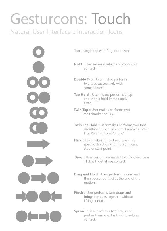
Ron has recently initiated a project with the intention of creating a visual language for representing gesture based user actions. He shares the belief of “gain[ing] common grounds when discussing interactions” and has just released the Gesturcon Touch Pack under a Creative Commons Attribution-Noncommercial-No Derivative Works 3.0 United States License. The zipped file contains EPS, PNG and Illustrator files for your use. His approach supports such interactions as taps, holds, double taps, flicks and is achieved with circular shapes. @vitorious also threw the idea of combining this with my own notation. Hmm, pretty cool.
Credits: Ron George
8 Responses to “Gesturcons: Touch Pack 1.0”


February 16th, 2010 at 4:49 pm
This is a really interesting idea! I think as gesture-based interfaces become the norm, we'll need a way to show users outside of video what to do. Plus, this could be handy for just wireframing. I have two critiques. The first is that some of these seem a bit complicated, like the Twin Tap Hold. Editing is important, and this seems like a gesture for the sake of gesturing. The second is that some of the icons, like double tap don't read as they are intended, imho. To me, the double tap reads like the two-fingered tap. Perhaps more thought needs to be given to the relationship and placement of the tap glyphs. But all in all, a great idea with a good execution!
February 19th, 2010 at 2:36 pm
Nice idea, the kind of thing I could have used on a project I have coming up. But since it is licensed non commercial I guess that means I can't.
Well it was nice to look at anyway and might inspire some of my own ideas.
February 19th, 2010 at 3:35 pm
I agree with Sherrod about the double tap – to me the overlapping circles make more sense for one finger tapping (as you can't physically overlap fingers).
February 19th, 2010 at 4:33 pm
I just emailed Ron and he's comfortable with people using it on commercial projects. Here is what he writes:
"Fair enough. I put that license there mainly because it was meant to be for in-house designer use and I didn't want to see them pop up with some huge firm or something, that's all. To be honest, I don't really care either way though.
Tell them to go ahead and use them. It's all good."
February 19th, 2010 at 4:42 pm
I agree the twin tap and double tap icons should be switched.
February 21st, 2010 at 1:43 am
Hey Guys. I just wanted to explain the reasoning behind the icons. These are for technical documents, for designers to explain and demonstrate interactions to other designers and developers.
The reason that the icons are overlapping is to demonstrate a single event as its triggered in the API. It happens to be two contacts, but it will trigger one event in the API. The icons that are spaced apart demonstrate two events for the API. So each event is triggered in succession and then they equal the results that you will design for.
It's important as we get more complex and technical that we make ourselves very clear when documenting and spec'ing out interactions. Don't leave room for any error and try your hardest to ensure that it speaks to the developer in their language from the beginning.
Thanks for the link Jakub.
February 23rd, 2010 at 12:41 am
Link not working.
March 17th, 2010 at 9:37 am
Ron,
I appreciate what you're saying but still think visualised documentation should be representative of the what the user is doing rather than how it works in the background.
Design docs need to be understood by as wide a range of people as possible to ensure there is no confusion between the developer, architects & stakeholders.
Still, a very interesting concept – just feel it needs further refinement to make it consistent with what I think people will associate with the iconography.
Ta.