


Wireframe-Mockup Hybrid
January 5th, 2010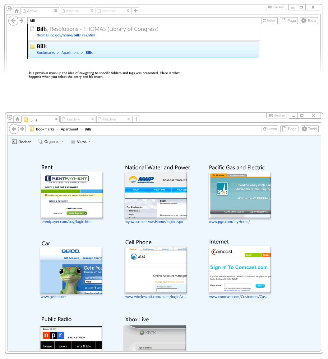
Recently, a visual mockup technique by Alex Faaborg on the Mozilla blog caught my attention. As Alex has been thinking about the merits of searching and browsing through bookmarks and history for the next Firefox version, it seemed like in a way he merged the traditional wireframe with a detailed mockup. While parts of the interface schematics are faded outlines devoid of any colour, other parts are represented in full colour and contain rich depth. Interesting? This effect enables the designer to emphasize the more important parts of an interface and focuses the viewer’s attention on what matters most. These wireframe-mockup hybrids perhaps reaffirm the importance of designing UI parts in the right fidelity and at the same time remind us that it is ok to leave stuff out.
Credits: Alex Faaborg
2 Responses to “Wireframe-Mockup Hybrid”


January 5th, 2010 at 7:16 pm
Not sure developers will get this mixed stuff right.
Still, this technique is nice for the interface designer's own use…
May 16th, 2010 at 8:41 pm
Yeah this is cool. I have done stuff like this by placing a translucent layer over everything but the part of the interface I want to emphasize, which sits on top of the translucent layer. It's like a light boxing effect except that the lightbox layer is white, and the stuff on top is a part of the interface beneath. This is especially helpful when showing changes of screen state across multiple pages.