Posts Tagged ‘wireframe’
Tuesday, October 20th, 2009
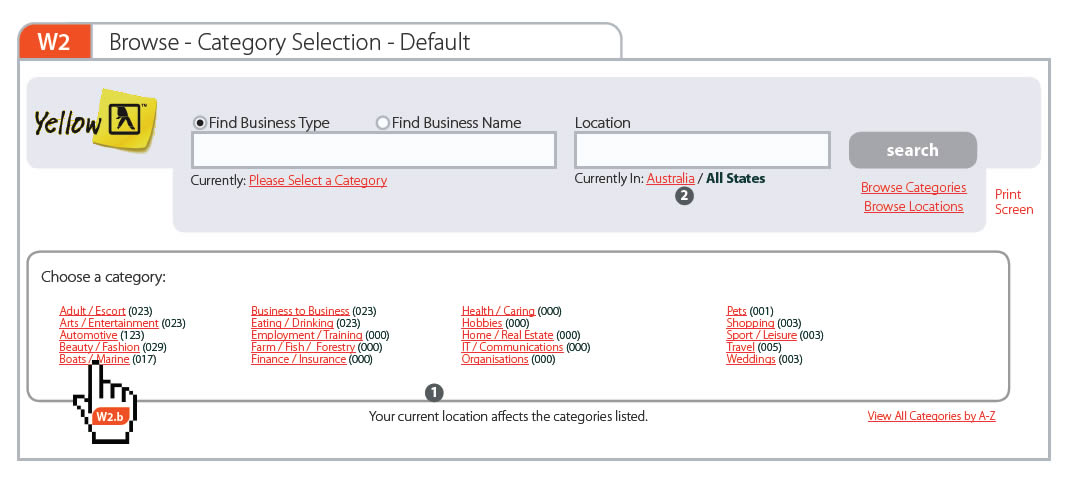
Here is an idea for representing narrative or user actions inside a wireframe. As an alternative to flows I wanted to showcase what the user is doing right in the context of the interface. For this, a simple clickable hand symbol was used with a wireframe reference inside of it. This was meant as to suggest that a click causes a new wireframe to appear. The value of such an approach to flows, can be that the readers of this documentation do not have to flip through pages to refer to flows to understand what the user is doing. Flows can be said to diverge away from the concreteness of a wireframe into abstraction. Here, instead, the flow of user activity is coming closer in on the interface.
Credits: Jakub Linowski
Tags: activity, linowski, wireframe
Posted in Samples | Comments Off on Clickpaths
Thursday, October 15th, 2009
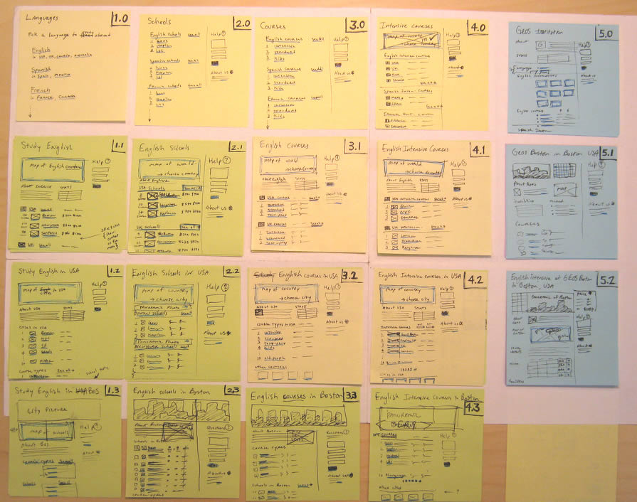
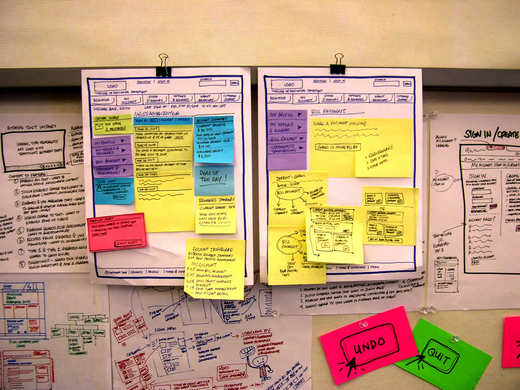
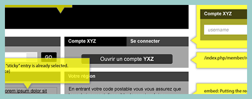
Combine wireframes and sitemaps together and you get something like this following sample from Jason. Wiremaps or siteframes? :) In the man’s own words:
First, the colors aren’t so significant. I just ran out of yellow. :) Underneath each sticky is a few other stickies from previous revisions. As time went on, things changed and so did the stickies on this page.
This document started off as ideas scribbled on a whiteboard. We devised an info architecture that involved controlling the user path by allowing them to drill down (vertically on the sheet) and across ( horizontally) but not diagonally. It’s not super clear, but everyone who needs to know understands the user flow through these pages.
There are 12 new pages that need to be created, as well as revising another half dozen or so. These sticky-frames also act as a site map, or at the least, a site map of templates.
Credits: Jason Robb
Tags: sitemap, sketch, wireframe
Posted in Samples | 3 Comments »
Thursday, September 10th, 2009
Quite often user interface pages will have to be long and scroll. As obvious as it sounds, here is a sketch which supports this. Jason has simply decreased the size of his frames and made them taller. On the same note, one of his sketches also makes use of a zigzagged line. I would guess that has been done to suggest a continuation of sorts, allowing him to communicate that there is more to the page without having to go into detail. I also like the heavy emphasis used on the title. Nice!
Credits: Jason Robb
Tags: annotation, colour, forms, scrollable, sketch, wireframe
Posted in Samples | 1 Comment »
Tuesday, August 18th, 2009
Here is a cool idea by Benoît which combines annotations with interface visuals into one coherent whole. Typically annotation bubbles were reserved for textual information, yet this sample extends it to contain more elaborate visual elements. More so, some of these annotations visible here also contain multiple variations of an interface suggesting some sort of multiple state representation.
Credits: Benoît Meunier
Tags: annotation, colour, referencing, states, wireframe
Posted in Samples | 4 Comments »
Thursday, August 13th, 2009
Scott’s sample shares resemblance to the previously shared wireflows posts here and here. One thing it does a bit differently however is that it combines interfaces representation which differ in size or scale. Larger screens are mixed with smaller ones. More so, this example here also represents both interface screens (or what the users see), as well as user activity (or what the user does).
Credits: Scott Dudley
Tags: activity, states, user flow, wireframe
Posted in Samples | Comments Off on Mixed Scale Wireflow
Thursday, July 30th, 2009
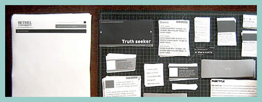
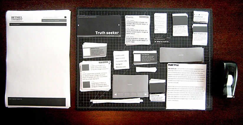
Paper Wireframing is an article by Doug on his process work with an approach which relies very much on paper and scissors. A technique like this has been noted in the past to be engaging and collaborative. Perhaps what sets this method apart from the previous example, is the use of electronically generated content whose copies are then printed numerously for the generative session.
Doug writes:
The idea behind Pwireframing (again, wireframing with paper) was to make the regular wireframing process more modular and collaborative. Instead of having a designer simply follow the instructions of a strategist, we started by discussing all possible contents of pages as a group, including syndicated feeds Bethel is currently maintaining. We also made some decisions about feeds or content Bethel would be likely to bring online in the near future. After this, I drew and printed modular drawings of all of the types of content we talked about, and cut them into sets.
Read the full article.
Credits: Doug Gapinski
Tags: sketch, wireframe
Posted in Samples | 3 Comments »
Tuesday, July 28th, 2009
Here is a quick way of setting page boundaries on long scrolling pages. Aluísio has applied and made visible some sort of page crop marks on his wireframe. This approach could be used to give a stronger sense of the relationship between the wireframe and the page screen to show what is visible and what is beyond the fold.
Credits: Aluísio Barcelos
Tags: scrollable, wireframe
Posted in Samples | 3 Comments »
Tuesday, July 21st, 2009
Keith relies on a similar technique to the Stickyframes approach posted earlier. His approach differs in that it mixes a number of techniques together. These hybrid interface representations mix sticky notes with sketching, sketches with flows, and anything else he comes up he just posts up and groups on a wall in a sketchboarding manner. Here is what Keith writes:
I’ve been creating wireframes since the late nineties and in retrospect have always relied on hand sketching and rapid ideation to solve my UI/UX problems.
This example is not unlike the Stickyframes example currently posted on your site. The difference with my approach is that I use color to begin to organize the chuncks of content or functionality. I also attach sticky notes containing mindmaps, flows, or mini sketches of interfaces. The grouping of ideas and sketches stay put until I have sorted out the actual page layouts to be rendered in Visio or AxureRP. The result is a moodboard for ideas which allows me to swap out thoughts until ideas are fully baked. I’ve had success sharing these with clients and collaborative teams early on in the process because they appear to be work in progress.
While I love working at a larger scale on whiteboards, these are a portable alternative for negotiating screens.
Credits: Keith Tatum of Resource
Tags: colour, sketch, sticky notes, wireframe
Posted in Samples | 1 Comment »
Tuesday, July 14th, 2009
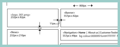
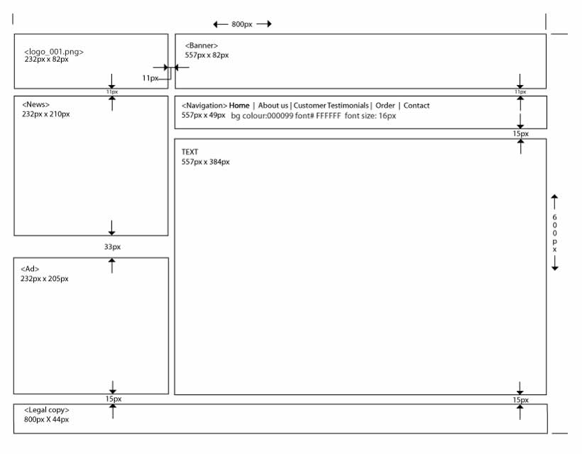
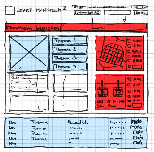
Often while wireframing, we delay considerations for exact sizing till later in the process. However, at other times, the designer may wish to portray some form of pixel dimensions explicitly. Here is one way to accomplish just that and communicate a wireframe’s dimensions, be it margins, widths, heights, or in between spacing. Lukas in his sample did this with the help of a few simple arrows and associated numbering. The nice thing about this approach is that it moves one step closer into putting a wireframe into some form of dimensional perspective.
Credits: Lukas Tomski
Tags: annotation, wireframe
Posted in Samples | 6 Comments »
Thursday, July 2nd, 2009
Similar to the recent sample, here is another one also from Uwe showing a more digital approach to colour overlays. I can only speculate that a paper based sketch was imported into the computer in order to colour it with some sort of transparencies. Perhaps what’s interesting about such a mixed media approach is the visibility that colour was an after thought in the process.
Credits: Uwe Thimel for kuehlhaus AG
Tags: colour, sketch, wireframe
Posted in Samples | 7 Comments »