


Emphasis Techniques in Sketching
May 26th, 2009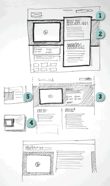
Just found these layouts on flickr belonging to James, which rely on a number of interesting emphasizing techniques. These include:
- Border thickness – thicker lines definitely are a quick way of making an element stand out.
- Tonation – darker backgrounds (in this case with the help of diagonal lines) can be used to emphasize an area (also see Matthieu’s sample).
- Isolation or incompletion – it’s very easy to draw attention to a particular element’s importance if the sketch is incomplete or only partially drawn (the sample by Jonas shows this nicely as well).
- Depth – drop shadows or three dimensional drawings are a quick way of making elements come out.
- Size – smaller sketches of course are less emphasized than bigger ones (see Little Frames).
Although not present in the above example, applying some colour to a sketch can also be a way of underlining desired elements.
Overall, emphasis is quite central to sketching as it sheds light on what is important and varies the visual priority. A sketch can also indicate its importance not only to the people being presented to, but also straight back to the original designer of the sketch. In The Reflective Practitioner, Donald Schön writes that design activity is a form of dialogue between the designer and the material of the situation. In other words, sketches, wireframes and prototypes are all things which in a way talk back to us. In this dialogue like metaphor, once an idea manifests itself in a visible form such as a sketch, it often leads to new ideas and the “conversation” continues on. Visual emphasis in sketching then plays a central role in keeping such cyclical dialogue alive.
Credits: James Bates
4 Responses to “Emphasis Techniques in Sketching”


May 26th, 2009 at 4:48 pm
The elements of emphasis fall under the category of designing interfaces, and to accomplish it one also needs a good tool that will create the variety of marks to allow the designer more control over things like hatching, tone and thickness. I am a big fan of Prismacolor markers. They have 3 different point sizes for varying thickness, and there are even micro-point markers for the finest of fine line work. They're art markers so they layer, thus enabling the use of tone and depth.
What other tools do people use that allow them to convey emphasis?
May 26th, 2009 at 6:15 pm
Adaptive Path has a great article about the wireframing tools they use.
http://www.adaptivepath.com/ideas/essays/archives…
In particular, I like the "chisel tip sharpie" and the "fine red marker". Worth a read…
May 28th, 2009 at 6:04 pm
Agreed. I really like the fine red marker for demonstrating flow, be it actions, events, conditions or state changes, etc.