Posts Tagged ‘wireframe’
Friday, April 17th, 2009
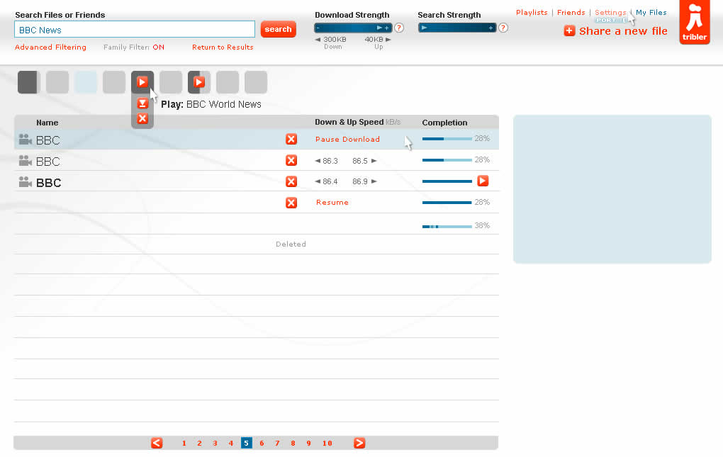
After the previous post, Sherrod reacted with his own cursor sample which aims to represent more varied mouse actions. He uses a combination of cursor icons to differentiate between clicks, mouse overs, and gestures. Taken together these all help to tell a clearer story and establish links between the different screens.
Credits: Sherrod Faulks
Tags: activity, wireframe
Posted in Samples | Comments Off on Cursor Actions
Wednesday, April 15th, 2009
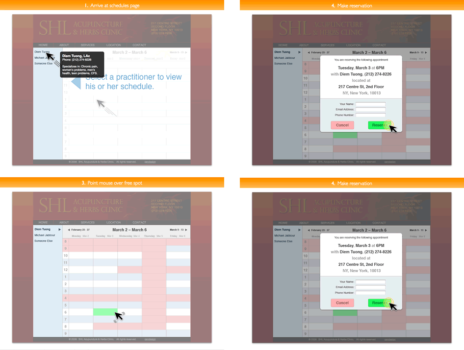
Cursors can be used inside of wireframes, or detailed visual layouts as in this case, to hint at states. Overlaying them on top of existing elements can give the viewer a stronger understanding of the multi state nature of the interface through the visibility of mouse positioning. In its most basic form a cursor can hint at an element’s onMouseOver state. In this sample I’ve used multiple such cursors on one screen to show multiple states all at once. I would assume it would also be possible to help understand other states as well (drags, resizes, etc) using cursors.
Have a look over at Konigi’s Wireframe Icon Set which now also contains cursor icons.
Credits: Jakub Linowski
Tags: activity, linowski, states, wireframe
Posted in Samples | 7 Comments »
Monday, April 13th, 2009
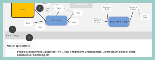
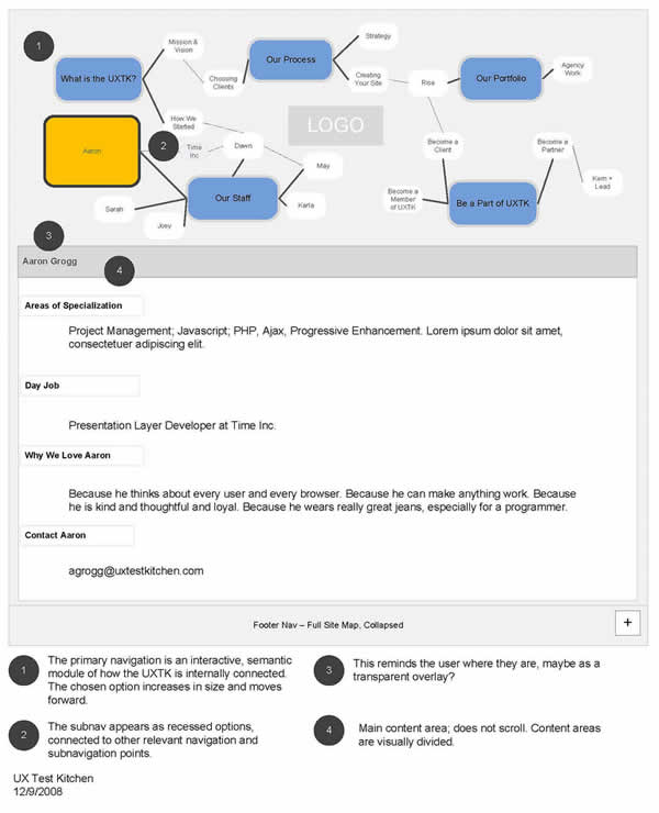
While designing the uxtestkitchen.com site, Dawn has come up with a navigation scheme which displays the site structure along with the current location at the very top of the interface. As we’d expect, these ideas have been naturally placed into the wireframe. What I find interesting however is the juxtaposition between the site structure and the wireframe at a more general level. I mean, this type of view could just as well be used even if the interface did not contain such a navigation. After all, seeing the site structure along side the wireframe in itself provides a richer picture. Similarly to showing needs alongside wireframes, perhaps seeing structure or user flows more closely could enrich the context.
A second thing I find interesting here, is the use of colour to suggest the current location of the user. Here, yellow has been used to hint at the currently selected item. This brings back thoughts about colouring clickables in wireframes. Just as actionable elements in a wireframe could have a reserved colour, perhaps a second standardized colour could be reserved to suggest selected items.
Credits: Dawn Bovasso
Tags: colour, sitemap, wireframe
Posted in Samples | 1 Comment »
Friday, April 10th, 2009
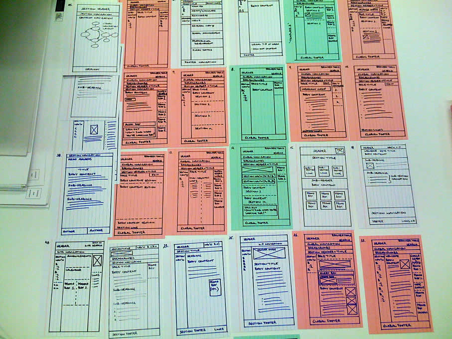
Just made some slight adjustments to the existing alternative sketching technique, aiming to steer more in the direction of brain storming or mind mapping. This resulted in something I’ll call a sketchstorm. Wanting to feel less constrained in the explorative stage of a project, little frames were sketched on a larger paper size (11×17) without any “alternative numbering”. Simply, the interface ideas which were more related to each other were grouped more closely together. As alternative concepts emerged, they were drawn outward away from the center. The center of the page still contains a focal idea which the sketches try to support. Overall, I can say that the larger sheet size combined with small interface representations did feel more free.
Credits: Jakub Linowski
Tags: alternatives, linowski, mindmap, sketch, wireframe
Posted in Samples | Comments Off on Sketchstorming
Wednesday, April 8th, 2009
Here is an interesting twist on the wireframe by means of using a different coloured background. When Steve has been drawing up templates of existing content for an intranet site, coloured paper has been used to denote the various templates types. In this case the colour suggests the differences in technologies used. However background colour could be just as well used to denote other things such as: user types, page states, stages in a flow, etc. It seems like an interesting approach, as typically the wireframe usually rests on a white background.
Credits: Steve Baty
Tags: colour, sketch, wireframe
Posted in Samples | 3 Comments »
Monday, April 6th, 2009
Personas inside of wireframes? Sherrod began combining little people figures with actual interface representations. It’s interesting to see these miniature persona like icons along with their basic user stories or simplified needs trying to provide an additional layer of information about the context of use. The icons also come available as a downloadable PSD file and contain a number of unique roles.
Credits: Sherrod Faulks
Tags: activity, agility, persona, wireframe
Posted in Samples | 8 Comments »
Friday, April 3rd, 2009
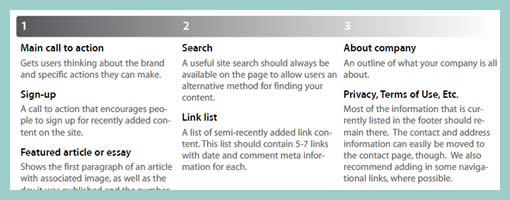
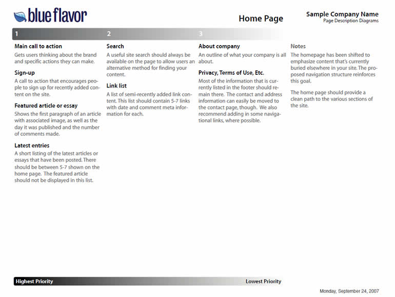
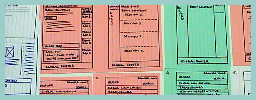
Page Description Diagrams are pretty much wireframes devoid of any layout representation. Page content chunks are described textually and also prioritized on a horizontal axis.
Here is a snippet of what Tom, of Blue Flavor, writes.
One of the main reasons why I love pdd’s is that they effectively remove visual design and layout-based discussions (which should be reserved for the visual design phase of the work) from the IA process. Presenting and discussing only content forces a client to focus on choosing what is and isn’t really important on a given page, helping to communicate their core message.
In addition, a good article on PDD’s exists over at boxesandarrows, and Garrett Dimon has posted a PDD template for Visio.
Credits: Tom Watson
Tags: content, priority, wireframe
Posted in Samples | 4 Comments »
Wednesday, April 1st, 2009
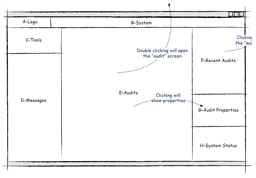
Cutting corners on the level of detail is a popular approach during wireframing which has been noted in the past during exploratory phases. These reference zones (term taken from Wireframes for the Wicked presentation), or content labels, do just that. Block outlines have been drawn out which are then labelled in order to describe what is contained within. Hans here has also introduced a number of arrows which begin to explore rough flows or events within the interface (similarly to Vivi’s In Page Events sample). Perhaps another difference between Hans’ and mine sample is that mine combines these abstract reference zones with more detailed sections, whereas Hans’ sample is fully referenced. Either way, these ways of abstracting the representation is quick and works very well in stirring initial interface ideas.
Credits: Hans Nieuwenburg
Tags: referencing, sketch, wireframe
Posted in Samples | 3 Comments »
Monday, March 23rd, 2009
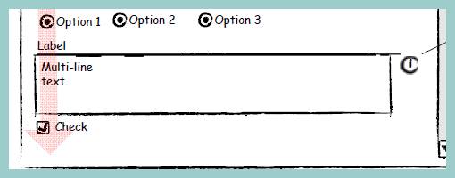
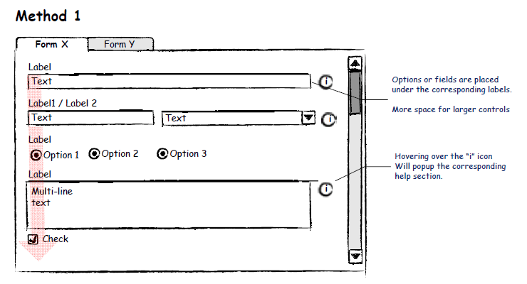
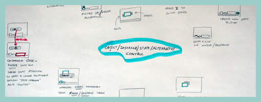
I would guess that not many designers think of specifying or controlling the tabbing order of form elements. It seems that quite often this is the type of interaction which is left alone for the browser to take over and automatically figure out on its own. Most of the time when users press the TAB key, the focus switches between input fields quite well, and if it doesn’t then the mouse is used to correct everything. Hans however, shared with me a user interface sample which clearly makes the tabbing order explicit. He uses a very simple transparent arrow going across form elements in order to indicate the order. It works quite well.
Credits: Hans Nieuwenburg
Tags: forms, sketch, wireframe
Posted in Samples | 6 Comments »
Friday, March 20th, 2009
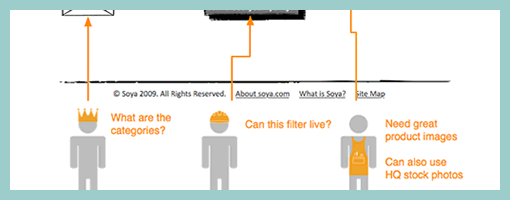
The bubble frame has stirred up some commotion on twitter the other day, and Tyesha reacted with her own variation. Her sample however sheds light on something else – the idea of prioritizing elements. She uses a very simple tactic that relies on numbered circles to denote the importance of an element. The really nice thing about communicating thoughts on priority in such abstract ways, is that it creates more flexibility for a visual designer to interpret the representation. This perhaps gives the designer more room to apply his/her own expertise as well.
I find it really interesting to see information architects thinking of such priorities behind various items on a page. There seem to be quite a few other ways in the realm of visual design which can be used to increase or decrease importance. Some less direct tactics include: the control of element size, emphasis through isolation, variance of depth (foreground, background), and of course a recent example that denotes priority with the use of tone.
Credits: Tyesha Snow
Tags: annotation, priority, referencing, wireframe
Posted in Samples | 3 Comments »