


Exploring UI Scaling
April 15th, 2011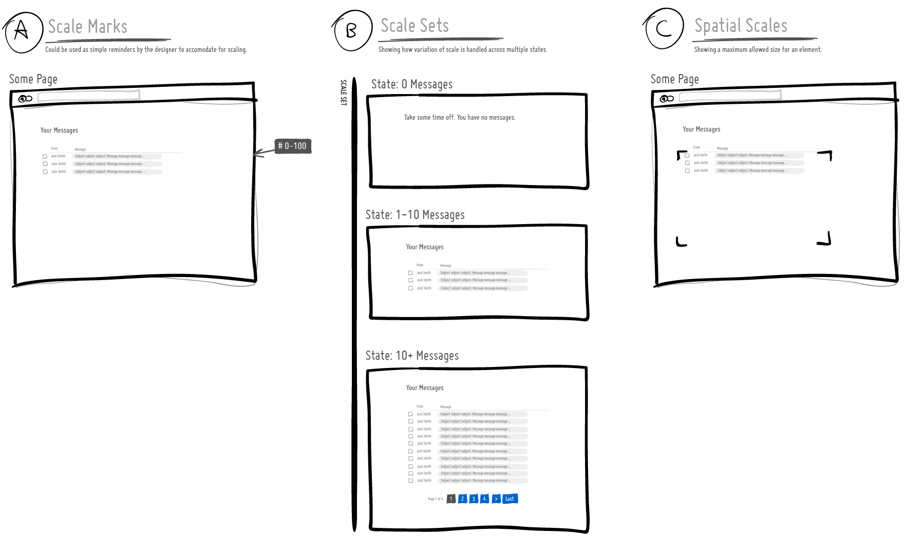
I’ve been thinking about ways to communicate how a user interface scales over time as the amount of information it needs to support varies. For example, sometimes the UI has to support multiple cases ranging from no results, to just a few results, to thousands of results. A good interface designer would probably think this through and come up with a UI that fulfills all of the relevant cases. For this, I began exploring a couple of visual language ideas to help myself and others who would like to tackle UI scaling. Here are some open and experimental thoughts:
A) Scale Marks. These are just floating reminder notes alongside a screen with a range of information that ought to be supported. Sometimes it’s easy to forget (or not know) how much data a UI really needs to support and these could be used as small self-targeted tests of sorts.
B) Scale Sets. This is a grouping of all the multiple UI states for those times when we actually want to draw out all of the relevant state ranges.
C) Spatial Scales. When there is more information, perhaps we might wish to communicate a maximum size of an element (max width / max height).
These are just a couple of thoughts which some day I might bring into the next release of the ISN. If you have other ideas, please share. :) Hope it’s useful.
Credits: Jakub Linowski
5 Responses to “Exploring UI Scaling”


April 18th, 2011 at 5:22 am
Thanks for Sharing this.
One thing I want to say in here as… place some text below the image. Such as click on the image to view in Full.
I read the post.. but not able to get it.. but when I clicked on the image.. the first time ever… then was able to relate the picture you been sharing. (i am visiting this blog regularly for around 1-1.15 years)
Thanks!
Gaurav M
April 18th, 2011 at 5:24 am
i suppose that fold line should be in mind too
April 18th, 2011 at 7:32 am
that's funny how I often realize on your blog that I ask myself those kind of questions, but not so consiously. I'm glad i found your thoughts about it !
April 18th, 2011 at 3:47 pm
Just worked in a subtle visual "plus icon" cue to hint that there is a bigger screen shot. Hope this helps. Cheers :)
April 19th, 2011 at 3:32 am
Yups! ok i saw!
What if the background of image underneath the + icon can be made brighter or lighter.. to give the visual distinction :- )
Please help! :-B