Posts Tagged ‘agility’

Tablet + Illustrator: the Case for Electronic Sketching

Thursday, February 4th, 2010

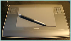
It’s probably nothing new that the sketch has been gaining quite some attention lately as a powerful design tool. Some UI designers have began to precede wireframing and prototyping with free-form pen and paper approaches that afford exploration and support a wider diversity of ideas. For over a year now, in my design process I’ve started doing just the same right after I picked up a set of markers and sketch pads. Looking back, sketching has been wonderful at giving rise to design representations that naturally act as conversation starters and therefore make sketching more so compatible with agile philosophies. However, traditional pen and paper has a few limitations which over the last few months became noticeable. As a reaction to this, I grabbed an Intuos 3 from Wacom, installed Adobe Illustrator and began sketching electronically using a pen and tablet. Finding the new approach superior, I have doubts I’ll ever go back to paper and wanted to share some of the reasons why.
Scaling

Like it or not, design ideas need to scale over time and good tools provide room for such growth. One thing that I love about Illustrator (which paper lacks of course) is that the art board or workspace can be stretched as needed whenever concepts need the extra room. The flexibility to resize the canvas is a really great feature especially during early ideation when multiple screens need to be shown together to tell a meaningful story. On the same note, another way Illustrator excels is in terms of a scalable fidelity. Whereas early on in a project the amount of detail might be small, over time however, the fidelity of an electronic sketch has the potential to develop. In a vector environment it is super easy to take a small UI sketch, stretch it to a larger size, and inject more detail inside of it.

Ease of Editing

Yes, in the real world we have pencils, erasers and the ability to redraw or correct our sketches to some degree. We can however only correct our paper sketches somewhat before they becomes unreadable. This isn’t the case with anything electronic or digital where cutting, deleting, undoing, redoing, erasing is second nature. A very common scenario is to draw different screens and only learn eventually that it makes sense for the two or three screens to be placed together – something that is very easily done by reorganizing or repositioning on the computer. Another superb thing about Illustrator is the ability to select a line and just redraw it, causing it the take on the new form. This of course can be done an unlimited amount of times in an electronic tool.

Legibility

Although this might not be the case for everyone out there, I personally find that my hand writing is very hard to read. Unless I spent extra care and time to write legibly, I find that on the computer it is way easier and quicker to type out text that can be read by others.

Carelessness

When I am about to sketch on paper, knowingly that it will be harder to undo, I hold myself back and think twice before the ink or lead leaves a mark. This slow down or inefficiency can be easily overcome in the electronic world with a tablet pen. When I sketch electronically, this worry disappears as I know that I don’t have to generate the right ideas, but instead can easily correct myself if something needs adjusting. This careless quality of electronic sketching brings forth immense value by affording greater exploration to occur more freely.

Reuse

Illustrator allows to create symbols of artwork very easily which in turn speeds up exploration ever more. Let’s say you have the same screen or component which you want to use a number of times across your work. Dragging the selection into the symbols palette allows you to reuse or instantiate that artwork and still have the ability to edit it in one location with it updating throughout. This is simply a superiority that paper cannot compete with.

The above are the reasons why I moved in the direction of electronic sketching. Perhaps the use of paper can still be justified in collaborative sketching sessions when there are more than one designer at the table and the design activity happens simultaneously in real time. For the remaining times, I find that the electronic sketch offers advantages over paper that are just too good to pass.

Credits: Jakub Linowski

UI Flow Shorthand Notation

Tuesday, September 22nd, 2009


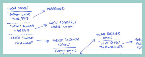
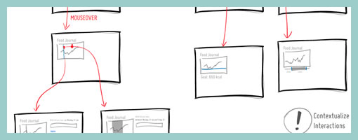
Amongst screens and wireframes, as interaction designers it is always important to consider the time element which binds and glues interface forms with human activity. Ryan Singer of 37signals just wrote an awesome little article about a quick way of noting down one of the common time-based documents we deal with – user interface flows. His shorthand version of a flow relies on making clusters composed of interface states or screens (above a horizontal line) and the actions which users take (below a horizontal line). These interface-action combinations are then transformed into a flow with the help of arrows that show possible sequences.

As basic as the approach sounds, it offers something quite unique in its potential for flexibility. Interestingly, Ryan has figured out a new way of how to represent alternative user actions per each screen (something I haven’t seen done before). These various actions which the users may take, can be separated out using a dotted line. More so, the notation also allows to visualize combined interface results stemming from a single action with the help of forking or branching arrows.

Overall, in an agile fashion, Ryan does not give much weight to these documents. Just like any other light and sketchy work, he hints at these flows being ephemeral and perhaps even a bit self-targeted:

Now don’t forget: all diagrams are destined for the garbage. The meaningful work is work that directly affects our customers as screens they can see or code that functions. But we still need to communicate and manage our work along the way. This shorthand has met a bare minimum for me to get a flow out of my brain in order to move on to other things. I hope it’s useful for you too.

Credits: Ryan Singer

Component Based Wireframes

Monday, May 11th, 2009


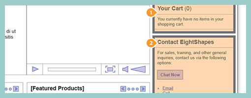
Earlier last month, EightShapes publicly released their Unify templates (for Adobe Indesign). Their systemic approach to wireframing emphasizes very modular ways to reuse elements, styles, pages and user interface components across deliverables. One thing which caught my attention is their interesting documentation technique of the components based approach which shares similarity with an the earlier post on object-oriented wireframing. Compontents are simply covered with a transparent orange overlay, are tagged with a referencing convention (“c#”) and are further elaborated and annotated on a separate page. This particular technique can be also visible in their PDF sample here.

Credits: Nathan Curtis – EightShapes

Sketchboarding

Tuesday, May 5th, 2009


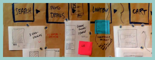
A collaborative sketching technique has been emerging from the people over at Adaptive Path, known as sketchboarding. A large sheet of paper is hung on the wall onto which additional pieces of paper are attached with the help of drafting dots, containing sketched ideas of different levels of fidelity. I find at least two things that stand out with this approach. First of all, inspirational material such as personas or requirements are used as a starting point to drive the conceptualization process. These materials are intentionaly placed on the left hand side of the sketchboard in close proximity to the wireframes. Secondly, the defined space where ideas are to be attached is stretched by design which invites exploration and refinement. Overall, this collaborative sketching technique works nicely as it also provides a bigger picture which can also be taken down and physically relocated if necessary.

Brandon has covered the technique quite in depth along with a video. Dan and Leah have also done a presentation about the approach in PPT format. More recently also, the following samples (along with templates) have been presented at the 2008 CanUX conference.

Credits: Leah Buley, Dan Harrelson & Brandon Schauer

Object-Oriented Wireframes

Tuesday, April 28th, 2009


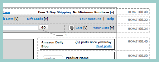
Rich Internet Application wireframes continue to pose a challenge to information architects who try to tame their complexity. Often all it takes is a few multi-state items on a single page and the number of all possible page variations skyrockets. Nick has introduced an object-oriented approach to wireframing which aims to ease the representation of such conditional multi-state interfaces. First, a wireframe is drawn up in the traditional sense. This is then followed by the definition of objects or component areas using dotted lines and a reference code. Each object’s various states and conditions are then explored in detail on a separate page, while still referring to with the same reference code. The approach works well in that it makes the interface components more manageable and easier to change.

Nick continues to evolve his approach, as well as has been presenting his ideas in PPT form over at slideshare.

Credits: Nick Iozzo

Engaging Paper Wireframe

Thursday, April 23rd, 2009


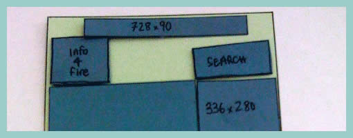
Often as noted in the past, there comes a time when the designer craves to invite feedback about a wireframe or any other design documentation. Rob here has taken one step further by creating an interface representation with elements being overlaid as separate pieces of paper. This has the added benefit of having an even more engaging wireframe which invites further collaboration. Here not only can viewers provide verbal feedback, but instead they can explore together different interface variations while freely rearranging elements. In retrospect Rob writes about his experience positively:

I really enjoyed the meeting I had. In the past support for these meetings has been thin. I used this free-flow method to get better participation and stake-holder engagement in this project – and I think it worked (know it worked).

Update: Rob just did a second version of this wireframe, which can be visible over at his flickr site. Looks like putty has also been used to keep all of the paper layers from flying around.

Credits: Rob Enslin

Agile People

Monday, April 6th, 2009


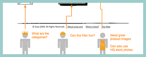
Personas inside of wireframes? Sherrod began combining little people figures with actual interface representations. It’s interesting to see these miniature persona like icons along with their basic user stories or simplified needs trying to provide an additional layer of information about the context of use. The icons also come available as a downloadable PSD file and contain a number of unique roles.

Credits: Sherrod Faulks

Tracing Paper Layers

Friday, March 6th, 2009


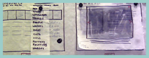
Here is an interesting technique which uses multiple pieces of tracing paper combined with sketching and scanning. It kind of reminds me of Photoshop layers except these exist in the real world. First, Jennifer drew various interface elements separate from each other on tracing paper and overlaid them together to form full page screens. These various combinations were later on also digitized using a scanner and then shared with others.

This technique shares some similarities in terms of flexibility with sticky frames. Just as with stickies, the designer can undo and rearrange elements very flexibly. Also, similarly to the sticky frame example where the designer used photography in order to reuse the various elements (and speed up the design process), here a scanner performed the same function. Tracing paper however has an additional characteristic of allowing to represent interesting transparency effects as is visible in the top right example suggesting an overlaying lightbox image. Tracing paper perhaps also affords a little bit more change and rearranging than sticky notes. All in all, such awesome tactics provide us with more speed and agility.

Jennifer writes:

We’ve also found that sometimes taking your design out of the computer screen forces your audience to focus on the concept rather than the execution, which is very helpful if your audience gets hung up on colors and buttons and the like. Frankly, it’s helpful to everyone involved: good design, I feel, serves the content, and all the flashy Flash/AJAX/JQuery what-have-you won’t save a poor design. I also believe that while good web design does not translate into good book design, etc., every designer should learn to use paper and pencil. Like the codex, it’s worked for 500 years; it’s not going anywhere soon.

Credits: Jennifer L. Anderson

Computer Based Sketchy Wireframes

Monday, March 2nd, 2009


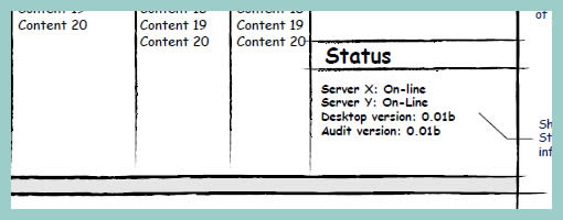
Jumping over to the computer does not necessarily mean that the wireframe ought to look rigid and clean, suggesting a higher degree of completion. Occasionally, the designer still feels the need to communicate the interface with a style which invites change by suggesting incompletion. One way of doing this is by means of a more sketchy style. Here is a sample of Hans using Visio loaded with a sketchy stencil designed by Niklas Wolkert. Jonathan Abbett has later on revised the stencil here.

Credits: Hans Nieuwenburg

Whiteboard Wireframes

Wednesday, February 11th, 2009


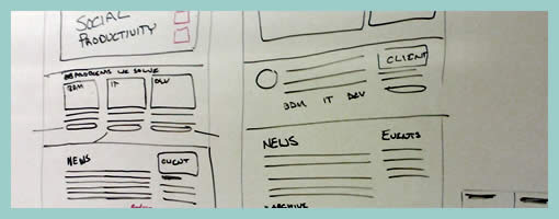
Sometimes it’s better to design collaboratively in the open instead of doing it from the safety of the solo oriented computer. If done right, more feedback can be harnessed quicker with higher quality returns. Agile programmers have been doing this with their paired programming approaches which apparently pay off by diminishing bugs and increasing code quality. Here is a sample from Michael drawing up wireframes on a whiteboard for the redesign of Jive Software’s website – visible and affording collaboration.

Credits: Michael Sigler