


Pattern Based Sketching
May 15th, 2009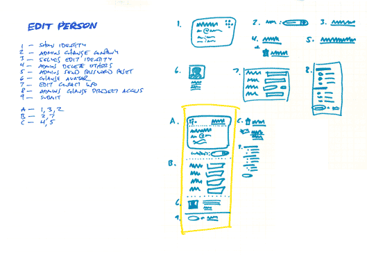
Ryan Singer of 37signals has written about and recently reaffirmed his satisfaction with a sketching technique he uses. The technique is inspired by Christopher Alexander’s book, Notes on the Synthesis of Form, and supports a number of important design qualities. It abstracts the starting point away from the specifics of UI elements, toward requirements or design considerations such as human needs, tasks or behaviours that are to be fulfilled. The technique emphasizes the interaction and forming of relationships between various requirements into manageable chunks or patterns. Prioritization of these patterns is then suggested. Finally, this approach also affords the exploration of multiple alternatives for each pattern or chunk followed by a unifying synthesis. In the end, the central ideas of Alexander are about letting design ideas emerge into unified and contextually fit forms.
Here is how Ryan describes the approach:
1. List all the things a screen should do. What should the customer be able to accomplish? What information are you sure should be displayed? Which affordances are necessary for customers to start a process or reach a goal? Label these things with numbers.
2. Look for any numbered items that relate to each other, conceptually or spatially. Label these groups of numbers with a letter.
3. Sketch a design (or multiple designs) for each number or letter group.
4. Combine the individually sketched blocks into a unified design. Let the pieces fall together into a whole.
Credits: Ryan Singer
2 Responses to “Pattern Based Sketching”


May 23rd, 2009 at 1:42 am
Along these lines, it's extremely helpful to write a list of design criteria, which are rules for a design — statements about the motivation behind the design that address what it needs to achieve for users and how it needs to work. The key is to focus your energy on the why and how rather than the what.
For example, I recently worked on the design of a Likert scale survey that was to include over 100 questions. I knew I wanted to avoid the obvious solution, which is a single page containing all the questions, listed alongside their accompanying radio button sets, because that would be remarkably demotivating and tedious. In my list of design criteria, I wrote, among other things, that the design should involve minimal mouse movement, should feel fast even if it wasn't actually fast, and should motivate the user to keep moving forward. As a result, I designed a solution in which the questions rotated into position to move to where the user's mouse already was instead of making the user move his mouse to the question; I used a color scale for the set of answer buttons (green = strongly agree > red = strongly disagree) so users don't have to memorize the order of the answers; and I showed just the next two upcoming questions so that users could stay motivated. (Of course, I also provided a way to change a previous answer.)
By getting away from the specifics and writing design criteria, I'm able to focus on the rationale behind a design and come up with better ways of achieving it rather than relying on standards.
June 5th, 2009 at 3:23 pm
Hi Robert,
Abstracting design criteria sounds interesting. Would you care to submit a few samples of that over to me? :)