Archive for the ‘Experimental’ Category

Exploring UI Scaling

Friday, April 15th, 2011


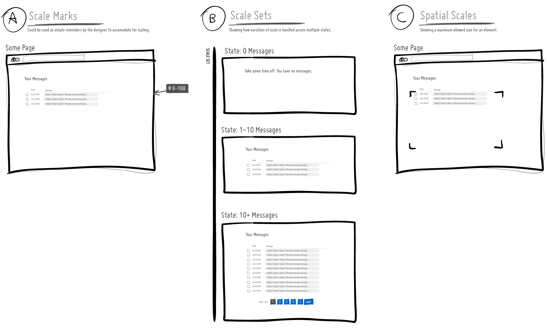
I’ve been thinking about ways to communicate how a user interface scales over time as the amount of information it needs to support varies. For example, sometimes the UI has to support multiple cases ranging from no results, to just a few results, to thousands of results. A good interface designer would probably think this through and come up with a UI that fulfills all of the relevant cases. For this, I began exploring a couple of visual language ideas to help myself and others who would like to tackle UI scaling. Here are some open and experimental thoughts:

A) Scale Marks. These are just floating reminder notes alongside a screen with a range of information that ought to be supported. Sometimes it’s easy to forget (or not know) how much data a UI really needs to support and these could be used as small self-targeted tests of sorts.

B) Scale Sets. This is a grouping of all the multiple UI states for those times when we actually want to draw out all of the relevant state ranges.

C) Spatial Scales. When there is more information, perhaps we might wish to communicate a maximum size of an element (max width / max height).

These are just a couple of thoughts which some day I might bring into the next release of the ISN. If you have other ideas, please share. :) Hope it’s useful.

Credits: Jakub Linowski

onProximityFade jQuery Plugin

Monday, July 26th, 2010


Here is another experiment in the form of an open source jQuery plugin named onProximityFade. What it does is it fades tagged elements (requiring a CSS class of “fadeBox”) depending on their proximity to the mouse cursor. The idea emerged after a subtle irritation with long lists of repeating links which sometimes feel as they receive too much attention on a page. So the intention is twofold. First, to visually deemphasize repeating and predictable elements throughout a page and thus achieve greater simplicity. Secondly, use gradual feedback to invite users to find actionable elements by using ranged values (the closer you get, the greater visibility). Any thoughts? Would love to hear them.

Have a peek at the demo or fork the code at github.

Credits: Jakub Linowski

Sticky Floating Navigation

Wednesday, June 30th, 2010


Cross posting from another blog, I thought to share one more little UI / Javascript / CSS experiment. The idea was to come up a few navigation elements which can behave as both floating (fixed positioning) and scrollable at different times. As a user scrolls, these elements feel as they somewhat stick to other parts of the interface (a central container), and hence the name. Please have a look at the quick and dirty prototype and let me know your thoughts.

Whether you call it an emerging UI pattern or an experiment, the main reason why I did this was to get a better feel for the interaction in a real life project. I also wanted to convey the idea of such a navigation to the client, and visual representations such as sketches or wireframes just weren’t adequate.

Beware, the code is ugly. But then again it’s a prototype, so who cares. :)

Credits: Jakub Linowski

Cursor Affordances

Friday, May 14th, 2010


Some time ago I’ve started a little quick and dirty Javascript and CSS experiment to help indicate more advanced mouse interactions in a visual way. By more advanced interactions I mean showing that things like double clicks, right clicks, and wheel scrolls could be performed on different UI elements. The left click is still perhaps the central mouse interaction that takes centre stage on the desktop, and I’ve seen users struggle to realize when additional interactions are possible. This I think is largely due to a lack of cues. Hence, these little cursor accordances aim to provide additional contextual symbols that float alongside the cursor. The other thing I wanted to achieve with this was to be able to display multiple cues at the same time (let’s say that both a left and a right click is possible on an element). So the code is super rough but here is a start. Basically numerous CSS classes are attached to HTML elements which then cause proper images to be overlaid near the cursor. Thoughts? Potential open source project?

Credits: Jakub Linowski

Grand Narratives & Play Points

Wednesday, April 21st, 2010


We can experience tiny operational interactions and we can experience grand narratives. Perhaps there is room for both of these when we think through and visualize experience, flows and time. Here is a quick idea to support these in an electronic sketch. A thicker line is basically used to denote the bigger story which is more linear, whereas the smaller interactions such as onlicks, hovers and drags are represented in a thiner style. The grand narratives also have starting points denoted by “play points”. These could be used to help guide readers to the important beginnings in a sea of little boxes. Just thinking (uhmm… I mean drawing) out loud. What do you think?

Credits: Jakub Linowski