


Cursor Affordances
May 14th, 2010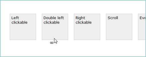
Some time ago I’ve started a little quick and dirty Javascript and CSS experiment to help indicate more advanced mouse interactions in a visual way. By more advanced interactions I mean showing that things like double clicks, right clicks, and wheel scrolls could be performed on different UI elements. The left click is still perhaps the central mouse interaction that takes centre stage on the desktop, and I’ve seen users struggle to realize when additional interactions are possible. This I think is largely due to a lack of cues. Hence, these little cursor accordances aim to provide additional contextual symbols that float alongside the cursor. The other thing I wanted to achieve with this was to be able to display multiple cues at the same time (let’s say that both a left and a right click is possible on an element). So the code is super rough but here is a start. Basically numerous CSS classes are attached to HTML elements which then cause proper images to be overlaid near the cursor. Thoughts? Potential open source project?
Credits: Jakub Linowski
19 Responses to “Cursor Affordances”


May 14th, 2010 at 1:31 pm
Scroll event looks good, but right/left click looks like a broken tooltip (tooltip baloon without text) and more than one icon displayed at time is quite confusing.
May 14th, 2010 at 9:33 am
I love this. As an Interaction designer working in the world of client-server software I find to my dismay that:
1) many of my systems’ users are not as ui-savvy as the people I used to design for when I was working with web applications, often missing opportunities to discover context menus and the like and
2) that much of our design / IA community is very web-centric in it’s thinking and publication.
I really appreciate seeing interaction ideas that can relate to desktop apps (and particularly to discoverability of functionality. I’d love to hear more about your implementation and if you were able to track gains in feature adoption or speed increases in task completion as a result. Basically, did users notice and how long before they turned the observance of these funny little symbols into expectation of behavior?
May 14th, 2010 at 6:53 pm
Interesting thoughts indeed, and I think that you should absolutely start a open source project here, but in my opinion, the representations them selves are not that important, what is important in my beliefs is widespread adoption. I'll explain why:
I can most certainly see this as a good cue to the user, but the not so web-savvy user(read my mom and grandpa and so on), risk understanding absolutely nothing and being more afraid/confused and thinking that their pointers have been broken.
For this to work with good results I therefor believe that we need this feature implemented all the way to OS-level. We should maybe try to start a movement and negotiate with Microsoft, Apple and Google.
However, if this is to be integrated all the way to OS-level, we get the risk of theses cues being used to such a degree that the user won't notice them anymore because they almost always have the possibility to left click, right click and scroll. That is true for at least the browsers were you have context menus that custom right click-actions remove access to.
For this reason I believe that unless you are in a rich web application like Google Docs alternate actions than the built-in browser features should be avoided at all. And once we're in the context of a really rich web application I think the users to a good extent have a natural intuitive understanding that there are secondary actions reachable from the right clicks.
To a certain extent I will also argue that; a large portion of the users that don't have this natural intuitive understand are the same people that get afraid or confused from different and new UI-elements.
However in the long run I believe that some sort of cue in this manner will be beneficiary.
May 14th, 2010 at 7:42 pm
This is great. Hope the Axure development team will read this post!
May 15th, 2010 at 5:36 am
this is so cool concept in all.
very nice
May 15th, 2010 at 7:09 pm
"EVERYTHING"
After implementing left-click, double-left-click, right-click, double-right-click, scroll, hover-delay, drag(/drop), triple-left-click, left+right-click, middle-click, and left-click-scroll, just hovering over that last one will create an icon explosion that will destroy a small part of the interweb.
I think the cues are a little… unsubtle, and the left-/right-click dots are a bit non-intuitive, but the idea could really help.
I'm thinking we can use Nielson's basic usability ramblings and say that we should design something to look like a button, if it's left-clickable.
Right-clicking, on the web, is a special case. I've seen Google Docs use it, but not much else. When you get right down to it, right-clicking should expose a context menu, so it should work no matter where on the page you right-click. It would make more sense to point out the ability in some sort of description piece. Or something.
The 'scroll' indication looks lovely, though!
May 17th, 2010 at 6:19 pm
Call me old fashioned… but I am more of a fan of just plain learning how to use your computer.
May 17th, 2010 at 6:50 pm
I think this is a good idea, but, as a user, I'd be more interested in learning what the left-, double-left-, and right-clicks do. For example, if right-clicking opens up a contextual menu, I'd want to see an indicator for that.
May 18th, 2010 at 10:31 pm
I can see how the scroll icon is useful, despite that the obvious way to indicate something is scrollable is to actually use a scrollbar apparatus.
But clickable elements should look… clickable. There's a reason why buttons look 3 dimensional. If you have resort to icons to communicate this, you've failed.
For right clicks… if you're hidden commands behind right clicks, it's a bad idea anyway, specially on the web environment.
May 19th, 2010 at 12:25 am
I like the idea especially with increasing use of web apps that go beyond the interactions of normal websites, like Gmail. While there isn't really a solid divide between what a web app is and a website, I think we'll see more web apps with higher range of interactivity.
It wouldn't make sense to have this all the time, but perhaps for a tutorial.
I also agree that the right- and left-clicks are a little unintuitive. Perhaps having a little mouse with a greyed out right or left button would make more sense.
May 19th, 2010 at 1:52 pm
I would argee with most of the comments before. It could be annoyng for the user to see these Icons all the time. And I think Henrique is right: a clickable button should look like a clickable button.
But in my opinion there is another use for this idea: its ideal for Wireframe-Dummies or, like said before, tutorials. If you have to to show a customer, how his application or website will function when ist ready, these mouse-icons are a good way to do that – even if there is no degin in the wireframes, like it should be.
So I agree with Pierre Foucart: Show this idea to the Axure development team! I'm not yet using this wireframe-tool, but I am looking foward to use it, just waiting for my boss to buy it…
May 19th, 2010 at 10:58 pm
Feels a bit too me like leaving it up to the car to tell you when to put the brakes on instead of just learning to do it instinctually.
Wireframing – that's a better idea for application I think.
May 20th, 2010 at 12:58 pm
Maitika. I like the comment around the potential of this becoming annoying. It makes me wonder if A) a more subtle solution could make this work better, or B) a solution that diminishes in visual strength over time as the user learns certain actions behind the interface. Another idea for implementing this could be C) where this becomes a setting or plugin in the browser (possibly enabled for new pages that you visit and still need hand holding). Anyone from Mozilla reading this, or know how to build Firefox plugins? :)
And I am also liking the idea of using a real mouse symbol to convey these actions. Could be more intuitive. Agreed.
May 20th, 2010 at 5:08 pm
That's an interesting take on the whole concept as well!
May 20th, 2010 at 5:10 pm
Agreed that the buttons could be stronger and more intuitive. Not sure if there would be a case though where all the actions are enabled. If they were, then you're right, it might be a bit of an information overload case. Thanks for the feedback!
May 20th, 2010 at 5:14 pm
Hi Stefan,
All good points. I wonder if taking this to the browser level in the form of a plugin might be another option. More advanced users might then potentially disable this, or it might get automatically disabled on its own for sites that are visited frequently (where the interactions are already learned). Taking it to the OS level would probably be better, but might require more negotiation?
May 21st, 2010 at 8:47 am
Very interesting. Would love to see some test data around this. I think it might need some refinement, but the concept is definitely intriguing. We do need better ways of cueing users. Some might argue that you shouldn't need it, and touch usability sort of supports that idea I think. Which leads me to the question….what about touch?
June 21st, 2010 at 9:21 am
Interesting :-)
However – Left-clickable and scrollable are useless.
Right click and double click are indeed barely discoverable for most users, and for that reason considered bad practice – I don't agree, and think such explorations are a must if we want to be able to create rich web applications. A context menu is a huge benefit in desktop applications, so we should be eager to implement it on the web.
But like Michael said, a typical context menu would work almost anywhere in the page, so the icon again becomes kinda useless. And I don't agree about advertising those features to the users using banners, default tooltips and such – This is poor usability.
We need to continue thinking about this solution. It is a step in the right direction, but there are more steps to be made.
June 30th, 2010 at 4:18 am
Hi Ronny. About your comment: "And I don't agree about advertising those features to the users using banners, default tooltips and such – This is poor usability." Isn't the option for left clickable items already being advertised in all web browsers with a cursor change? I'm simply suggesting subtle use cues or affordances that can be learned and which extend the traditional left click to other advanced interactions which aren't yet visible.