Posts Tagged ‘alternatives’

Sketch Map

Tuesday, February 12th, 2013


What do you get when you mix mind maps and sketches together? Well, Sketch Maps, of course. Catriona of InspireUX just shared an interesting approach to organizing your sketches around a central idea. Awesome big canvas sketching! I’m a firm believer that your workspace affects the way you think. How you structure your screens will affect what you end up with. In the case of these Sketch Maps, it’s clear that the structure guides the designer to maximize the number of alternative ideas. It forces the designer to explore more alternatives in a playful way as opposed to thinking about a concrete unified solution. Two thumbs up. Thanks for sharing.

Credits: Catriona Cornett

MBTI Sketching Framework

Thursday, October 8th, 2009


Here is another interesting sketching approach which Henk describes in detail in an article on his blog. Basically, the framework he uses aims to support various personality traits based on the Myers-Briggs Type Indicator, as originated from the psychologist, Carl Jung. In this approach, the designer is forced to generate concepts for these distinct personality types which are segmented into four areas. These types include: competitive, spontaneous, humanistic and methodical. I guess it’s interesting to see designers find inspiration from 100 year old ideas.

Credits: Henk Wijnholds

UI Flow Shorthand Notation

Tuesday, September 22nd, 2009


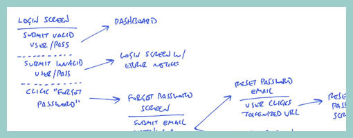
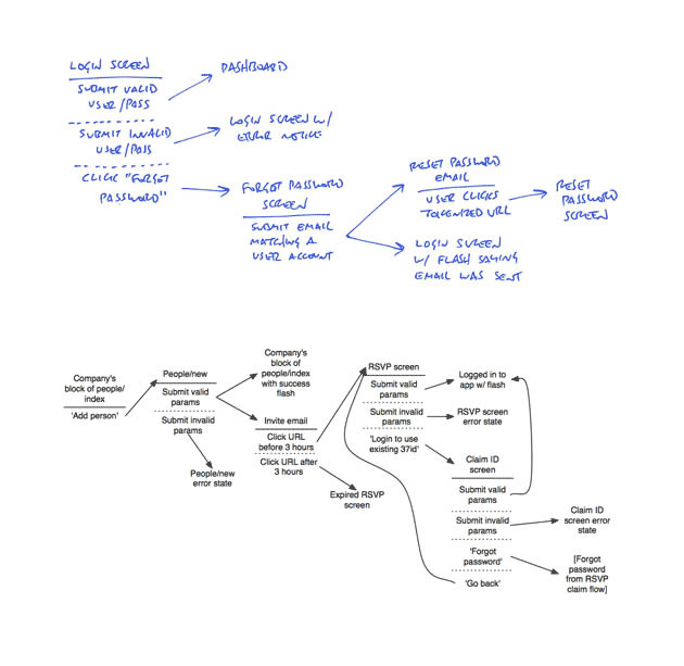
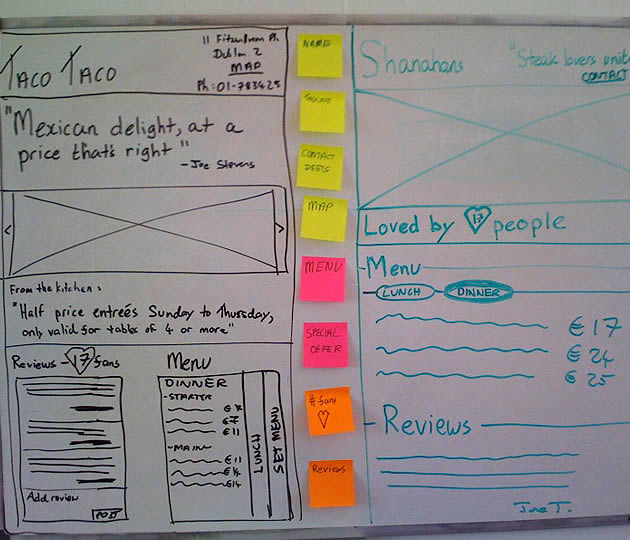
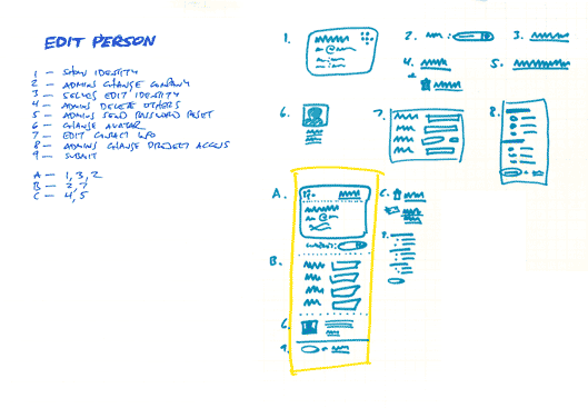
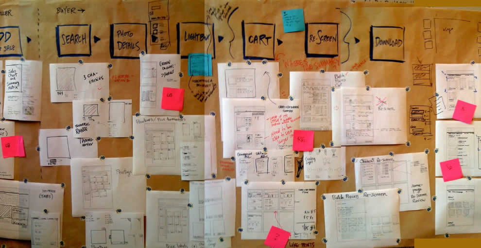
Amongst screens and wireframes, as interaction designers it is always important to consider the time element which binds and glues interface forms with human activity. Ryan Singer of 37signals just wrote an awesome little article about a quick way of noting down one of the common time-based documents we deal with – user interface flows. His shorthand version of a flow relies on making clusters composed of interface states or screens (above a horizontal line) and the actions which users take (below a horizontal line). These interface-action combinations are then transformed into a flow with the help of arrows that show possible sequences.

As basic as the approach sounds, it offers something quite unique in its potential for flexibility. Interestingly, Ryan has figured out a new way of how to represent alternative user actions per each screen (something I haven’t seen done before). These various actions which the users may take, can be separated out using a dotted line. More so, the notation also allows to visualize combined interface results stemming from a single action with the help of forking or branching arrows.

Overall, in an agile fashion, Ryan does not give much weight to these documents. Just like any other light and sketchy work, he hints at these flows being ephemeral and perhaps even a bit self-targeted:

Now don’t forget: all diagrams are destined for the garbage. The meaningful work is work that directly affects our customers as screens they can see or code that functions. But we still need to communicate and manage our work along the way. This shorthand has met a bare minimum for me to get a flow out of my brain in order to move on to other things. I hope it’s useful for you too.

Credits: Ryan Singer

Prioritized Stickynote Requirements

Thursday, September 17th, 2009


Des just sent me a link to where he describes his early design process with a few whiteboard wireframes. One thing he does is create some sort of inpage requirements with the help of sticky notes which are placed alongside the UI work for inspiration. These rough and abstract textual ideas or requirements guide his thinking during the wireframing process. More so, he goes even further and uses colour coded stickies to denote priority.

In his own words:

They’re colored by importance. For this project it was:
Yellow = super important, site is useless without
Pink = nice to have, but requires restaurant owners to do some work
Orange = social features, relies heavily on people using the site (might not be there at all).

At the same time, I also found it very interesting that Des explores variations or alternatives as not to fall into the pattern trap. There is another interesting article related to this which he wrote about, Thinking in Patterns, on his company blog.

Credits: Des Traynor

Functional Mindmaps

Tuesday, September 1st, 2009


Abstracting away from the way the interface looks, we begin to face higher level goals, functions or activities that the design ought to support. Eugenio here has done just that by using Mindmeister software to generate a high level mind map of the activities users will be able to accomplish. Thinking about functional requirements such as these before jumping into wireframing is a divergent design tactic as it allows more flexibility in interpretation. In other words, by being more ambiguous these functional mindmaps can generate a greater variety of new ideas. Comparatively, wireframes or sketches which are more concrete, are a convergent tactic which steer us in a single direction with the aim of getting us all “on the same page”. In my opinion, a design process that makes room for both divergent and convergent tactics, generates the best results. I guess, Eugenio’s sample here is a nice reminder to think a little bit bigger beyond the boundaries of the wireframe.

Credits: Eugenio Grigolon

In Page Conditions

Tuesday, May 19th, 2009


Zef just pointed me to a number of UX templates he published (along with their story), and one particular thing caught my attention. That is, his way of handling display logic based on a few “if” statements in the actual page itself (similarly to a post on in page events). The visual language used is a simple bracket with a conditional statement beside it, which is related to a grey block representing some state. This way of visualizing multiple states compared to an approach where the states are elaborated on a separate page, has the added benefit of being easier and quicker to comprehend as they are contextualized in the page. However, something also tells me that this way of documenting multiple states might work best for simpler conditionals than for more complex ones. The component or object-oriented approaches perhaps still offer more agility and flexibility even if they require more effort to imagine the full picture from elements spread out on numerous pages.

Credits: Zef Fugaz

Pattern Based Sketching

Friday, May 15th, 2009


Ryan Singer of 37signals has written about and recently reaffirmed his satisfaction with a sketching technique he uses. The technique is inspired by Christopher Alexander’s book, Notes on the Synthesis of Form, and supports a number of important design qualities. It abstracts the starting point away from the specifics of UI elements, toward requirements or design considerations such as human needs, tasks or behaviours that are to be fulfilled. The technique emphasizes the interaction and forming of relationships between various requirements into manageable chunks or patterns. Prioritization of these patterns is then suggested. Finally, this approach also affords the exploration of multiple alternatives for each pattern or chunk followed by a unifying synthesis. In the end, the central ideas of Alexander are about letting design ideas emerge into unified and contextually fit forms.

Here is how Ryan describes the approach:

1. List all the things a screen should do. What should the customer be able to accomplish? What information are you sure should be displayed? Which affordances are necessary for customers to start a process or reach a goal? Label these things with numbers.
2. Look for any numbered items that relate to each other, conceptually or spatially. Label these groups of numbers with a letter.
3. Sketch a design (or multiple designs) for each number or letter group.
4. Combine the individually sketched blocks into a unified design. Let the pieces fall together into a whole.

Credits: Ryan Singer

Sketchboarding

Tuesday, May 5th, 2009


A collaborative sketching technique has been emerging from the people over at Adaptive Path, known as sketchboarding. A large sheet of paper is hung on the wall onto which additional pieces of paper are attached with the help of drafting dots, containing sketched ideas of different levels of fidelity. I find at least two things that stand out with this approach. First of all, inspirational material such as personas or requirements are used as a starting point to drive the conceptualization process. These materials are intentionaly placed on the left hand side of the sketchboard in close proximity to the wireframes. Secondly, the defined space where ideas are to be attached is stretched by design which invites exploration and refinement. Overall, this collaborative sketching technique works nicely as it also provides a bigger picture which can also be taken down and physically relocated if necessary.

Brandon has covered the technique quite in depth along with a video. Dan and Leah have also done a presentation about the approach in PPT format. More recently also, the following samples (along with templates) have been presented at the 2008 CanUX conference.

Credits: Leah Buley, Dan Harrelson & Brandon Schauer

Sketchstorming

Friday, April 10th, 2009


Just made some slight adjustments to the existing alternative sketching technique, aiming to steer more in the direction of brain storming or mind mapping. This resulted in something I’ll call a sketchstorm. Wanting to feel less constrained in the explorative stage of a project, little frames were sketched on a larger paper size (11×17) without any “alternative numbering”. Simply, the interface ideas which were more related to each other were grouped more closely together. As alternative concepts emerged, they were drawn outward away from the center. The center of the page still contains a focal idea which the sketches try to support. Overall, I can say that the larger sheet size combined with small interface representations did feel more free.

Credits: Jakub Linowski

Interaction Sketch Alternatives

Monday, March 30th, 2009


Inspired by the High Level Layout Aternatives sample, when I was sketching some ideas for fluidIA the other week, drawings such as this emerged. Even though the use of letters as a way to distinguish alternatives was borrowed, the intention wasn’t really about exploring layout. Instead the focus was more about exploring a number of various interaction alternatives where screen or state changes are interlinked with some form of action (mostly key presses in this case). The sample also makes use of a simple title suggesting a unifying idea for all alternatives. Just thought it would be worthy to share.

Credits: Jakub Linowski