Posts Tagged ‘colour’
Tuesday, January 5th, 2010

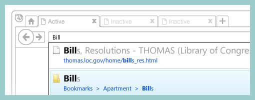
Recently, a visual mockup technique by Alex Faaborg on the Mozilla blog caught my attention. As Alex has been thinking about the merits of searching and browsing through bookmarks and history for the next Firefox version, it seemed like in a way he merged the traditional wireframe with a detailed mockup. While parts of the interface schematics are faded outlines devoid of any colour, other parts are represented in full colour and contain rich depth. Interesting? This effect enables the designer to emphasize the more important parts of an interface and focuses the viewer’s attention on what matters most. These wireframe-mockup hybrids perhaps reaffirm the importance of designing UI parts in the right fidelity and at the same time remind us that it is ok to leave stuff out.
Credits: Alex Faaborg
Tags: colour, emphasis, priority
Posted in Samples | 2 Comments »
Wednesday, December 30th, 2009

I just kicked off a new inspirations category intended for samples and techniques from outside the boundaries of the UI/UX/IA profession. I’m looking forward to seek out some inspiration from within other fields in the new year (please continue to send in samples or ideas). For now, here is a first post in this category.
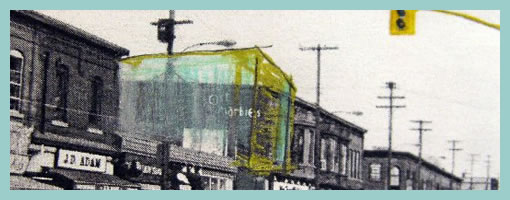
I’ve noticed that my sister who is in her third year of studying architecture does quite a bit of sketching and model prototyping herself. Looking through her work, one thing which caught my attention was the use of a form of sketching which overlays the envisioned building (or neighbourhood) on top of an existing environment. For me, this seems like a superb and smooth way of transitioning from the present into the future. The present in this case is a black and white photograph of the neighbourhood and acts like a clear reference point. The future state of the intended design clearly stands out by means of a coloured pencil sketch on top of the photograph. Occasionally, I’ve also seen her make use of overlaid tracing paper.
To me this seems really interesting and I wonder if the same approach can be used in UI design. When redesigning existing UIs, why not take screenshots of the current present state, import into Illustrator and sketch the future state on top. Eager to try this one day.
Credits: Dominika Linowska
Tags: colour, sketch
Posted in Inspirations | 3 Comments »
Monday, November 30th, 2009

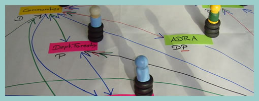
The Net-Map Toolbox is collaborative and physical tool developed by Eva Schiffer with the aim to visualize influencers in a social context. The maps generated with this approach are a snapshot of a social setting with key influencers being emphasized (raised). I found it interesting to see an attempt to capture more complex social situations with multiple people in the equation. In Alan Cooper’s book, The Inmates Are Running the Asylum, the traditional direction given was to design for a single user. Could this rule be breaking down today in light of designing for more complex contexts? Here is a description about the toolbox directly from the Net-Map website:
Net-Map is an interview-based mapping tool that helps people understand, visualize, discuss, and improve situations in which many different actors influence outcomes. By creating Influence Network Maps, individuals and groups can clarify their own view of a situation, foster discussion, and develop a strategic approach to their networking activities. More specifically, Net-Map helps players to determine
* what actors are involved in a given network,
* how they are linked,
* how influential they are, and
* what their goals are.
Credits: Eva Schiffer
Tags: activity, colour, sticky notes
Posted in Samples, Tools | Comments Off on Net-Maps
Tuesday, October 13th, 2009

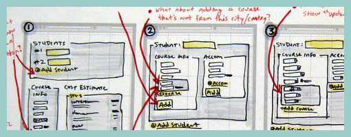
According to Jason, sketches are never complete but only refined. They exist with the intention to pose questions and ask to be scribbled over on top. And that’s exactly how Jason uses them. He will make adjustments and modification straight over them with a red coloured marker. Thus in a way, all on the same drawing, the sketches become a layered representation of the initial idea along with the revisions. Although I personally prefer to use red to represent action items on my sketches, I still find this interesting approach in its power to visualize a history of changes. This makes me wonder though if there would be a systemic way to separate out all future sketch revisions from each other. Could there also be possibly a way to tag which sketched changes belong to which person (should there be multiple authors?) … ahh, just thinking out loud.
Enough of my thoughts. Here is what Jason really thinks:
I was sketching some designs for wireframe templates. The red is my way of calling attention to changes, questions, or comments about the design.
The neat thing about sketches is that what you see there is black and red. The black is my initial guess. The red is the correction to my initial guess. From there, I implement the changes in the live product. So, for instance, I opened my PSD and made the changes in there.
So the sketches are never really “done.” They’re done in the sense that I’m done using them. But they’re not done in the finished sense, they don’t reflect the final changes, other than by what I’ve written in red.
Credits: Jason Robb
Tags: annotation, colour, sketch
Posted in Samples | 4 Comments »
Thursday, September 17th, 2009

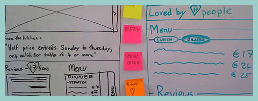
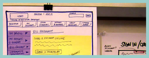
Des just sent me a link to where he describes his early design process with a few whiteboard wireframes. One thing he does is create some sort of inpage requirements with the help of sticky notes which are placed alongside the UI work for inspiration. These rough and abstract textual ideas or requirements guide his thinking during the wireframing process. More so, he goes even further and uses colour coded stickies to denote priority.
In his own words:
They’re colored by importance. For this project it was:
Yellow = super important, site is useless without
Pink = nice to have, but requires restaurant owners to do some work
Orange = social features, relies heavily on people using the site (might not be there at all).
At the same time, I also found it very interesting that Des explores variations or alternatives as not to fall into the pattern trap. There is another interesting article related to this which he wrote about, Thinking in Patterns, on his company blog.
Credits: Des Traynor
Tags: alternatives, colour, priority, sketch, sticky notes
Posted in Samples | 1 Comment »
Thursday, September 10th, 2009

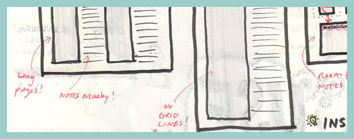
Quite often user interface pages will have to be long and scroll. As obvious as it sounds, here is a sketch which supports this. Jason has simply decreased the size of his frames and made them taller. On the same note, one of his sketches also makes use of a zigzagged line. I would guess that has been done to suggest a continuation of sorts, allowing him to communicate that there is more to the page without having to go into detail. I also like the heavy emphasis used on the title. Nice!
Credits: Jason Robb
Tags: annotation, colour, forms, scrollable, sketch, wireframe
Posted in Samples | 1 Comment »
Thursday, August 27th, 2009

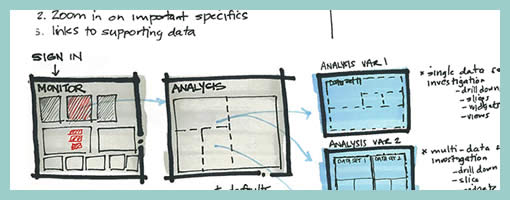
Ben just sent me a sketch which uses a number of techniques seen previously. One thing which is a bit unique perhaps are some of the short lists of requirements or goals which he combines with his sketches (seen on page 1 and 3). These seem to guide his thought process at the outset, and are often at the top of a page in the form of a list. Another cool thing he does is break up his ideas into some conceptual chunks with distinct titles that are highlighted. He also emphasizes his sketches similarly to some approaches listed earlier. To draw attention to certain elements, the thickness of borders is varied and some of the screens use colour overlays. Ben’s sketches are also occasionally loaded with question marks – something I’ve noticed to appear in my own drawings as well. Here is how Ben describes his process:
1. I usually lay down a 10% cool grey field where I am going to show “the screen” (or whatever object I am going to sketch)
2. I then draw in the frame of my screen, usually with a Sharpie. I like the effect of the bold border, and it helps me to set up a hierarchy within the sketch with different line weights (Staedtler 0.1, 0.3, 0.5, 0.7 mm black pigment pens)
3. Once I have the screen set up, I just sketch as needed, showing different levels of detail depending on what I need to document
4. I use a wash of blue (very light blue marker) to set off anything that I want to emphasize, red pen for interactions or to call out areas
Sometimes I use a light color pencil to add dimension or texture if I feel it’s important for the design, beyond that, it’s pretty free form.
Credits: Ben Rossi
Tags: annotation, colour, emphasis, sketch
Posted in Samples | 4 Comments »
Tuesday, August 18th, 2009

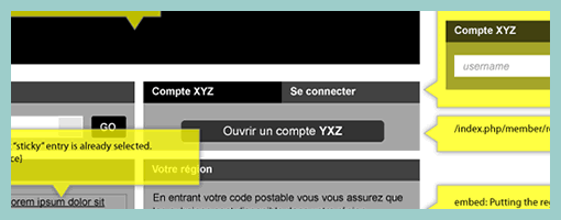
Here is a cool idea by Benoît which combines annotations with interface visuals into one coherent whole. Typically annotation bubbles were reserved for textual information, yet this sample extends it to contain more elaborate visual elements. More so, some of these annotations visible here also contain multiple variations of an interface suggesting some sort of multiple state representation.
Credits: Benoît Meunier
Tags: annotation, colour, referencing, states, wireframe
Posted in Samples | 4 Comments »
Tuesday, July 21st, 2009

Keith relies on a similar technique to the Stickyframes approach posted earlier. His approach differs in that it mixes a number of techniques together. These hybrid interface representations mix sticky notes with sketching, sketches with flows, and anything else he comes up he just posts up and groups on a wall in a sketchboarding manner. Here is what Keith writes:
I’ve been creating wireframes since the late nineties and in retrospect have always relied on hand sketching and rapid ideation to solve my UI/UX problems.
This example is not unlike the Stickyframes example currently posted on your site. The difference with my approach is that I use color to begin to organize the chuncks of content or functionality. I also attach sticky notes containing mindmaps, flows, or mini sketches of interfaces. The grouping of ideas and sketches stay put until I have sorted out the actual page layouts to be rendered in Visio or AxureRP. The result is a moodboard for ideas which allows me to swap out thoughts until ideas are fully baked. I’ve had success sharing these with clients and collaborative teams early on in the process because they appear to be work in progress.
While I love working at a larger scale on whiteboards, these are a portable alternative for negotiating screens.
Credits: Keith Tatum of Resource
Tags: colour, sketch, sticky notes, wireframe
Posted in Samples | 1 Comment »
Thursday, July 2nd, 2009

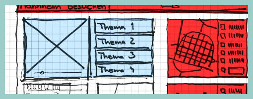
Similar to the recent sample, here is another one also from Uwe showing a more digital approach to colour overlays. I can only speculate that a paper based sketch was imported into the computer in order to colour it with some sort of transparencies. Perhaps what’s interesting about such a mixed media approach is the visibility that colour was an after thought in the process.
Credits: Uwe Thimel for kuehlhaus AG
Tags: colour, sketch, wireframe
Posted in Samples | 7 Comments »
