


Grand Narratives & Play Points
April 21st, 2010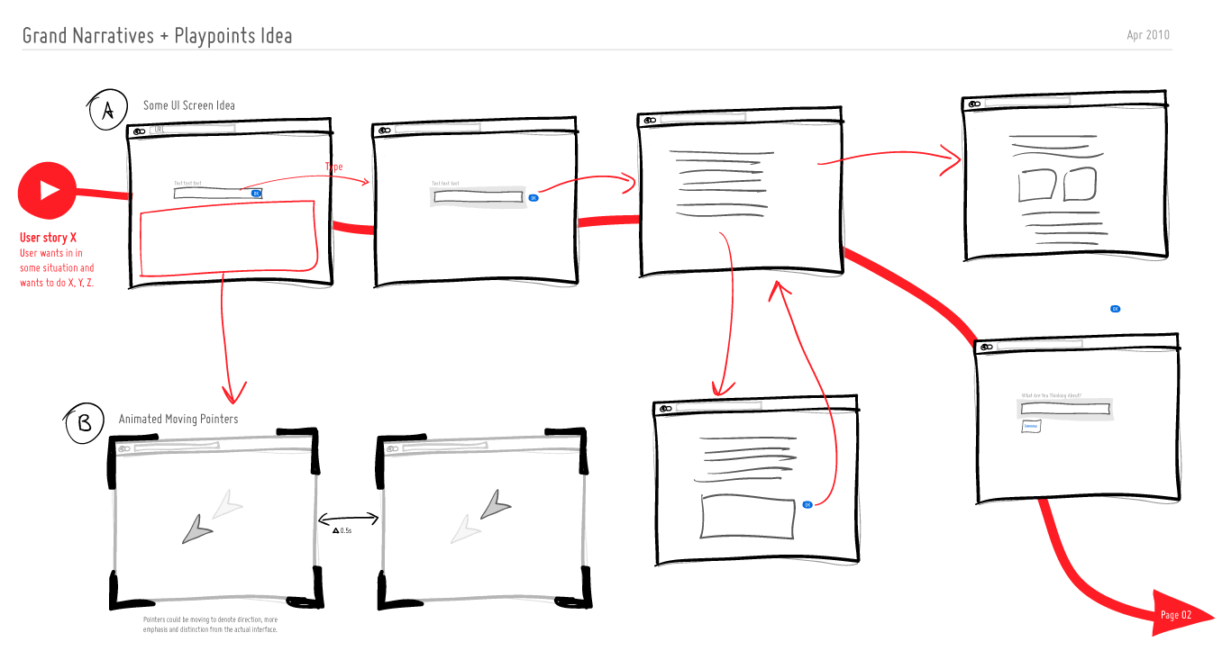
We can experience tiny operational interactions and we can experience grand narratives. Perhaps there is room for both of these when we think through and visualize experience, flows and time. Here is a quick idea to support these in an electronic sketch. A thicker line is basically used to denote the bigger story which is more linear, whereas the smaller interactions such as onlicks, hovers and drags are represented in a thiner style. The grand narratives also have starting points denoted by “play points”. These could be used to help guide readers to the important beginnings in a sea of little boxes. Just thinking (uhmm… I mean drawing) out loud. What do you think?
Credits: Jakub Linowski
4 Responses to “Grand Narratives & Play Points”


April 21st, 2010 at 2:53 pm
This is a good idea! I'd make it a rule for myself to have this bigger story pictured behind the little one…
May 6th, 2010 at 8:59 am
Hi Jakub, Thanks for sharing!
The main idea sounds good. But when I think it through (and look at your sketch) it is not clear to me how the big story behind all the screens could be visualized as a red line. Can you explain a bit more what you try to visualize with the thicker red line. What is it saying in your example?
In your example it seems to me that it represents some how a structure between the screens, but I don't understand how these could be consecutive.
It also brings up the question: How does the user get to the screen on the lower right corner in you example. It is connected through the thicker story line, but there is no interaction that gets me there.
An idea; The red line could help the viewer to look at all the important screens, to make sure that they are seen. But I think I would only use it if there is an order in the screens which helps the user to understand the whole concept of the design.
In that case I would make sure that the interaction lines have a different color than the (red)storyline.
So to me it is a line with potential, but it needs a little more explaining (to me/ and maybe to the customer as well).
May 14th, 2010 at 5:21 am
Hi Lisanne,
I think you hit the nail on the head here, in that this is work in progress. Hence I just started an "Experimental" category and moved the post in there as well. You're also right about the bottom screen having no real interaction links (thiner lines) and that would be my mistake. Typically it actually would have some kind of interaction to get the user there. So, my bad.
As to the bigger question in terms of what this is trying to achieve, I think I'm exploring the idea to visualize intent. The starting point for each thicker line is a Play like symbol that would indicate the intent or larger story that the user is trying to achieve. Perhaps sometimes I find that by documenting these "smaller" interactions (clicks, hover), the larger picture of what the user is trying to do gets lost. That's where these grander narratives could come in.
Again, it's all exploratory work :) More feedback or alternative ideas of your own would be great.
Best,
Jakub