


Paper Prototype Cutouts
November 18th, 2009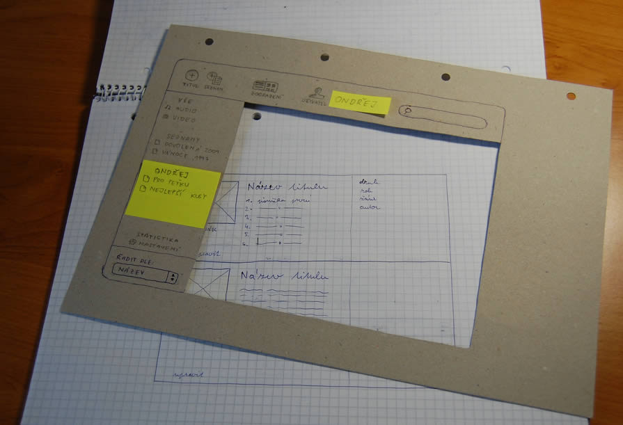
Here is a cool idea of combining multi layered interfaces in the physical world. Ondřej has created a paper cutout for this sketches that allows him to reuse parts of his interface by means of overlapping screens. Real world masters? :) In his own words:
As a part of a school project of mine I created such prototype. Having considered all the problems I’m going to resolve I’ve made a list of proper goals:
- I have to create a paper prototype of an audio/video manager app. I already have the creative brief and the technical brief.
- The prototype should contain all the screens and dialogue boxes of the app. It should be compact, easy to store, portable all-in-one solution.
- It should provide quick and fancy user testing.
I wanted to have the whole app in a single notebook. Because the app would have a single window interface, the solution had crossed my mind immediately.
The result with all its benefits you can see above.
- A page = a screen. Using such solution provides you with a lot of space around every screen. Put down some thoughts, notes and explanations.
- The main frame of the app can serve as a stencil when drawing new screens. Speeds ups the drawing process and keeps the notebook full of drawings clean and consistent.
- In addition, the space around every screen serves as a place for pop-up windows, dialog boxes and other elements made from post-it papers.
- The main frame stencil can hide all the stuff around a screen and turns a set of described wireframes into a testable prototype in a moment.
Take such prototype anywhere, create new screens in a bus or train, test with your mates during a coffee break and finally archive it next to your past prototypes. Worth trying, isn’t it?
Credits: Ondřej Válka
6 Responses to “Paper Prototype Cutouts”


November 18th, 2009 at 6:06 pm
Where this also works well is where the UI has panels that slide or, for example, iPhone mockups. The cutout above is the phone hardware and window is the UI.
November 18th, 2009 at 7:08 pm
Good idea. Makes me want to pencil sketch more often.
November 18th, 2009 at 10:39 pm
pauric: Definitely iPhone-friendly way of creating mockups.
Thanks for publishing the post, Jakub!
November 19th, 2009 at 7:15 am
See all the other photos of this mockup at http://www.flickr.com/photos/34791101@N07/sets/72…
November 19th, 2009 at 9:46 pm
At my company we did something similar for a IPhone application study. We took a manila folder and glued an IPhone image onto the smaller fold. We then cut out the screen and used scaled screen shots for our paper prototype. Our testers really appreciated the ability to slide the screens and still maintain the IPhone context.