


Colouring Clickables in Wireframes
January 25th, 2009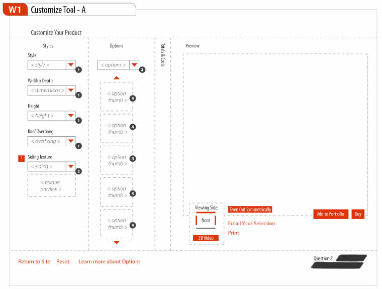
Sometime ago I felt a need to represent in wireframes everything that could be clickable or actionable. This came largely from people asking me where one could click on inside a wireframe during presentations. When I just presented black and white screens it was not always easy for them to distinguish standard content areas from clickables and people would ask for confirmation. For this reason I began using one colour, usually red, to denote any interface areas, buttons, or text links that could be acted upon. In this regard, I found that this justified and consistent use of colour worked out pretty well.
Credits: Jakub Linowski
20 Responses to “Colouring Clickables in Wireframes”


January 25th, 2009 at 10:15 pm
I've run across the same type of situation when creating interactive wireframe prototypes. I'll second your solution of using a consistent, contrasting color for the interactive components. It does work out pretty well. Its a good way to quickly explore interactivity without letting the limitations/artifacts of the wireframe prototype get in the way of the user experience.
January 25th, 2009 at 10:30 pm
I've used the HTML default underlined-with-blue to denote links in the past.
I like this thought though, Jakub — clearly shows what is clickable beyond just text links.
Thanks for sharing. This blog is becoming one of my favorites!
January 26th, 2009 at 12:51 am
I do the same thing when using iplotz – I create a red or yellow area around an object and make the transparency about 30%, so users can still the object, but know it is an area to click on. Also, in Preview mode when testing the wireframes, the objects highlight as you pass the mouse over them…that works well with the red area.
January 26th, 2009 at 1:37 am
That's nice… I really like know what tool you use for it? Keep movin.
January 26th, 2009 at 9:28 am
Hi Juarez. I used Illustrator to create these samples.
January 26th, 2009 at 9:40 am
Nice idea. I second Toms positive comment about this blog too. Really interesting to see techniques used by others.
January 26th, 2009 at 2:27 pm
interesting. Normally i use the blue for the links in the wireframes. I don't use color in any other interactive element but i think that is an interesting proposition.
January 26th, 2009 at 7:15 pm
This is especially helpful if you aren't the one writing the functional spec. You can't assume best practices like headers being hot will be followed unless you mark as such. I would stick with blue though as this is a well understood method of showing links already.
January 26th, 2009 at 7:41 pm
Agreed. A blue colour for the clickable links and areas could be more consistent with existing conventions. I just think I like red and grey combinations. :)
January 26th, 2009 at 8:34 pm
Jakub, thanks! Would you help me a little more? Do you know some article to do that? Did you already thought about make a little screencast teaching us? :)
January 27th, 2009 at 11:12 am
Hey Juarez. I'm not planning to turn this magazine into an Illustrator Tutorial site. I think there are plenty of sites out there like that already. Did you have a look on delicious already? http://delicious.com/search?p=illustrator%20tutor…
January 27th, 2009 at 12:26 pm
I prefer to use underlined blue for text links and a blue border for buttons or other clickable areas, but I've found your solution to be very smart because red is so much more noticeable than blue… My only concern is that the standard in html for links is blue… It would be interesting to evaluate the impact of using red in wireframes, but it is just my 'user testing centered' mind speaking here… Nice site!!
January 27th, 2009 at 5:24 pm
Hey Jakub… I understand your point and this magazine is AWESOME. I think if you'll make screencasts or workshops online about it will be pretty Nice! :)
January 27th, 2009 at 11:23 am
Hey Juarez. I'm not planning to turn this magazine into an Illustrator tutorial site. I think there are plenty of sites out there like that already. Did you have a look on delicious already? http://delicious.com/search?p=illustrator%20tutor…
February 13th, 2009 at 11:59 am
I do use blue for all links in visio and clickable objects in Visio. Helps me know what I've made clickable, and helps the client know what is clickable.
February 20th, 2009 at 3:42 pm
I like the concept of using color in a wireframe but you'll really need the right client to understand it. The main reason for going non color is to keep the client from focussing on the color saying "why is it that shade of blue, we don't have blue anywhere". If you can get clients past that issue then color is a great tool.
February 20th, 2009 at 11:42 am
I like the concept of color wireframes for an aesthetic reason. I think the functionality of the wireframe though is to help the client understand the usability of their site and basic layout. And for that purpose, I think color should stay away from the wireframes from what Tony Chester said. Clients will just have one more thing to get caught up on and I think it might be tough to get them off of that. Maybe leave the color for the first design comps.
February 21st, 2009 at 7:52 am
If the client has trouble misunderstanding that the use of colour has a functional meaning assigned to it (and not for aesthetic or branding reasons), perhaps this can be communicated verbally or inside the wireframe legend. I think that's an interesting point being raised here of justifying this more clearly. I do believe strongly though that denoting actionable items with colour outweights an almost effortless mention about why it has been used. In the long run, not only is it useful for the designer him/herself to look back and see what can be acted up but also representing clickables by the use of a monotone colour can make it easier to evaluate wireframes in front of users. During paper prototyping this technique could also help participants understand what can be clicked and what is simply text – increasing the authenticity of an evaluation session. My 5 cents.