October 24th, 2012
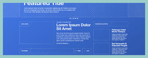
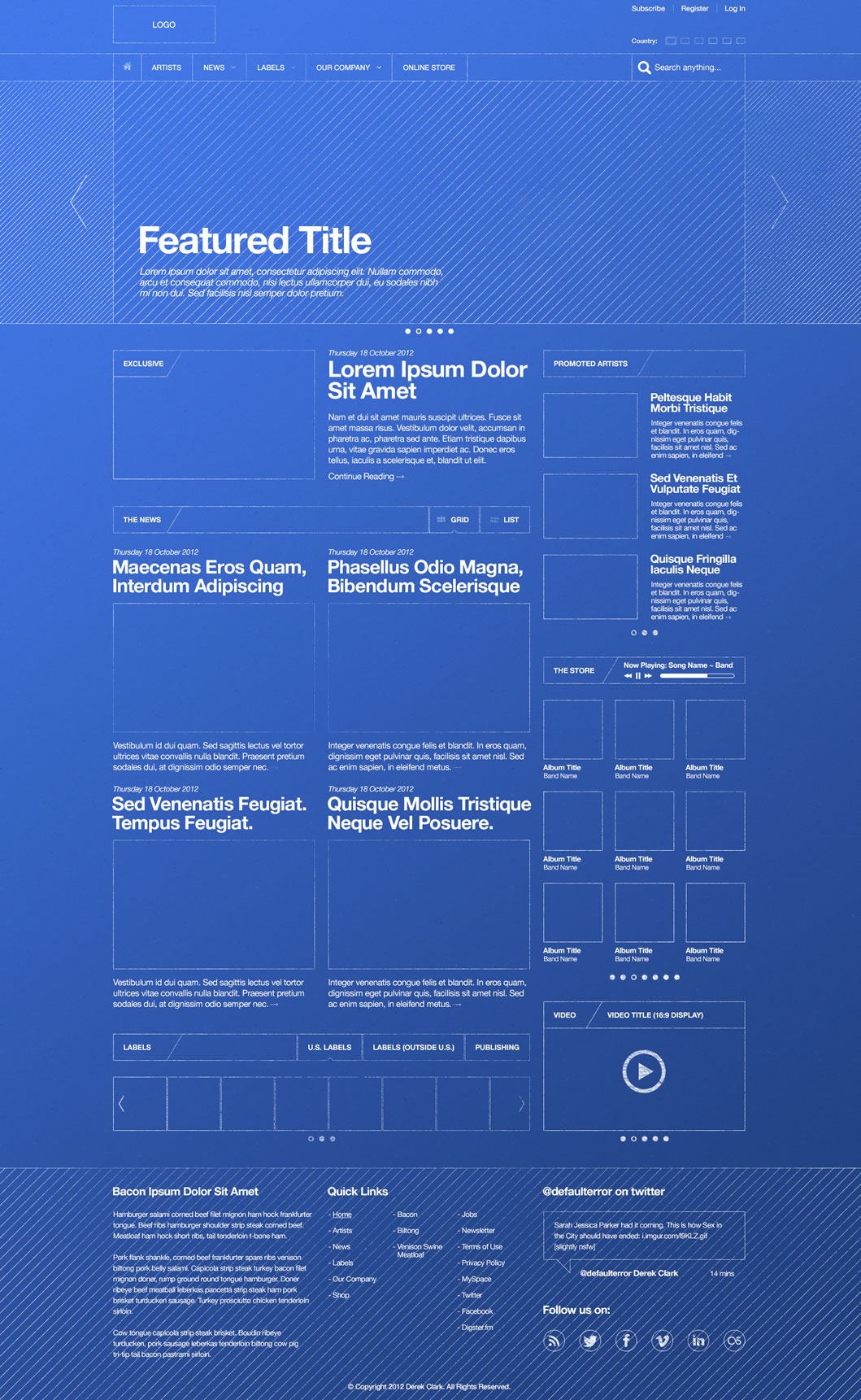
Here is a something a little different while drawing inspiration from the past – a blueprint wireframe. It definitely looks like a traditional architectural or engineering diagram with a clear conceptual look. Derek has done up the piece in Photoshop (debatable whether the best tool for wireframing or not), but nevertheless the white on blue colors and jagged lines surely make this piece feel like it’s an abstract representation of lower fidelity. I thought it was pretty interesting that someone has found inspiration from 19th century diagramming. Thanks for sharing.
Credits: Derek Clark
Tags: wireframe
Posted in Inspirations, Samples | Comments Off on Blueprint Wireframe
October 8th, 2012
Hi! I’m on the lookout for a talented User Interface Designer in Toronto (ideally, but also open to remote). If concept sketching, visual design and prototyping are your thing, then please checkout the job posting and reach out to me. Looking forward to hearing from you.
Thanks,
Jakub
Posted in Announcements | 1 Comment »
October 1st, 2012

Proto.io last Thursday just released the next version (V3) of their interactive mobile app prototyping tool. The new version promises to push prototyping to the next level with an even wider range of devices. With custom devices, users can now prototype for pretty much any device with a screen, from SmartTVs to refrigerators. Adding to that, it becomes the first mobile prototyping tool to support full feature animations of UI items within a prototype screen. Its V3 release also includes keyboard events and web fonts, among other improvements.
V3 features in detail from their press release:
Custom device prototyping
Created specifically for mobile, Proto.io identified the growing problem of prototyping for the many different devices and screen resolutions of available mobile devices. Without wanting to restrict users to predetermined mobile devices and factoring in the ever evolving mobile scene, Proto.io took things a step further. It created a prototyping first by giving users the liberty to determine their screen size dimensions and then apply their own skin for the device they are prototyping for, to create a real user experience for the viewer. With this update, prototyping is not restricted to just mobile anymore. It opens up prototyping apps for any device. That includes Smart TVs, PSP and other gaming devices, refrigerator interfaces, airplanes, cars, alarm clocks, medical equipment and pretty much anything with a screen interface. See a custom ‘gaming device’ demo here.
Full feature animations
Since its launch, Proto.io included between screens animations like slide, pop, fade, flip, turn and flow. It now comes to add full feature animations, allowing for simple animations of UI items in the prototype’s screens. That means that users can interact with any item on the screen and make it animate, really bringing prototypes to life. The animations types include move, scale, resize, rotate and fade. Users can set a duration, easing effect and start delay for each animation, and set commands like loop iterations and repeat animation steps. Check out the interactive demos!
Keyboard events and web fonts
Going by the principle that not all devices are created equal, Proto.io wanted to enhance the user’s experience when prototyping for not-only-touchscreen and non-touchscreen devices. For example, a gaming device is accompanied with several hard buttons for navigation and gameplay. Proto.io users can assign keyboard events and map each of these buttons’ functionality. So when a user hits the right arrow key (→) on their keyboard, the corresponding hard button will respond with the action preset by the user. Keyboard events is a useful tool to complement a touch screen interface design that a user would want when prototyping for car radios, remote controlled Smart TVs, handheld gaming devices, etc.
Web fonts are also supported in V3. That includes using any of the 1000+ available fonts, freeing up prototypers to using more suitable fonts for their prototypes. The main benefit of using web fonts is that they show exactly the same in almost any device or browser.
Have a look at more demos and give it a try!
Credits: Alexis Piperides
Tags: prototype
Posted in Tools | Comments Off on Proto.io V3 – Changes mobile prototyping as we know it
September 24th, 2012
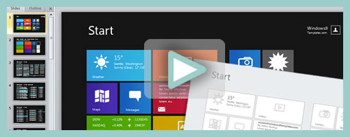
Windows 8 Templates has recently gone live as the new operating system is just around the corner. The site features a number of Metro UI themed kits and templates for PowerPoint users. The most comprehensive grouping (Windows 8 All-in-One Bundle Pro) contains a wireframing kit, a prototyping kit, an icon pack and storyboarding shapes (requires Visual Studio 2012). The main difference between the prototyping and wireframing kits is that the former has a bit more color. All of the work within each kit is also vector based and so makes it easier to edit and stretch the assets appropriately as needed. So if using a low barrier to entry tool such as PPT is important in your process, then give this template kit a try.
A couple of words on the use of PowerPoint by Jordan (the Author):
While I am adept in professional design tools like Photoshop, 99% of the time my tool of choice for mocking up an app is PowerPoint. PowerPoint is incredibly productive and simple, and yet powerful enough to help me develop even the most custom of designs quickly and efficiently. Better still is that everyone knows PowerPoint, and that means my clients can easily contribute to the design with their own edits and ideas. Another +1 from clients when they feel truly involved with the design of their product. It doesn’t stop at static mockups, I can use PowerPoint animations and slide transitions to turn any mockup into a functional prototype that clients can click through as though they were using a real app.
Credits: Jordan Gurrieri (Twitter)
Tags: powerpoint
Posted in Templates | Comments Off on Windows 8 Templates for PowerPoint
September 14th, 2012
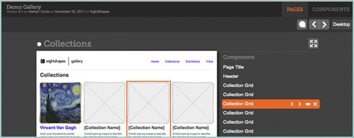
Blocks (github) is a HTML prototyping tool brought to you by EightShapes – the company that’s all about modular components. The JavaScript toolkit allows designers (code literate ones that is) to tag pages or the components within, for purposes of presentation and reuse. Such tagged HTML page prototypes then become listed in a table of contents so to say, along with all of the unique components on the side. Blocks is a presentation layer tool that sits on top of the prototype and can be turned on or off. The other core benefit or idea behind this is that instead of duplicating HTML over and over again, the toolkit instead also allows to reference HTML code and reuse it across multiple pages. Being pure JavaScript, it also looks pretty simple to implement.
One thing which I don’t see and think would still be nice to have is a way to tell stories across these listed pages and components. Right now, all of these assets are very much fragmented and require the designer to do the magic of tying it all together into a flow or narrative. I wonder how the toolkit would feel if there was a layer of visible use cases, scenarios or non-linear flows that could be attached over on top.
Nathan also shares an interesting article which compares HTML prototyping to other tools like Axure. I’d have to agree with Nathan on this one that working with HTML (and JavaScript) for prototyping has the definite benefit of being closer to the medium as opposed to abstracting it. Even if writing JavaScript functions is too much for a designer (although it can be learned), that also opens up a perfect opportunity to collaborate on the prototype with a developer. For me personally, prototyping is less about setting up clicks between all of the screens, as is more about being able to get to the right richness of interaction, data, or visual representation for a narrower set of screens. With HTML and JavaScript there is simply more potential to get to the highest level of detail possible in order to feel out a risky part of the product. That’s not to say, that more often than not, just the “clicks” are adequate and so many other “abstracting tools” work for a lot of people. Thoughts?
Either way grab and fork it from github. There is also a good video where Nathan describes the approach.
In his own words:
EightShapes Blocks is a toolkit for user experience designers to modularize, communicate, and deliver annotated HTML prototypes.
Credits: Nathan Curtis
Tags: opensource, prototype, wireframe
Posted in Tools | 1 Comment »
September 4th, 2012
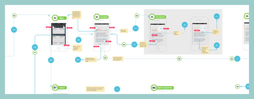
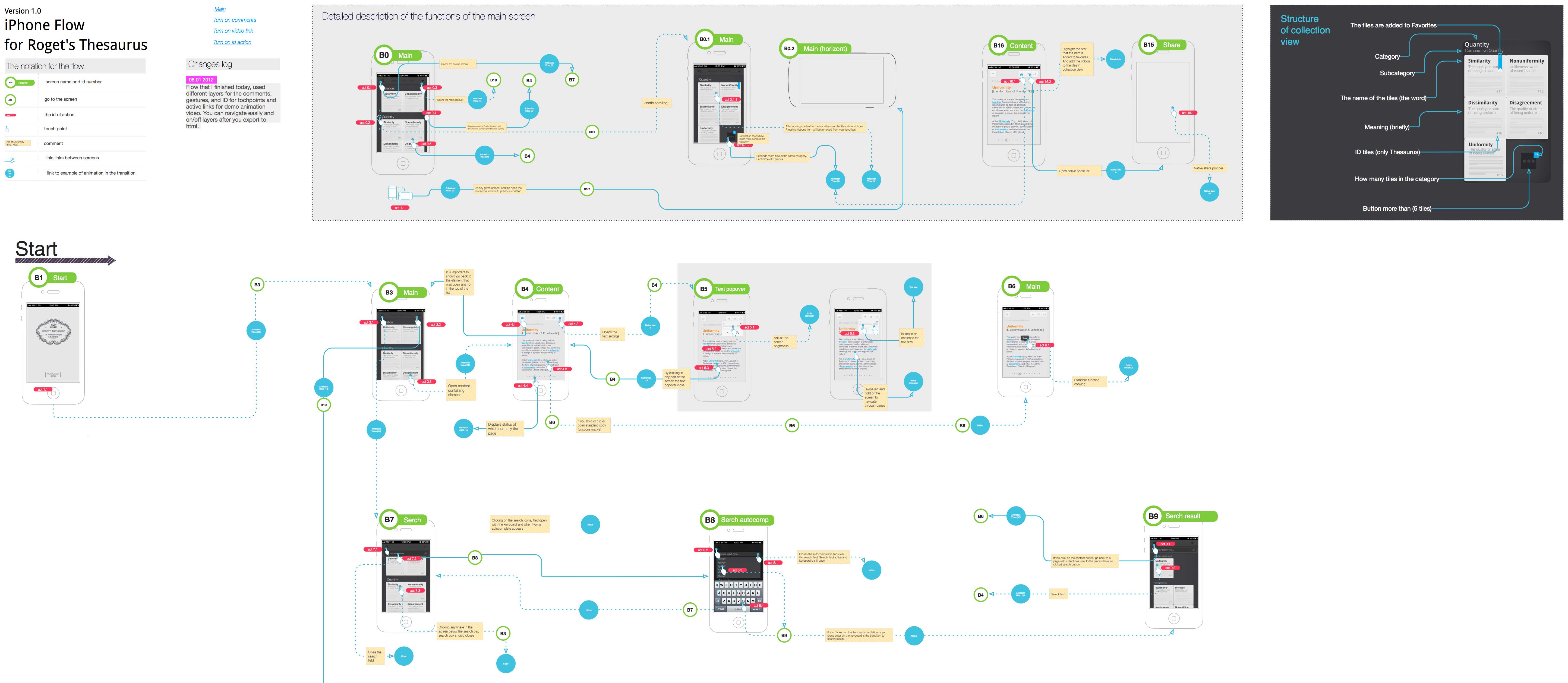
I like spacious canvases with non-linear flows, and here is a work sample from a fellow designer which shows just that. If one can move away from the outdated convention that interaction designers create screens, towards what Bill Buxton calls the stuff “in between the screens”, then it doesn’t take long to realize that larger workspaces are the way to go. In this example of a mobile app, Anton used Omnigraffle and some inspiration from UML to pull off a few interesting things which I thought might be worthy of highlighting:
- Merging of wireframes with flows. As the above artifact mixes readable screens with flows or user actions, the element of time and narrative begins to emerge. Since the flow diagram is inseparable from the wireframe, it also saves the designer from the extra effort of synchronizing multiple documents.
- Transition references. Although not visible in the sample, the blue circles are actual links to .mov files that show short video demos of the transitions. Wires plus video feels fresh!
- Screen references. All of the screens have an ID tag, and occasionally actions lead to screen references instead of full screens – a way of reusing and again minimizing duplication efforts. Also each screen links to a folder with source PNG layout files.
- Action references. Most user actions here also have an ID with a distinct style and can therefore also be referred to.
- Starting Point. Since the canvas is quite large it has a clear starting point to guide the viewer.
- Layout structure. In the top right of the canvas, the core structure of the layout along with some popular components are explained.
- Toggle-able layers. Various information is kept separate on distinct layers and so that it’s possible to toggle it on and off for various audiences.
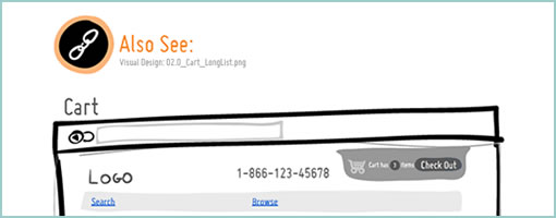
In comparison to the above, I have to say that the way in which I do my work is very similar by relying on cross document references. This hierarchical documentation structure (where wires cover the widest scope and prototypes the narrowest) allows designers to focus on what’s necessary at a particular level of fidelity. Below is how I reference visual design mockups within wireframes or sketches (with an “Also See” + filename tag). Again, keep in mind that in my case, only certain screens need and/or have references to more detailed assets.
Anyhow, thanks Anton for sharing!
Credits: Anton Volkov (main sample) & Jakub Linowski (second sample)
Tags: activity, user flow
Posted in Samples | 5 Comments »
August 21st, 2012
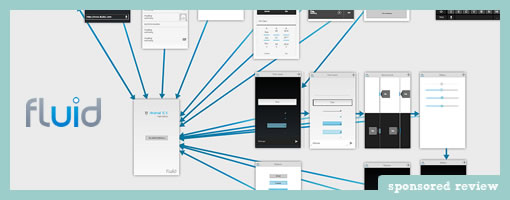
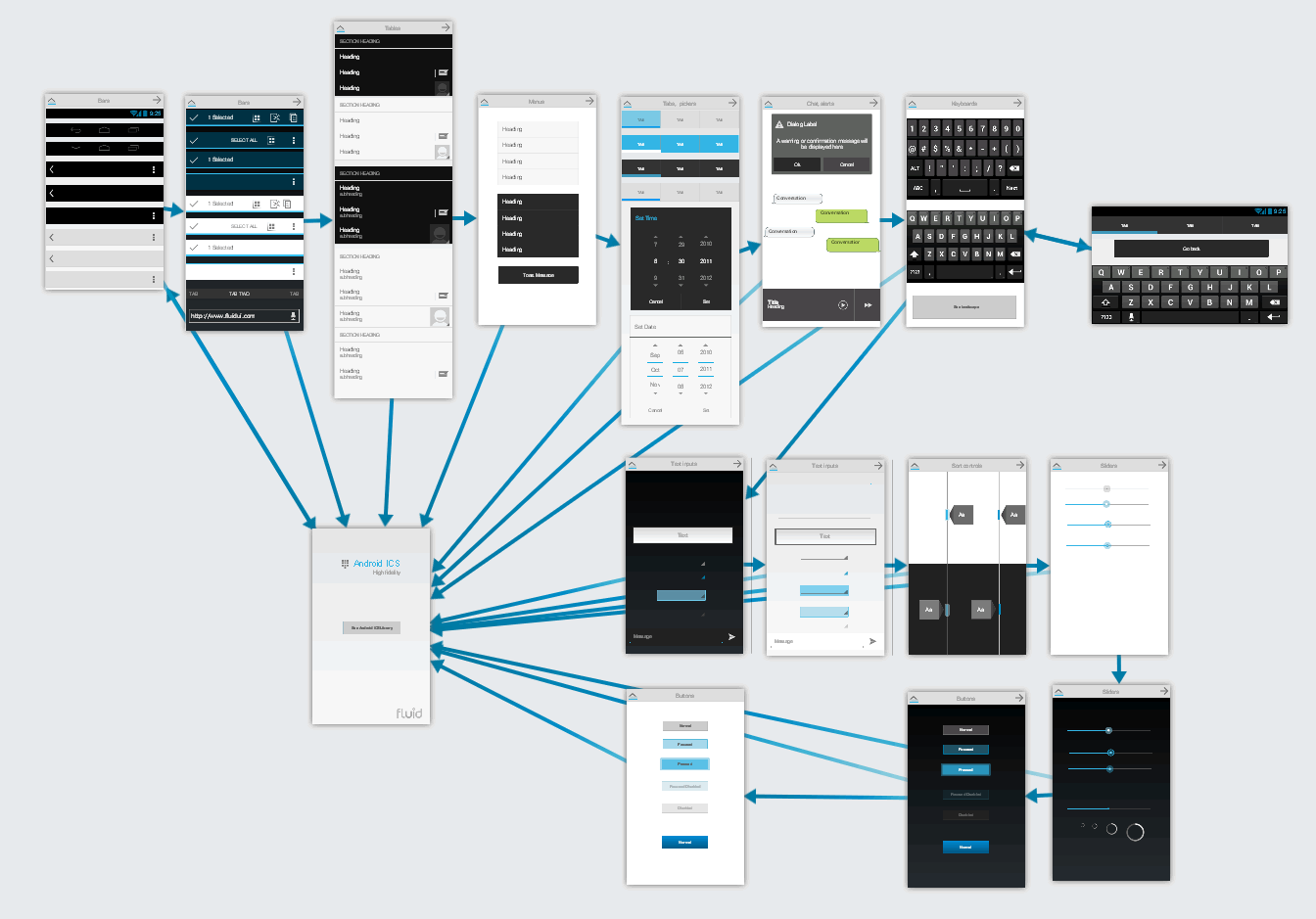
Fluid UI is a new browser based, HTML5, mobile app prototype tool released the other month by a small and skillful team from Dublin and Berlin. The tool is blazing fast and at the outset allows users to work in two modes. One of which provides an overview of various screens and their links from a bird’s eye view – great for screen flow design. The other more detailed page level view is accessed by clicking on any particular screen, which then brings a close up of it – great for detailing, and actually designing the screens. In the screen design view, users can rearrange standard iPhone, Android and Windows 8 (their newest addition) elements and components by dragging and dropping from a wide wireframing library. A great number of wireframe samples from their libraries can be seen in their extensive flickr stream. The transition between these two views also happen pretty seamlessly as well which adds to the experience.
As users zoom back out to the screen flow design view, all of the links between pages are explicitly made visible as directional arrows – something I’ve come to like and also very much do in my personal style while designing.
Other features also include the ability to incorporate gestures and design for hand-held devices. Out of the box screens are available for a number of mobile platforms, with precanned components for iPhone, iPad, Android, and Windows 8. For those designers that wish to work with their own assets, the tool also allows to upload custom images for use across screens. Mockups can also be previewed and exported as HTML, PNGs or PDF. With the tool being native in the browser, a degree of collaboration and sharing is also possible. More so, the guys have also release an Android App to allow previewing of your work, as well as the ability to setup and scan QR codes related to projects.
Pretty Slick! Give it a try (in Chrome & Safari).
Credits: Dave Kearney & Ian Hannigan
Posted in Tools | 1 Comment »
August 15th, 2012
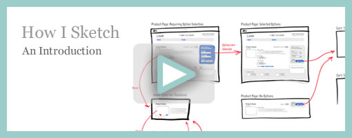
I’ve decided to do a screencast of How I Sketch and the style that came to be known as the Interactive Sketching Notation. It’s around 13 minutes in length going over the basic concepts, some of the key benefits, as well as an example of a real world project. The video is in HD so you might have to expand to full screen in order to experience the real deal. Somewhere at the end you might also find a few minutes of attempted real time UI design. :) Let me know if it’s useful, and if it is, I might do another one of these in the future. I’ve also setup a Vimeo Channel for this just in case. Enjoy. Cheers.
If you need the Adobe Illustrator template, you can purchase it right here for $29.
Credits: Jakub Linowski
Tags: linowski, sketch, sketching
Posted in Inspirations | Comments Off on How I Sketch: An Introduction
July 23rd, 2012
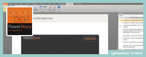
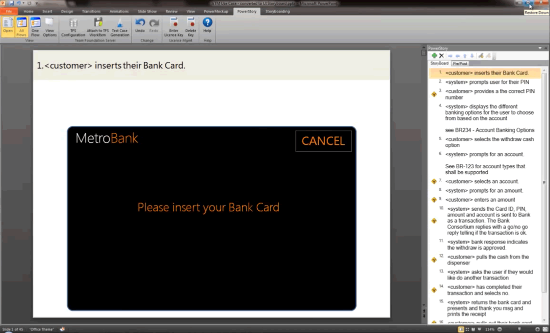
PowerStory is a PowerPoint UI requirements tool that Martin has been closely working on and recently released as a plugin for Windows 7, MS Office 2010. The main goal here is to save project time/budget and also improve the accuracy of your requirements and test cases, which is applicable to both small and larger teams.
First of all, it combines written use cases with visual storyboards all within PowerPoint. It does this by associating a PowerPoint slide with each use case step in the main flow and alternate flows defined using PowerStory’s step editor (see the right hand side of the image above).
This more flexible approach enables you to define realistic user interaction behavior, making your requirements more accurate. In addition you will save time because a lot of use case steps and therefor UI mockups will be reused, when compared to traditional linear storyboards.
Secondly, PowerStory also can be used to auto-generate test cases into TFS (Team Foundation Server – Microsoft’s software lifecycle system) directly from the Storyboards. What are test cases? You know, those things which tell you if your big and complex software is on track. The uses cases which are written inside of PowerStory are also tagged as “system” or “user” which then translate into either a UI event or a user action inside of TFS’s as test cases.
PowerStory is a unique approach that can work in both small agile teams and larger enterprise teams, because it combines traditionally separate deliverables into one saving time and increasing agility, but also has the ability to generate test cases for formal testing teams or small agile cross functional ones. And after all it is based on PowerPoint, which is already on most desktops, so it is easy to share your work.
So if you write requirements, wear the Business Analyst or UI/UX hat then give this fresh approach a try.
Here is the five day trial download.
Credits: Martin Crisp
Tags: powerpoint
Posted in Tools | Comments Off on PowerStory
July 12th, 2012
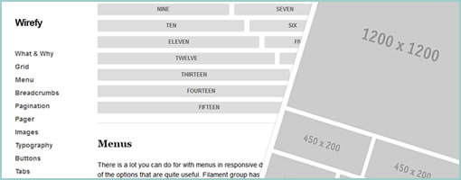
Wirefy has been recently released by Christopher over at github. It’s a collection of functional responsive HTML snippets and templates which scale as you resize the browser (hence across devices). Hopefully beneficial to those who build HTML prototypes. Good work. Thanks a thousand for sharing.
From the website description:
Wirefy is a collection of CSS & JS files to help you rapidly experiment with responsive wireframes. Whether you keep them to yourself or use them to help educate your clients, Wirefy is flexible and here to help. Wirefy has been built from the ground up. Following the philosophy of mobile first, Wirefy will respond to the proper viewport. Go ahead, resize this page to see how it works. Wirefy is style agnostic so that clients don’t get hung up on colours, fonts, other design elements. It’s meant to be another tool for your development kit that provides the most basic styles as a foundation.
Credits: Chris Da Sie
Tags: opensource
Posted in Templates | Comments Off on Wirefy


