MicroPersonas

January 23rd, 2013

MicroPersonas
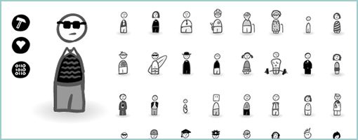
MicroPersonas is a new icon set that I just came up with for building and using quick persona like characters in your interaction design deliverables. The set is founded on the belief that personas should be generated rapidly with only those characteristics that can be used to influence or inspire design action. If personas are to be leaner, more concise and live closer with interface sketches (without being lost in separate documents) then this is a materialization of that type of thinking and a step toward lighter documentation.

The set comes with 40 sketched style characters and 9 characteristics (beliefs, habits, comments, triggers, tools, needs, problems, data, and artifacts) setup in .AI (Illustrator) and .PNG (Fireworks) formats.

Purchase and download it at www.linowski.ca/micropersonas for $29. Enjoy …

Credits: Jakub Linowski (Twitter)

jKit – jQuery based UI Toolkit

January 14th, 2013

jKit
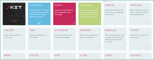
jKit is a new toolkit for jQuery, built by Fredi Bach from Switzerland, that I think has much to offer for those with HTML prototyping needs (the way prototyping is ought to be done I believe). :) The toolkit contains quite a few widgets, interactions and behaviors that help to enhance the UI while at the same time lowering the programming barrier to entry. Some of the many things that the toolkit allows for includes: a carousel, tooltips, form validation, zooming interactions on images, list cycling for styling, auto scrolling, etc, etc, etc. Anyhow, there is a lot more to it so have a look at the awesome examples and see if you it fits your needs for the next prototype you decide to build. Thanks Fredi for releasing it under an MIT license! Rock on!

In Fredi’s own words:

jKit was born in the summer of 2012. After developing almost two dozen jQuery plugins over the past years, some for myself and some for client projects at the company I work (deep AG), it was time to create something bigger and better, especially as we needed a frontend library at our company that was easy to use for our publishers and had the features we needed. But only after implementing the first few features, I started to see the real potential for this toolkit. With only about 1k per command, the plugin could add quite a lot of useful features without getting to big in size. It would meen for us that we could add this toolkit together with jQuery onto all our new client projects and easily have all the features we needed in 95% of all cases, with the benefit, that the API was easy to use and consistent. And now we’re here, with a really feature rich UI toolkit that meets our needs and gets better almost every day, mainly because we actually use it and hopefully because of the input you can give is for perfecting it more and more. I really hope you like jKit as much as I do, because at the end of the day we can all benefit from the knowledge and experiences of each others, getting this baby somewhere not even I imagine right now.

Credits: Fredi Bach (Twitter)

Indigo Studio

January 9th, 2013


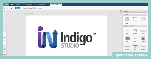
Indigo Studio, a new interaction design tool, has been released just over a month ago by the Infragistics team on both MAC and Windows. The first version is completely free and there is no catch (future versions 2 and on will be paid). It has some interesting aspects to it:

Storyboarding

The tool itself is interesting in that it has two modes of working: screen and storyboard. The screen mode allows designers to express the position and layout of typical interface elements in a traditional sense – pretty standard for a modern UI prototyping tool. Storyboarding mode however allows designers to work at a higher level of abstraction and see the bigger picture with multiple screens in view. Here the designer is given the opportunity to think bigger than just screens as the links between them come into view. Additionally, stepping beyond just screens, Indigo Studio comes preloaded with helpful sketched out real world “scenes” of people using various devices in various context. This sets the tone to think beyond just the UI.

Interactions

Once elements are laid out, Indigo Studio allows designers to express a set of interactions or events that tie screens together into a clickable prototype. Interactions can be attached to various elements or plain hotspots (helpful if you simply wish to upload JPGs or sketches from another application). Typical interactions include such things as when a user: focuses, double clicks, focuses, changes a field, or right clicks.

Screen States & Transitions

Screens in Indigo Studio have been elaborated to include multiple states that offer a helpful way to reuse elements across a more complex situation. For example, placing an element (or making changes to it) on the first state of a screen will automatically duplicate the element (or changes) across all of its states. Of course secondary states can also be modified to incorporate unique changes as a result of interactions. All screens and screen states can also be tied with handy transitions whose delays and durations can be defined as well.

Sharing and Feedback

Additionally, all prototypes in Indigo Studio can also be shared online for further comments and feedback. Sharing a prototype generates a useful link which can be sent to the team.

Indigo Studio looks pretty solid for a first release and I’m curious what future versions might bring. Ready to see if it works for you? Give it a try.

Calling Bull$#!%: The Best Interface Is No Interface

December 28th, 2012

Calling Your BS
A thoughtful article by Golden Krishna of Cooper came out a few months back which has picked up some steam recently. Its title reads “The best interface is no interface” which I think is one sided, flawed and so here are a few of my thoughts on it out in the open.

Reductionism and minimalism do not guarantee a good interaction. The author seems to advocate a 3 step process for most user tasks. On the other hand however, Zoltán Gócza writing the UX Myths blog has challenged the 3 click rule sometime in the past already, advocating for ease of navigation and a scent of information instead. Then again, I have to admit that I do value simplicity just as Golden Krishna. Lowering unnecessary cognitive workloads must be a good thing as opposed to lengthy and manual labour intensive tasks. I also do believe that a design process often unintentionally fragments the forms we design and it’s very healthy to spend energy and effort to merge or refactor shared functions so that there is less interface duplication. Nevertheless, you can still have a useless or unusable 3 step process and an awesome 7 one. More so, when you take the statement of reductionism and push it to the extreme, you result with a 0 step process and nothing to interact with at all. In that case all that you’re left with is an aware system that knows you inside out. Is that what we want? Is that good design? Perhaps in some cases yes, in others less so I think.

Non-screen based thinking does not guarantee good needs based design. The author writes “When we let go of screen-based thinking, we design purely to the needs of a person.” I’m not sure that letting go of the screen guarantees good design. There are tons of screen-less traditional tangible products which are crap. You can still have needs based user interfaces but that comes more from your values as a designer and your process. Don’t punish screens for poor design.

Interfaces are actually good because they allow us to express intent. Whether you are clicking a button on a screen or turning your keys to open a door (also an interface with two states), you are expressing a very clear intent. Interfaces (screen based or not) enable interaction. Sure, I believe adaptive systems that learn about users are great, but they are not an answer to all situations. Imagine Amazon’s adaptive algorithm being so far stretched that they actually automatically order products for you. Call it the No-Click Ordering Process. Would customers have to spend more time at the post office trying to ship and return unwanted products? Now imagine a purely adaptive nuclear launch facility without all those terrible buttons that require two users to turn the knob simultaneously before a missile is launched. Perhaps sometimes, manual expression of intent is still a good thing – at least until Ray Kurzweil figures out the singularity thing?

Interfaces are also good because they limit the amount of information that is displayed at once. Take a book as an example which is an interface to a story. With it, we can navigate through pages and chapters and focus our limited human attention at words which we combine into sentences over the course of time. If a book did not have an interface however, we would not be able to flip through pages. Instead, we’d have to comprehend the full story in an instant split second with our brains frying from cognitive information overload. A good interface respects our cognition with a proper visual hierarchy and serves us limited amount of content at a time. Let’s not get rid of it completely perhaps?

Screen based interfaces are extremely multifunctional. Actually one thing that traditional screen based interfaces do quite well is that they can shift their functions pretty quickly and flexibly as someone interacts with them. The number of functions a screen can serve is infinite. Sure that comes at the price of learning and possibly confusing some users, but that becomes the designer’s job with the potential at their disposal. A physical product such as a wine opener will be a wine opener and serve a very narrow set of functions by comparison. Yes, the advantage is surely that a wine opener allows us to store the interaction as motor memory with the benefit of physical tactile feedback. Nevertheless I think a designer should choose if the product should be screen based or tactile or both based on some of the qualities and interaction characteristics.

Don’t get me wrong. I think it’s great that Golden is challenging the amount of screens we “slap” everywhere. Those two examples of a car dashboard with a Twitter screen and a fridge with another are perfect in highlighting desperate and thoughtless products. I think it’s also great that the author is thinking about adaptive systems that alleviate unnecessary labour and guess some decisions for us. Finally, I also think it’s great that Golden is taking into account hardware sensors that open up novel ways of interacting. But please don’t shoot yourself in the foot and make sensational statements that the best UI is no user interface at all. If the best UI was truly no UI, then why not put your money where your mouth is and get rid of all links and buttons on the Cooper.com website, and well, actually why not get rid of the screen based website altogether? Sorry if this sounds harsh, but it’s just a devil’s advocate thought experiment to make a counter point. :) I suggest we stay clear of extremist design philosophies and find a more balanced approach where good interfaces live alongside adaptive systems and new interactions. In the end, interfaces are here to stay and so is my pencil.

Credits: Jakub Linowski
Iterations: Concepting Cards

December 21st, 2012

Iterations
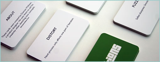
Design inspiration cards have been around for a while in various shapes and sizes with the intention to challenge and help us break out of our routines. Duncan, a product designer in the Netherlands, made a concepting card deck called Iterations which he released under a Creative Commons license. He also describes his process of building them in a blog post.

Iterations is interesting in that it focuses on the early ideation phase when designers are “concept sketching”. The cards have small tactical actions that inject some randomness into a design process, which might say “SHUFFLE Disorder components”, “LOOP Repeat last Iteration”, or “COMPRESS Remove excessive space” as an example. Most cards are clear and understandable, even if some are a bit abstract, such as “POSSESS Imbibe iteration with the spirit of a personal hero.” :)

Either way, a pretty interesting project I think even though it cannot be bought. You can still make it yourself if you read and respect the CC license.

Updated: Duncan informed me that there is also a free online version. :)

Credits: Duncan McKean

Web Layout UI Kit

December 12th, 2012

Web Layout UI Kit
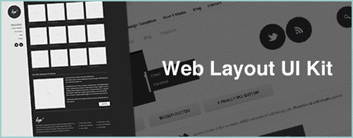
The Web Layout UI Kit is a PSD template by Blaz from Melbourne. It contains five distinct layouts with a high dosage of black, grey and white contrasts that can be used as starting points for further wireframing. Makes me think back to an earlier post by Matthieu on visual priority. So if designing wireframes in Photoshop is your thing, have a look at this freebie template – I believe it requires registration. Enjoy.

Credits: Blaz Robar

InVision Sync (for Mac)

December 5th, 2012


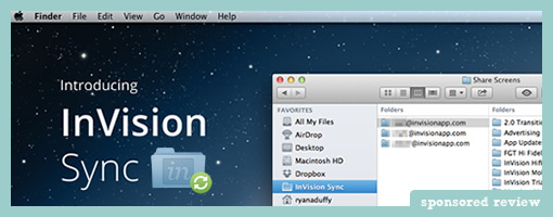
InVision Sync is out (for Mac) and they have removed another hurdle from their online protyping tool – that of having to manually upload screens through the browser. It’s a simple yet powerful improvement which streamlines their prototyping workflow. Designers can now simply set local InVision project folders and then save and manage screens directly to them. InVision Sync will do all the burdensome work of then syncing and uploading the screens to the server so that hotspots can be assigned (hotspots still remain after an existing file has been changed). And yes, if you have a team of designers working on the same project, InVision Sync will upload and download screens accordingly both ways in order to keep things, well, in sync. Way smoother!

InVision Sync runs in the background on the MAC system toolbar and surfaces a few additional quick options to end users. One of these is the ability to quickly grab URL links of projects that can be shared with others. Another feature directly accessible from the toolbar is the ability to see recent comments. Finally, when working with a team, Sync provides system notifications on all files which have been changed. Definitely a move forward in many ways that improves the online prototyping experience.

Ryan Duffy, one of the designers on the project, also released a great Vimeo screencast which explains the full process. Pretty slick!

Ready to try it out? Grab the DMG file.

Interactive Sketching Notation v1.3

November 21st, 2012

ISNv1.3
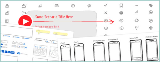
The next version of the Interactive Sketching Notation is out for those who like to sketch electronically and tell stories with big canvases. The Adobe Illustrator template has been mostly extended to include more icons, device screens, and components amongst a few other minor fixes.

There are now 80 common user interface icons in a sketch based style. Proportionally sized screens now include devices such as: iPhone 4 & 5, two popular Windows 8 phones (Nokia Lumia 920 & HTC Windows Phone 8X), Samsung Galaxy Nexus, Samsung Galaxy S3, iPad, iPad Mini, Nexus 7, and a bunch of browser screens. Newly added components include such things as a: video player, map, chart, two new tooltips, and tabs. Finally, I’m also am trying out a second user story style which is composed of a: user type, scenario title, scenario description, need, and problem – still experimental. If anyone has any symbols, components or feedback to be included in a future release, please let me know. Enjoy. :)

Purchase & Download here.

Credits: Jakub Linowski

FoldTester & Scrolling

November 13th, 2012

FoldTester
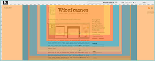
FoldTester is a free tool that allows you to enter a URL and see numerous viewable areas as percentages based on world internet users. It’s a simple testing tool for determining viewport areas (minus the tabs, window borders, scroll bars, etc.) as well as determining where the fold might fall. I’m not sure if the tool uses up to date numbers considering the common pattern is that screens are getting bigger.

The fold, beware! Looking at this tool one might quickly fall into the trap of trying to squeeze everything above the fold. It should be noted however, that the fear of users not scrolling is an old fashioned myth. To prove the point, Paddy (the author of FoldTester) also created Life Below 600px, which shows that scrolling should be looked up to as a fundamental UI interaction and basic user behavior. The fold then gives way to scrolling as an immense opportunity for building up a story which leads to a powerful call to action.

One term which I heard being thrown around at work was the notion of a “False Bottom”, that I think is still relevant. The idea is simple. If scrolling is to be relied on, designers should always give the impression that more content is present further. This can be achieved by repetition (showing multiple repeating elements) or continuity (cutting an element in half with the fold). In other words, if there is scrollable content, one should try to avoid showing closure near the fold (ex: lots of white space that suggests completion).

Anyhow, enjoy …

Credits: Paddy Donnelly

PowerMockup v3: Wireframe with PowerPoint

October 30th, 2012


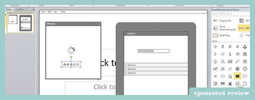
PowerMockup v3 is out. The new version of this awesomely simple PowerPoint plugin comes now loaded with a total of 100 UI stencils and 140 icons. Aside of a nice introductory video screencast which Andreas did, the update allows designers a great deal more of control over their stencil libraries. With custom stencil item creation, export and import options, and categorization, it is now easier to manage and reuse interface assets.

Stencils now can also be searched instantly with a handy keyword search box that limits assets as soon as someone types anything. This search makes use of a synonyms thesaurus of sorts and improves the overall search experience even further. Some stencils and elements are now also made a bit smarter when they are resized. These smarter elements know when and how to keep their proportions, as in stretching a tabbed navigation for example.

Some additional containers have been also expanded to contain such screens as windows, tablets, and iPhones. The plugin works with PowerPoint 2007, 2010 and 2013 and so is ready for the next release of MS Office. Nice!

Try out the 30 Day Free Trial.

Credits: Andreas Wulf