September 16th, 2011

The guys over at UXHeroes.com have just put together a software bundle with a few popular tools that could be of interest to people doing wireframing. The bundle includes a 6 months subscription to the following tools: Gliffy Online, HotGloo, and Mocksup. The awesome thing is that you can pay what you want starting with $1. If you choose to pay $40+ or more, you will unlock access to Chalkmark as well.
Sounds like a deal.

ps. This bundle is also a prelude to their main event, the UX Heroes Super Bundle, which will feature even more tools.
Tags: offer
Posted in Announcements | Comments Off on Special Offer: UX Heroes Software Mini Bundle
August 16th, 2011
It took a while, but here are some results from what people submitted for the Feedback Note call for samples:
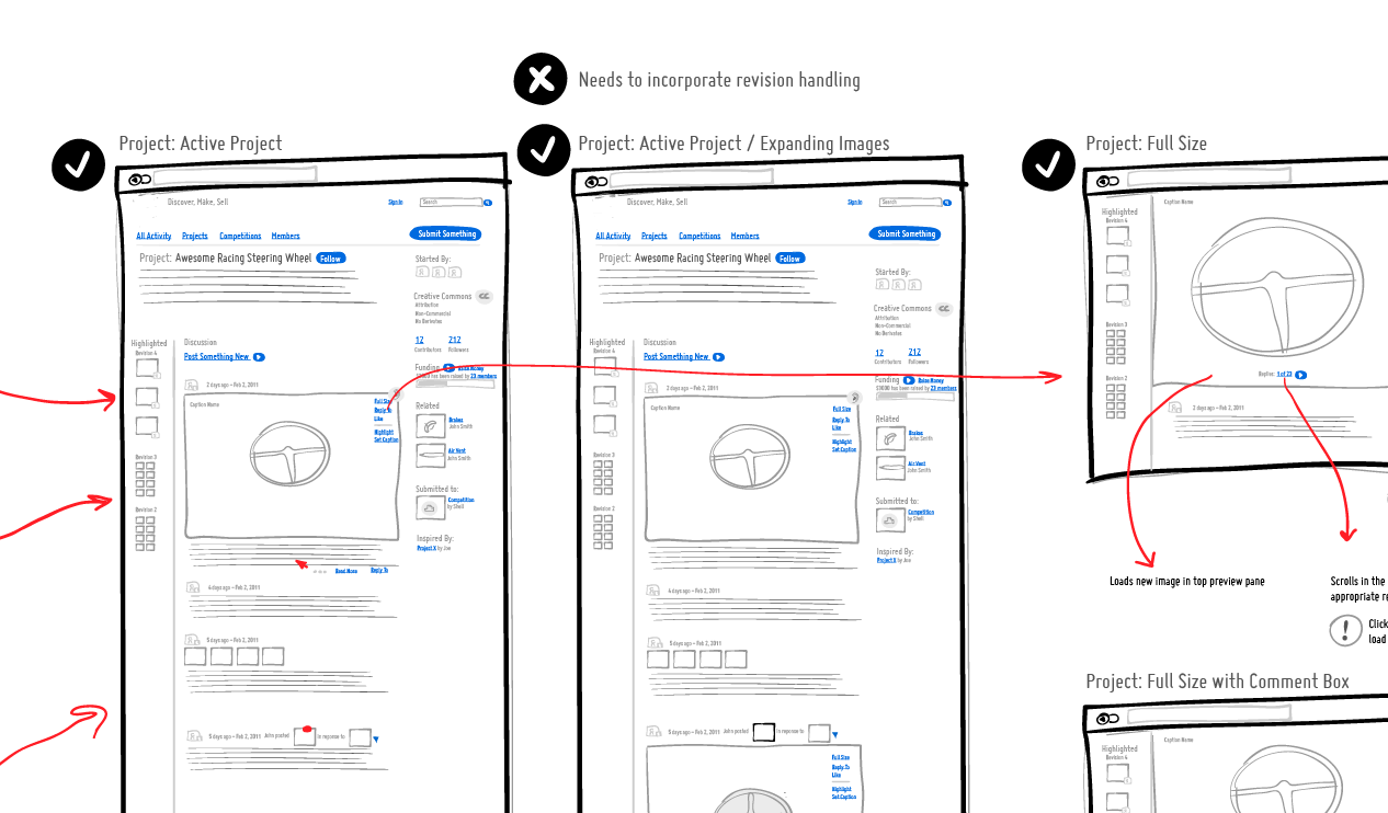
Dedicated Note Spaces
Craig’s preferred method of capturing feedback is on the wireframes themselves within a dedicated notes section. After printing out the full set of wires on a large piece of paper he then takes notes and sketches on top of what is already there. Looking more closely, a lot of the feedback in this particular wireframe is written in a question or task format – as in: “How would the user do this or that”. I think it’s an interesting way of testing the interface with additional sub cases which should be eventually accounted for.
Credits: Craig Kistler
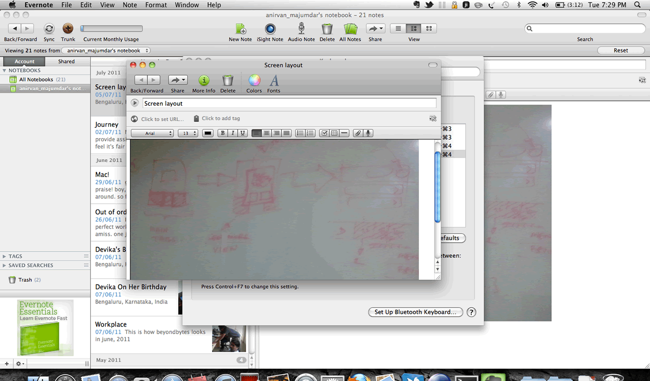
Saving Whiteboards with Evernote
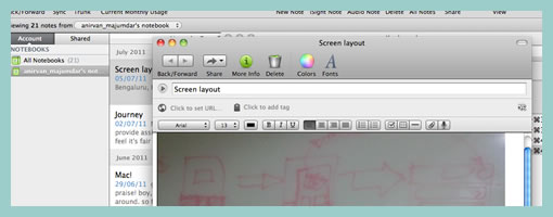
For Anirban, what works is jotting down everything on a whiteboard, and taking it as a snap using the Evernote app. Apparently, with Evernote he can capture the progression of the artifact and then play it out as a sequence as it occurred. In this way, the physical and the virtual can be easily bridged and stored for later.
Credits: Anirban Majumdar
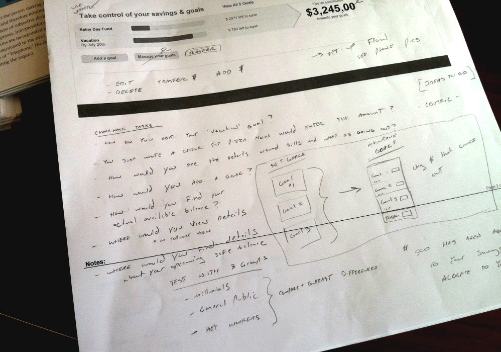
Capturing Sign Off with Checkmarks
When it comes down to my own approach for collecting feedback, I often write all over the wireframes in a different colour on a separate layer. Recently however I’ve began trying to capture sign offs or some form of collective agreement in the wireframes. Sometimes when working with a larger group, team members wish to know and store what has been agreed upon, and what needs additional work. Extending my personal sketching style, I started using two basic circle like symbols of a checkmark as well as a “x” to denote just that. These little symbols I drop throughout the wireframes as needed, and then update a copy of the document in a shared folder (usually Dropbox).
Credits: Jakub Linowski
Thoughts? Comments? Or have other ways of collecting feedback? Please share.
Tags: feedback, linowski
Posted in Samples | 4 Comments »
June 29th, 2011

How do you capture what others say when they criticize your work? I’m super interested in seeing the different ways of how people gather such design feedback. Do you have some sort of note taking system? Do you use stickies? What do you write down and emphasize? If all goes well and enough people submit, I’ll share the results (yup, including my own) in a future compilation post and hopefully begin revitalizing the samples section. Sounds interesting? Here are a few pointers:
- Send an image (JPG, GIF, PNG or PDF) with a maximum size of 1000 x 700px
- Submit by July 15th
- Optionally, describe your technique in a paragraph.

Posted in Announcements | 4 Comments »
June 7th, 2011
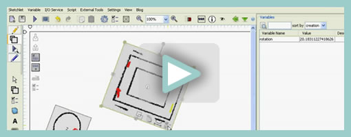
Sketchify is an open source toolkit for simulating simple drawings with a wide range of inputs in real time. As an example, it allows you to quickly create a functional prototype of a moving car along with the mouse acting as a controller for its direction. Other inputs which Sketchify may apparently hook up to include: motion sensing (with a webcam), speech recognition, face recognition, Wii Remote, web services, Phidgets, and Arduino. All of these of cource can then be tied back to move, hide, and affect various interface elements. Here are a couple additional youtube videos which demonstrate more examples of what is possible with this tool.
From the Sketchify website, in Željko’s own words:
Sketchify (also known as AMICO Sketchpad) is a toolset for sketching of novel classes of user interfaces, originally developed by Željko Obrenović at the Concept Lab of the Eindhoven Technical University. Sketchify extends the concept of paper and pencil sketching to a more generic concept of rapid manipulation of interaction material. Interactive material is any piece of software/hardware that represents or simulates a part of user interactive experiences, such as inputs from sensors, output of audio tools, interaction with Web services, or simple drawings. Through manipulation of interactive materials, designers create “interactive sketches”, which in rough terms illustrate interaction scenario or interaction techniques. Our tool gives a designer freedom to combine elements of traditional freehand sketching and with numerous extensions, such as end-user programming (spreadsheets and scripts), and links to existing software functionality.
Credits: Željko Obrenović
Tags: opensource, prototype
Posted in Tools | 2 Comments »
May 27th, 2011
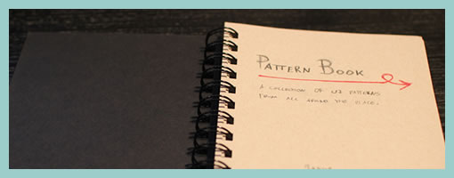
A few weeks ago, I started a personal pattern project which I’m finding useful and thought to share as a potential design activity. After grabbing a blank notebook, I basically began sketching out and writing down various examples of interesting interactions I find all over the web. The idea isn’t completely new as design and interface patterns have been around us for quite a while now. In fact, some really awesome collections have sprung up that are great for designing interactions and interfaces. If you’re seeking inspiration from these publicly available pattern libraries some existing resources include:
- UI Patterns
- Pattern Tap
- Patternry
- Little Big Details
- Designing Web Interfaces: Principles and Patterns for Rich Interactions (Book)
- Welie.com – Patterns in Interaction Design
- UIPatterns.net
- Quince
By personalizing these patterns however, there could be a few added benefits beyond just observing other people’s work passively. For one, I’m beginning to notice that after drawing out some selected examples it becomes easier to internalize and remember them later on in the future. When working on projects, these sketched patterns tend to emerge from memory more vividly than ones that were just seen somewhere. Secondly, when recording these patterns personally it is also possible to gain another chance at practising and evolving your own personal sketching style. Patterns are a great source of more complex user-interface interactions which may push the boundaries of your visual communication and sketching abilities.
There is no set standard on how to record them. Some things which I thought might be useful to include were elements such as: a title, a few screens (tied together with user actions), a simple description, a date, and an example URL. But really, these being personal, it’s all up to you to come up with your own style. So go ahead and grab that fresh notebook …
Credits: Jakub Linowski
Tags: linowski, sketching
Posted in Inspirations | 8 Comments »
May 19th, 2011
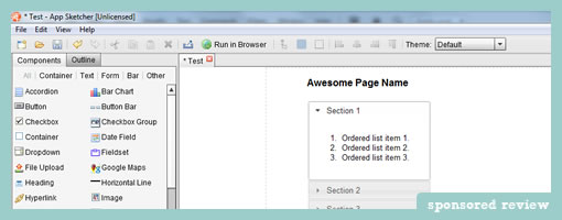
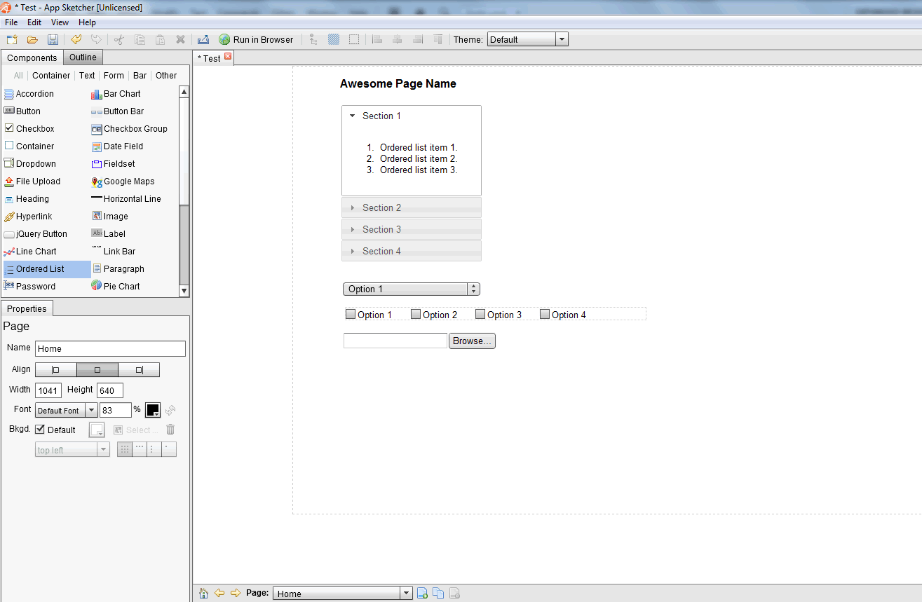
App Sketcher is a lightweight prototyping tool for developing interactive HTML prototypes or wireframes. The software installs as a standalone Adobe AIR application and therefore may run on a number of platforms. There is a left hand pane which contains draggable and editable user interface components – perhaps one the most common features shared across some other tools out there. Unlike most other tools though, App Sketcher uses real web controls such as HTML elements, jQuery components and Google Maps in this pane.
App Sketcher’s end deliverable is a fully interactive HTML prototype. Clicking on the prominent “Run in Browser” button results in a seamless transition into the browser window where the prototype can be experienced (or shared with someone else without the need for any additional plugins).
One small detail which caught my attention is how interactivity is discoverable in the final prototypes. App Sketcher does this by showing a tiny lightning icon wherever an action is assigned to. This small but useful feature might help people notice and differentiate what is actually clickable from what is not.
Other features that are also present include such things as: multi-page support, CSS themes, object alignment, and multi level undos.
Download and try out the software.
Credits: Feng Chen
Posted in Tools | Comments Off on App Sketcher
April 26th, 2011
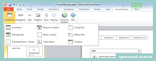
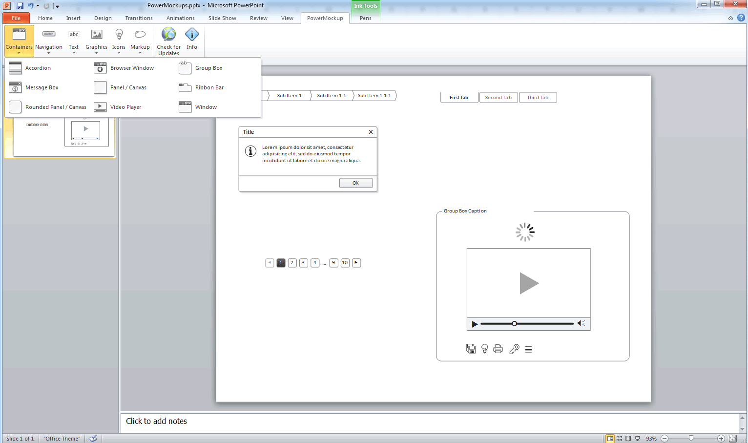
PowerMockup is a simple UI design plugin for Microsoft PowerPoint that makes it easy to create low fidelity wireframes. Perhaps one of its core strengths is that it has a low barrier to entry, since many people out there already have access to PowerPoint. The plugin speeds up the design process by letting users insert fully editable UI elements (containers, navigation items, icons, and text elements) onto the canvas.
The merits of PowerPoint as a prototyping tool have been discussed in the past and are definitely worth to consider. For one, PowerPoint supports basic interactivity and nonlinear page linking. Personally however, I still like to think of a the page-by-page linear narrative nature of PowerPoint as an equally strong alternative presentation style to interactive prototypes. With a defined beginning and an end, a PowerPoint deck ensures that viewers don’t have to discover interactivity, but instead can be guided across flows.
Would I personally use this tool as an interaction/interface designer? I’m not sure. I’ve come to love Illustrator, endless canvases, and free-form electronic sketching as a technique. So moving away from that style of working would require something more than a set of pre-canned elements. I’d still recommend it to others on a more multidisciplinary team – especially if there were people with less of a design background, but still a desire to express their ideas quickly.
Overall, a great little product. Thanks Andreas!
Credits: Andreas Wulf
Tags: powerpoint
Posted in Tools | 6 Comments »
April 15th, 2011
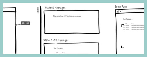
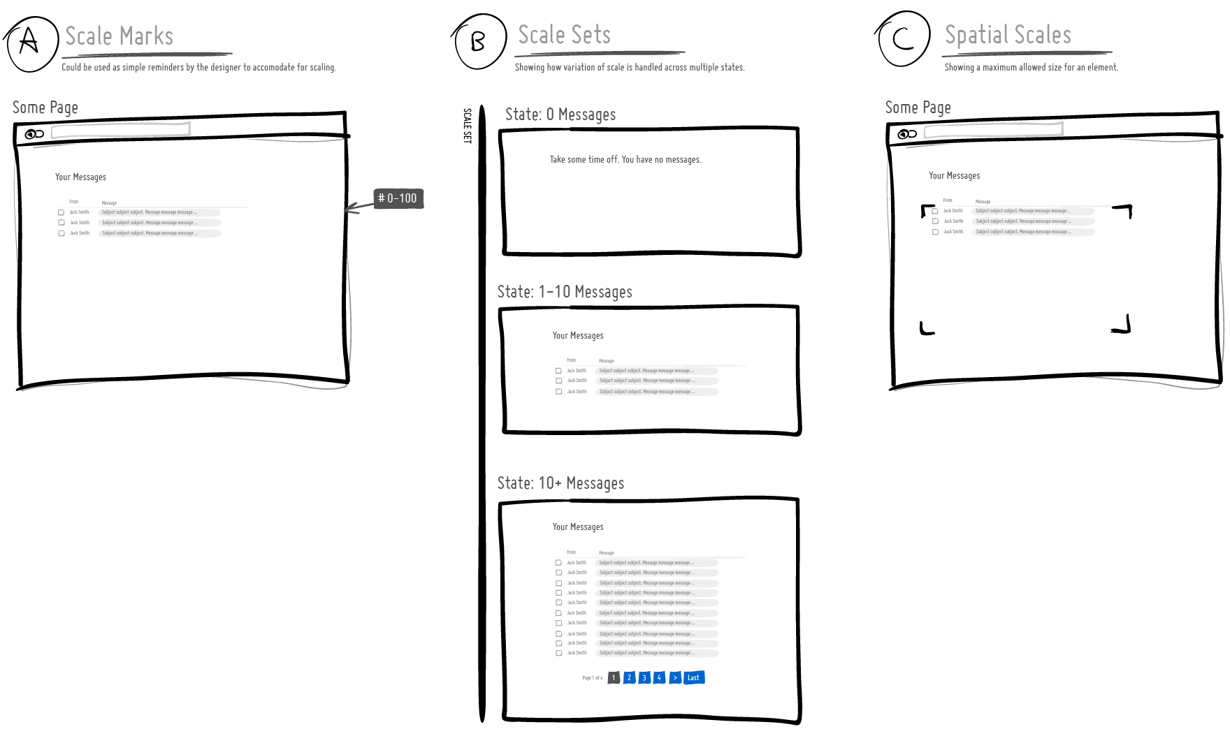
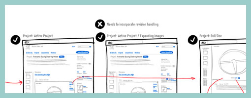
I’ve been thinking about ways to communicate how a user interface scales over time as the amount of information it needs to support varies. For example, sometimes the UI has to support multiple cases ranging from no results, to just a few results, to thousands of results. A good interface designer would probably think this through and come up with a UI that fulfills all of the relevant cases. For this, I began exploring a couple of visual language ideas to help myself and others who would like to tackle UI scaling. Here are some open and experimental thoughts:
A) Scale Marks. These are just floating reminder notes alongside a screen with a range of information that ought to be supported. Sometimes it’s easy to forget (or not know) how much data a UI really needs to support and these could be used as small self-targeted tests of sorts.
B) Scale Sets. This is a grouping of all the multiple UI states for those times when we actually want to draw out all of the relevant state ranges.
C) Spatial Scales. When there is more information, perhaps we might wish to communicate a maximum size of an element (max width / max height).
These are just a couple of thoughts which some day I might bring into the next release of the ISN. If you have other ideas, please share. :) Hope it’s useful.
Credits: Jakub Linowski
Tags: linowski, sketching
Posted in Experimental | 5 Comments »
March 25th, 2011
Do you use Omnigraffle and annotate your work with little, round and numbered circles? Meredith just recently created a bunch of scripts which help with these dot annotations. The scripts automatically generate the numbers and thus make it easier to add and remove notes without having to readjust the numbering all the time on all remaining dots. Looks useful. Thanks!
In her own words:
The problem is that it’s not uncommon for me to have 20-30 dots on a single wireframe. What happens if I need a new “1″? Without a script, it means creating a new “1″ dot, then changing the old “1″ to “2″, the old “2″ to “3″, etc. I don’t have time for that!
Credits: Meredith Noble (Usability Matters)
Tags: annotation
Posted in Tools | 1 Comment »
March 18th, 2011
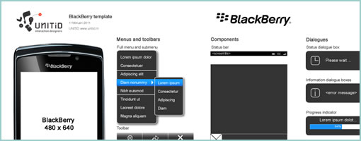
Here comes another mobile template for Fireworks for mocking up Blackberry screens. It has been released publicly sometime a month ago by UNITiD – a small company from the Netherlands. Enjoy if it’s useful.
In their own words:
For all interaction designers who will be designing apps for the BlackBerry platform, we’d like to share our Fireworks template. The template is made for BlackBerry devices with resolution 640×480 but as all UI elements are vector images they can easily be resized.
Credits: UNITiD
Posted in Templates | 1 Comment »