Archive for the ‘Samples’ Category

Computer Based Sketchy Wireframes

Monday, March 2nd, 2009


Jumping over to the computer does not necessarily mean that the wireframe ought to look rigid and clean, suggesting a higher degree of completion. Occasionally, the designer still feels the need to communicate the interface with a style which invites change by suggesting incompletion. One way of doing this is by means of a more sketchy style. Here is a sample of Hans using Visio loaded with a sketchy stencil designed by Niklas Wolkert. Jonathan Abbett has later on revised the stencil here.

Credits: Hans Nieuwenburg

Sticky Sitemaps

Friday, February 27th, 2009


The need for flexible design documents such as sitemaps has already been noted in the past. In this example however, instead of using the computer, a very similar style of exploring and representing site structure has been accomplished with the use of sticky notes. Indentation has been applied to the stickies in order to suggest multiple levels of structure. Why not just do it on the computer then? Well, I think that such a rough approach invites more collaboration and input from others. Paper, sketching and stickies all invite change and feedback more so than computer based tools. Here is what Dave has to say:

It is an early stage in the development process, and the use of post-its allows quick iterative thinking, and opens collaboration across the project team. Taking photos at different stages meant that versions can be kept. This was the final version, before being drawn up in Illustrator for client sign-off.

Credits: Dave Needham

Graph Paper Layout Sketch

Wednesday, February 25th, 2009


A sketch drawn up by an interaction designer and a sketch drawn up by a visual designer will emphasize slightly different things. An interaction designer likely will focus more on multiple element states, and events (or links) which glue them together. Whereas someone with a more traditional visual or graphic design background will put extra effort on sizing, alignment, positioning and visual priority, which all work together in establishing proper visual relationships between elements. This second case is perhaps visible in a sketch submitted by Mike. The sample here makes use of graph paper, straight lines, and explores block and element relationships.

A sketch like this is just more evidence that the wireframe overlaps greatly with graphic design – a case made earlier. This overlap suggests once again that the wireframe can be grounds for collaboration between information architects, interaction designers and visual designers.

Craving more graph paper? Konigi provides a number of awesome stencils aimed at IA’s and visual designers which can be downloaded. Of course writing about graph paper and wireframing, one could not overlook another awesome blog about a similar subject matter over at graphpaper.com.

Credits: Mike Rohde

Rough Interface Sketching

Monday, February 23rd, 2009


At least two rough sketching tactics can be identified in this submitted drawing which make it lean very much toward the low end on the fidelity scale. First of all a great deal of the text has been represented using simple squiggly lines as opposed to using real words. Secondly, the interface page boundaries have faded as some elements have been drawn floating independently of any screen edges. Such roughness has definitely a place while designing as it provides ever greater speed of generation. This value does come at a price however as hinted in the previous entry. The lower the fidelity, or the rougher the sketch, the more difficult it may be to understand by others and thus it may require support by explanation.

Credits: Darren Azzopardi

Sketching Alternative and Social Activities

Friday, February 20th, 2009


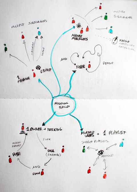
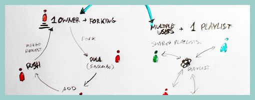
Recently as I was thinking about an assignment of designing a new playlist system at work, a number of ideas collided all into one and resulted in this design sample. The desire was to explore alternatives, quickly, of high level activities, which would have to support interactions between a number of actors or people. So I jumped back into pencil, paper and marker mode. As simple or obvious as it may seem, what I think might of worked well worth noting is the use of colours to denote different (or same) people. Another thing that perhaps worked out was the use of one activity as a starting point in the center and then branching out toward alternatives.

I think this little sample was influenced by other’s work as well worthy of noting. First of all, here at TU Delft we were exposed to quite a bit of mind mapping exercises which in a way resemble the interface sketches of Jonas Löwgren. Then again, this sample also shares the high level characteristics of a user journey submitted by Steve Johnson. Finally, as I’ve written in my personal blog I’ve also began questioning the sterility of one path user flows wondering about how to explore the diversity of activities.

The sample isn’t perfect, and as is argued in Pencils before Pixels, the lower the fidelity of the sketch the harder it is to use it to communicate with others. However when I showed the sketch to others, and supported the sample verbally, it enriched the conversations.

Credits: Jakub Linowski

Multiple Element Changes Using Miniframe References

Thursday, February 19th, 2009


Here is a sample revisiting the problem of exploring multiple element changes all over the screen as a result of an interaction. Traditionally a full wireframe would have to be redrawn in order to document such subtle and multiple changes. Here is a quick solution that avoids having to wireframe the full page and thus decreases effort and increases document flexibility. Fabian has achieved this by combining state based wireflows with miniframes which act as references for the elements which do change. Overall, this document reminds us of an important consideration relevant in wireframing richer interactions. This being that one interaction can have multiple element reactions. Just to recap, Bill Scott has used an alternative method of documenting a similar case with a multiple elements & state conditions matrix.

Credits: Fabian Nöthe

High Level Layout Alternatives

Tuesday, February 17th, 2009


Here is a sample exploring the possibilities of various layout approaches in the early stages of a design process. Consecutive lettering has been used to suggest multiple interface alternatives. The variations however only explore very rough structural or navigational alternatives. The level of fidelity is very much devoid of detail. I continue to wonder what other designers do when they want to explore numerous alternatives of more detailed interface elements or screens which are a bit further in the design process. Would you have samples of something like that? If so, please submit.

The source of the file can be found on flickr.

Credits: Bram Pitoyo

Sitemap References

Sunday, February 15th, 2009


In a way, sitemaps can be thought of as a unifying table of contents of an information architecture project. They provide a way to zoom out and view the whole organization from a bird’s eye point of view. As interesting as things look from the clouds, one can fly around only for so long, and information architects often also allow to come back down to the wireframe or page level. This zooming back in is often done through some form of referencing. Here in this sample I began referencing at least three things: wireframes, content inventories, and additional sitemap pages. Wireframes are referenced with a red “W#” stamp, content inventories with a “C#” stamp, and additional pages with upper corner blocks. Some time ago in the past I also referenced user scenarios at this level. The list of references could possibly be expanded to accommodate other item as well.

Credits: Jakub Linowski

User Type Views & Annotations with Polypage

Friday, February 13th, 2009


Here is another very good Polypage HTML wireframe submitted by Joey Marchy from nGen Works. Two interesting uses of Polypage make themselves visible in this sample. First, on the upper left hand side, all of the various user types have been defined. Toggling them gives a good sense of what all of the various wireframes will look like for that particular user. Secondly, Polypage has also been used to annotate the wireframes and this is accessible through the upper right corner by means of such tags as “user roles” and “hash marks”. The really nice thing about this annotation technique is that no longer are the actual annotations separated somewhere in the right hand side from the main wireframe, but instead are contextualized right in the wireframe itself. This allows people reviewing the wireframe to read the annotations quicker as opposed to having to translate number references into actual notes, as it is done traditionally.

Joey writes:

We created a functional HTML prototype to accomplish two goals: get client signoff on all application interaction and provide a roadmap for the development team building the application. We used a combination of PHP and the awesome Polypage jQuery plugin to show the myriad of states between differing user levels and application states.

Credits: nGen Works

Whiteboard Wireframes

Wednesday, February 11th, 2009


Sometimes it’s better to design collaboratively in the open instead of doing it from the safety of the solo oriented computer. If done right, more feedback can be harnessed quicker with higher quality returns. Agile programmers have been doing this with their paired programming approaches which apparently pay off by diminishing bugs and increasing code quality. Here is a sample from Michael drawing up wireframes on a whiteboard for the redesign of Jive Software’s website – visible and affording collaboration.

Credits: Michael Sigler