Archive for the ‘Samples’ Category

Personal Card Set

Wednesday, March 25th, 2009


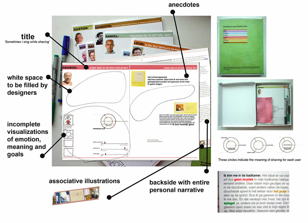
The people over at TU Delft, have come up with a persona deliverable which makes use of white space and invites interpretation in order to involve the team in the findings more closely. This is an example of participatory communication where designers begin to own the data through active co-creation as opposed to just passive reading. Similarly Johnny Holland recently wrote about personas being more about the process which immerses designers in the findings, than just being about the outcome.

Froukje in Sharing User Experiences in the Product Innovation Process writes:

Each card is laminated and the set comes in a box together with a set of non-permanent markers and a sponge. The cards invite designers to interactively structure and analyse them: they can create overview, re-arrange, select and compare the cards. The design of the cards invites designers to add their interpretations and react on the leads suggested by the researcher. Each card has plenty of white space for annotations of ideas/insights/conclusions, which can be made with the non-permanent markers, and can be wiped off with the sponge. This way, designers are stimulated to become active partners in the communication.

Credits: Froukje Sleeswijk Visser

Tab Order Diagram

Monday, March 23rd, 2009


I would guess that not many designers think of specifying or controlling the tabbing order of form elements. It seems that quite often this is the type of interaction which is left alone for the browser to take over and automatically figure out on its own. Most of the time when users press the TAB key, the focus switches between input fields quite well, and if it doesn’t then the mouse is used to correct everything. Hans however, shared with me a user interface sample which clearly makes the tabbing order explicit. He uses a very simple transparent arrow going across form elements in order to indicate the order. It works quite well.

Credits: Hans Nieuwenburg

Prioritizing Elements with Numbers

Friday, March 20th, 2009


The bubble frame has stirred up some commotion on twitter the other day, and Tyesha reacted with her own variation. Her sample however sheds light on something else – the idea of prioritizing elements. She uses a very simple tactic that relies on numbered circles to denote the importance of an element. The really nice thing about communicating thoughts on priority in such abstract ways, is that it creates more flexibility for a visual designer to interpret the representation. This perhaps gives the designer more room to apply his/her own expertise as well.

I find it really interesting to see information architects thinking of such priorities behind various items on a page. There seem to be quite a few other ways in the realm of visual design which can be used to increase or decrease importance. Some less direct tactics include: the control of element size, emphasis through isolation, variance of depth (foreground, background), and of course a recent example that denotes priority with the use of tone.

Credits: Tyesha Snow

XXL Iteration Views

Wednesday, March 18th, 2009


Juhan printed out all historical iterations of a single super sized screen. The awesome thing about this perspective is the quick overview one gains of the exploration performed. One can see very rapidly what has been tried, rejected or accepted, and how the design has evolved through the markings. In comparison to the world of programming, developers also have views such as these and in particular they rely on “diff” tools to highlight changes between code revisions.

Speculating here, another thing which comes out from seeing this (at least to me), is the desire of some designers to communicate a degree of completion. It has been noted in a previous post that it is desirable to control the amount of feedback a presented view affords (ex: by using sketchy styles more comments can be generated). Here perhaps the multiple revisions of a design lined up in such a way can give the feeling of greater completion to the viewer, and thus afford less feedback. If someone was to look at this and see a fifth iteration building on top of the past versions, perhaps they’d think twice before asking to shift the header another 10 pixels. This is not to say that affording less feedback in our deliverables is negative. Contrary, sometimes it is perfectly valid to begin shutting voices out. Otherwise, we’d spin our design wheels and wouldn’t move forward.

Here is the real image on flickr, and Juhan writes:

Rani stands next to the 5 iterations of a single screen we designed (and re-designed) over the last 48 hours. We mark up all the prints and show early adopters for feedback.

We’re close enough to roll to stage… and starting using the damn thing.

Every funky pixel, grid, and design jumps out on big prints.
Print big or get out!

Credits: Juhan Sonin

Bubble Frames

Monday, March 16th, 2009


Bubble Frames – crudely rounded content areas with labels. Perhaps a merger of sorts between Rough Interface Sketching and Generic Content Labels. Chris explains it best:

Whenever I start a new web project, I want to conceptualize, and fast. Ideas seem to flow at a rapid pace in short intervals, making it hard to capture everything. I’m a huge proponent of rapid prototyping. I want to take as many of those ideas as I can, build a quick prototype, take a step back and then carefully analyze everything.

The best ideas are born in those critical few moments that you rapid prototype. And over time, those ideas can be melded into something that is truly incredible.

A tool that I use as part of my rapid prototyping process is what I call “bubble frames.” It sounds kind of stupid, I know. And it might not be all that unique. It’s really a mesh of things I’ve seen and read. But I thought I’d share it anyway to those who need some inspiration for their own rapid prototyping exercises.

The bubble frame is a watered down version of a wireframe. Instead of constructing exact boxes and labels as a skeleton for the web site, I use quickly drawn circles to represent what types of information will go where. I vary the size of these circles to represent the importance of the information they will contain.

Credits: Chris LeCompte

Sticky Note Pulldown Menus

Friday, March 13th, 2009


While sketching a user interface with the client, in this example popup overlays or pulldown menus have been drawn up using sticky notes. This technique has been around for a while (as probably seen in a lot of paper prototyping sessions) since it makes perfect common sense. Sticky popups stand out from the background noticeably and also can be easily removed and reattached as desired, which makes them ideal as a solution.

Credits: Hans Nieuwenburg

Content Sitemaps

Wednesday, March 11th, 2009


While still in a highly conceptual mode of thought during site mapping, already rough ideas begin to emerge as to how particular pages will look like or what they might contain. Often these ideas go beyond a simple one word page label. Here is an example which captures such ideas textually in more detail. This interesting view combines structural page representations with textual content descriptions – a merger of sorts between a site map and a content inventory.

Credits: Lewis Litanzios

UML State Charts

Monday, March 9th, 2009


Here is an interesting way of approaching state changes using UML notation, and more specifically state charting. Perhaps the learning curve of documenting such technical interactions is not the lowest. However, once the team agrees on using such an advanced notation system, the represented interactions and state changes can be explored with greater accuracy and detail. Some interesting symbols include: loops which imply refreshes; brackets which suggest conditionals; forward slashes which suggest system actions; and larger rounded area containers representing nested states which are always accessible.

Yohan also sent me two interesting UML references. One simpler PDF reference explains very well the notation used in the above example, and a second extended reference explains additional UML diagramming notations.

Credits: Yohan Creemers

Tracing Paper Layers

Friday, March 6th, 2009


Here is an interesting technique which uses multiple pieces of tracing paper combined with sketching and scanning. It kind of reminds me of Photoshop layers except these exist in the real world. First, Jennifer drew various interface elements separate from each other on tracing paper and overlaid them together to form full page screens. These various combinations were later on also digitized using a scanner and then shared with others.

This technique shares some similarities in terms of flexibility with sticky frames. Just as with stickies, the designer can undo and rearrange elements very flexibly. Also, similarly to the sticky frame example where the designer used photography in order to reuse the various elements (and speed up the design process), here a scanner performed the same function. Tracing paper however has an additional characteristic of allowing to represent interesting transparency effects as is visible in the top right example suggesting an overlaying lightbox image. Tracing paper perhaps also affords a little bit more change and rearranging than sticky notes. All in all, such awesome tactics provide us with more speed and agility.

Jennifer writes:

We’ve also found that sometimes taking your design out of the computer screen forces your audience to focus on the concept rather than the execution, which is very helpful if your audience gets hung up on colors and buttons and the like. Frankly, it’s helpful to everyone involved: good design, I feel, serves the content, and all the flashy Flash/AJAX/JQuery what-have-you won’t save a poor design. I also believe that while good web design does not translate into good book design, etc., every designer should learn to use paper and pencil. Like the codex, it’s worked for 500 years; it’s not going anywhere soon.

Credits: Jennifer L. Anderson

Wireframe-Sketch Hybrid

Wednesday, March 4th, 2009


Sometimes the designer wishes to focus feedback and discussion only to certain areas of the interface. Knowingly that firmer and more defined styles suggest completion, while empty spaces and sketch styles invite discussion, the designer here has utilized this knowledge to channel feedback. This sample is a hybrid between a wireframe and a sketch. It has been started off using the computer and then printed out, while leaving a central area blank for sketching with the stakeholders. This interesting combination suggests to the stakeholders very clearly that the computer based areas are more defined and less open to feedback while the empty and sketchy areas are in need of refinement and more open to input.

Credits: Hans Nieuwenburg