Archive for the ‘Samples’ Category

Error Handling in Wireframes

Monday, January 19th, 2009


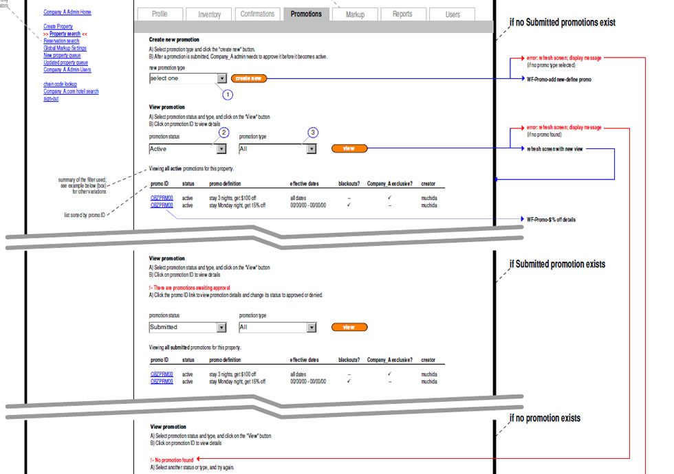
As we begin to think about, sketch and specify multiple interface states, it quickly becomes apparent that error handling is one potential candidate which is rich in state complexity. Looking around for an example of how to document errors I found a very interesting sample of such an error wireframing technique. Minoru Uchida has agreed to showcase and share it here.

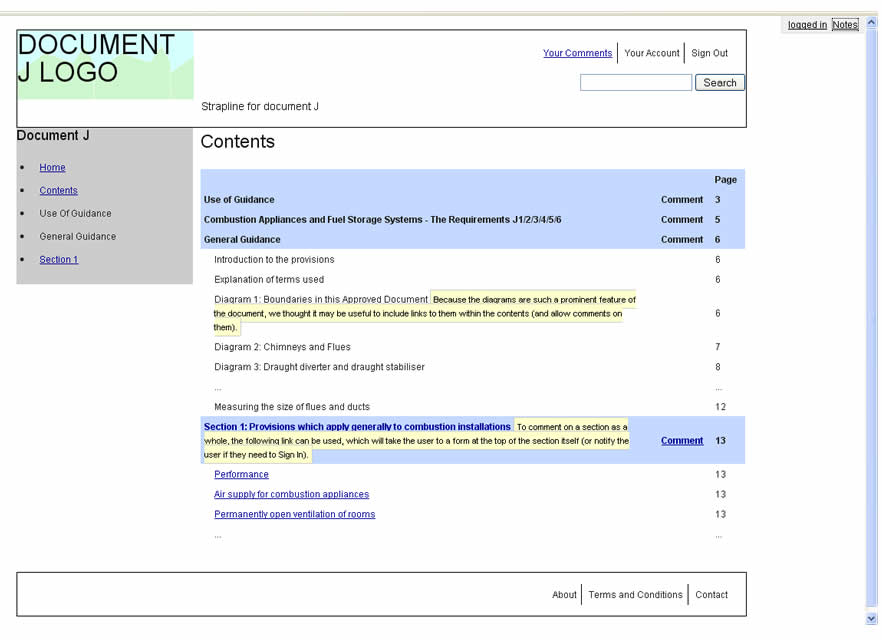
The technique is quite simple. Similarly as in the previously described In Page Events example, coloured lines are used to denote user actions. If however there is a conditional error, a red arrow is used to guide the reader to a new page section with the error message in red. The nice thing about this technique is that the page can be further divided horizontally and only a few elements which change are duplicated. The remaining elements such as the header and footer are shared across the full page.

Credits: Minoru Uchida & Mark Hines

State Based HTML Wireframes with Polypage

Saturday, January 17th, 2009


Ben pointed me to an interesting set of HTML wireframes which use Polypage. Polypage expands HTML wireframes or mock-ups and allows for the creation of page states. Furthermore, the various states are independent of each other and can be toggled on a small top menu to affect the page view. Say for example you want to show your wireframes to your client in the “logged out” and “first time visit” states. Polypage allows you to click through all your wireframes to demonstrate such a case. Later on when you decide to demonstrate the “logged in” state, all you do is toggle it in the top menu and continue your presentation.

The technique was initially developed at Clearleft, and Richard Rutter explains how to use it better. Here are two more sets of wireframes using this technique which contain more page states to explore.

As a side note, here is also an interesting debate as to whether these things are wireframes or prototypes.

Credits: Ben Sauer

Push & Shove Rules

Thursday, January 15th, 2009


Changing elements on a page can be forceful. Traditionally, the popup or the dialogue box is an example of a rather unforceful behaviour where the overlaying element does not affect the underlying interface. It appears on top and nothing underneath changes other than a drop shadow or a grey out. This does not have to be the case however. One example of such more forceful push and shove behaviours can be seen during dragging operations. Bill documented this nicely in such a diagram. As an item is dragged and its position changes, the surrounding items are affected as they are pushed around. Using key frames, one can imagine the underlying rules during such an operation.

Finally, these push and shove rules do not have to be limited to dragging alone. As RIA elements become more flexible to resizing, dragging, animating or any other positional and size changes, such behaviours could be considered.

I found this example on Bill Scott’s superb companion flickr page for his upcoming
Designing Web Interfaces book.

Credits: Bill Scott

Stickyframes

Tuesday, January 13th, 2009


There is a fuzzy line between what constitutes a paper prototype and a wireframe sketch loaded with sticky notes. Although Danny originally tagged them as prototypes (which is perfectly valid in my opinion), I would like to expand the possibility that such design representations may have uses beyond paper prototyping. Instead, sticky paper can also be used in the conceptualization stage in which wireframe generation and sketching fall into. Could this then be called a stickyframe?

Stickyframing, or the idea of using sticky notes combined with sketching can bring great value for a design process. The strength of such a combination is the decreased effort for changes or modifications provided by stickies, while at the same time having the immediacy and flexibility of ideation that sketching allows. Sometimes during paper sketching we’ll draw out an interface element and then we’ll want to reposition it. At other times, we’ll want to redraw an element while the remaining interface parts are perfectly fine. In both of these situations, we’re often forced to redraw the whole page view as we generate more design knowledge. Stickies of course help combat such inefficiencies.

On the same note, an emergent thought comes to mind which further could extend stickyframes – digital photography. Just the same way as Danny Hope took pictures of the various page views and posted them on flickr, the same could be done in a design setting. Photography could not only allow for the various interface states to be frozen as a future reference. More so, photographing sticky wireframes could allow for a reuse of various elements (or their states) across different pages. It’s just a thought, as the fight for increased document agility continues on.

Credits: Danny Hope

Isolated & Referenced Elements

Monday, January 12th, 2009


This is an interesting sketching technique provided to me by Jonas Löwgren, which separates individual interface elements from the page. Here, individual elements are taken out from the page view and then referenced back to a mini version of the page which contains a structural representation. More so, the page structure only lives in one area (the centre). Nearby each sketched element there is also some faded hinting of what is around the element. Taken together, this increases the speed in which the sketches can be generated, as there is less need to redraw full pages with all other elements.

Secondly, this technique also has the strength to emphasize particular elements as they speak back at us with a louder voice. The isolation of various items, freed from the page view makes them stand out more. There are also other submitted samples (here and here), which also made use of this technique in a wireframe context.

Credits: Jonas Löwgren

Pulldown Contents Sketch

Sunday, January 11th, 2009


Need to scribble the contents of a pull down menu quickly? Sockyung uses a pretty straightforward sketching technique of a bulleted list on the side margin and an arrow reference.

Credits: Sockyung Hong

Multivariate Wireframes

Friday, January 9th, 2009


Ben explains it best:

We do a fair but of multivariate testing work, where users get served different combinations of elements to see what works best.

The problem with wireframing this is that you can end up with a lot of repetition. Sure, you get a very impressive, thick wireframe doc – as you’ll have hundreds of wireframes each with small or large variations between them. But they tend not to get read :)

We use a small representation of page on the top left to help explain the type of page we’re describing. Then each element lives inside a call out, which then contains relevant information. This also makes updates much faster, as any element change can be applied to one page rather than 3 or 4.

Credits: Ben Still

User Journeys

Wednesday, January 7th, 2009


Steve sent me a User Journey sample today and I thought it was pretty interesting. Besides there being an article on Boxes and Arrows on this technique, perhaps I can add my 5 cents on what I am seeing here. Other than the iconographical style, two important ideas become apparent. First, the duration of the interactions in this visual are wider than usual. Typical user flows represent quite narrow time lengths, whereas the deliverable shows interactions spanning out over the weekend, and even a month afterwards. Secondly, the computer screen is represented as only one item in a bigger context of the physical world. The little people here interact with other physical objects such as magazines, MP3 players and PDAs. Taken together I find this sample as an interesting way to think and represent activity beyond the desktop screen within a richer reality.

Here is also what Steve writes:

I have been working on creating these 3D characters for some time now to bring to life some (often boring) User Journeys for our clients.

I have used them several times in pitches and key stakeholder meetings and they seem to be well received, while at the same working as a good platform to get our ideas across. Clients seem to get things more easily when they are illustrated or drawn out in front of them. I have also found people are more likely to contribute in meetings if they see ideas detailed in this way. If I have the library of assets with me, I can easily (using omnigraffle or equivalent) add their idea to the diagram in the meeting, increasing their sense of participation.

And just because you are illustrating your User Journey it doesn’t mean you are trying to dumb the information down. Before I create a diagram like this one I make sure I sketch out my ideas with a pencil and paper before hand to ensure all bases are covered.

Credits: Steve Johnson

Flexible Sitemaps

Tuesday, January 6th, 2009


When thinking about high level web site structures, we often rearrange content or page items. I at least, place page holders here and there, look at new content, and then revisit the structure as new knowledge or insights are generated. This is especially so during the early phases of site mapping. In order to imbue these documents with more agility and flexibility, sometime in the past I developed the habit of avoiding arrows and line connectors. I felt that the lines slowed me down as they added an extra step to the work flow. Each time I would reorder a page item, I would then also have to rearrange the lines as well. Instead I began using indentation, tone and alignment to suggest hierarchy. Perhaps this tactic is not perfect, as changing the background colour of an item also requires additional time. Nevertheless, it’s still one step closer in the direction of making documentation more flexible to change.

Credits: Jakub Linowski

In Page Events

Monday, January 5th, 2009


Events such as mouse clicks, mouse overs, key presses, and focuses according to John Resig are the “glue which holds all user interaction”. Traditionally IA’s have documented these interactions with numbered annotations referenced on the side margin. However finding and reading such text based annotations can be a relatively slower process compared to the immediacy of contextualized visual symbols. Here I found a nice example on documenting an event within the page, which challenges the numbered annotation technique. Simply put, it’s just a red arrow within the page suggesting a cause and effect. Perhaps it’s not completely clear whether it is a mouse click or mouse over, but still it makes me wonder what if a new visual language emerged for more diverse in page interactions.
Credits: Vivi Zhang