February 18th, 2009
As readers are submitting quite interesting content, I would like to try and see if by setting up a drop.io account it will make it even easier. It looks like easier submissions are a requested feature, but I am not completely sure by how that can be achieved. Drop.io/wireframes will hopefully make it easier to submit larger files. Is more guidance needed in terms of what should be submitted? Are people resistant to submitting source files? If you have any ideas or comments, feel free to let me know. :) Cheers. Jakub
Posted in Announcements | Comments Off on A little easier content contributions?
February 17th, 2009

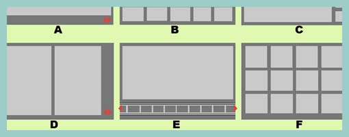
Here is a sample exploring the possibilities of various layout approaches in the early stages of a design process. Consecutive lettering has been used to suggest multiple interface alternatives. The variations however only explore very rough structural or navigational alternatives. The level of fidelity is very much devoid of detail. I continue to wonder what other designers do when they want to explore numerous alternatives of more detailed interface elements or screens which are a bit further in the design process. Would you have samples of something like that? If so, please submit.
The source of the file can be found on flickr.
Credits: Bram Pitoyo
Tags: alternatives, multivariate, sketch, wireframe
Posted in Samples | 1 Comment »
February 15th, 2009

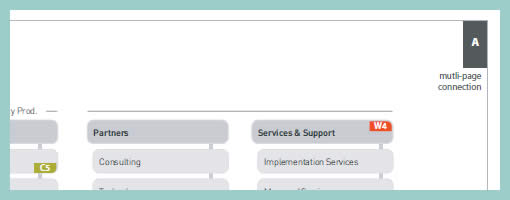
In a way, sitemaps can be thought of as a unifying table of contents of an information architecture project. They provide a way to zoom out and view the whole organization from a bird’s eye point of view. As interesting as things look from the clouds, one can fly around only for so long, and information architects often also allow to come back down to the wireframe or page level. This zooming back in is often done through some form of referencing. Here in this sample I began referencing at least three things: wireframes, content inventories, and additional sitemap pages. Wireframes are referenced with a red “W#” stamp, content inventories with a “C#” stamp, and additional pages with upper corner blocks. Some time ago in the past I also referenced user scenarios at this level. The list of references could possibly be expanded to accommodate other item as well.
Credits: Jakub Linowski
Tags: colour, linowski, referencing, sitemap
Posted in Samples | 10 Comments »
February 13th, 2009
I’m seeking some more inspiration for fluidIA, the open source UI prototyping tool, and I need some volunteers willing to take part in user research. Basically I would like to observe a couple of people while they are designing user interfaces. You have to be in Toronto in March, or in the Netherlands in February. The second option which I am asking for is to video record your best and worst wireframing moments (via Jing).
Here are the details: www.fluidia.org/research
Any willing people, greatly appreciated! :)
Posted in Announcements | 1 Comment »
February 13th, 2009

Here is another very good Polypage HTML wireframe submitted by Joey Marchy from nGen Works. Two interesting uses of Polypage make themselves visible in this sample. First, on the upper left hand side, all of the various user types have been defined. Toggling them gives a good sense of what all of the various wireframes will look like for that particular user. Secondly, Polypage has also been used to annotate the wireframes and this is accessible through the upper right corner by means of such tags as “user roles” and “hash marks”. The really nice thing about this annotation technique is that no longer are the actual annotations separated somewhere in the right hand side from the main wireframe, but instead are contextualized right in the wireframe itself. This allows people reviewing the wireframe to read the annotations quicker as opposed to having to translate number references into actual notes, as it is done traditionally.
Joey writes:
We created a functional HTML prototype to accomplish two goals: get client signoff on all application interaction and provide a roadmap for the development team building the application. We used a combination of PHP and the awesome Polypage jQuery plugin to show the myriad of states between differing user levels and application states.
Credits: nGen Works
Tags: annotation, HTML, prototype, wireframe
Posted in Samples | 2 Comments »
February 11th, 2009

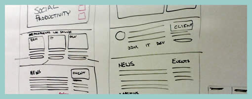
Sometimes it’s better to design collaboratively in the open instead of doing it from the safety of the solo oriented computer. If done right, more feedback can be harnessed quicker with higher quality returns. Agile programmers have been doing this with their paired programming approaches which apparently pay off by diminishing bugs and increasing code quality. Here is a sample from Michael drawing up wireframes on a whiteboard for the redesign of Jive Software’s website – visible and affording collaboration.
Credits: Michael Sigler
Tags: agility, sketch, wireframe
Posted in Samples | 6 Comments »
February 9th, 2009
I would like to announce fluidIA.org, a second project of mine with the intention of creating an open source and agile UI prototyping tool. The project is just beginning but anyone who would like to contribute in terms of design ideas, comments, or code is more than welcome. The site is still evolving as I am the only who has been working on this project since March of last year. I assure you however it will evolve. I might post another thing or two about the project here in the future once things start rolling. If you would like to work as a designer (by submitting sketches, wireframes, or other visuals) on this design tool with me, then please email me. I will be handing out accounts allowing to post and upload images. Enjoy. – Jakub.
Posted in Announcements | 2 Comments »
February 9th, 2009

Just found a nice HTML prototype sample using the CSS 960 Grid System. The CSS grid allows to align elements more easily across pages. Although it can be said that the technique is perhaps more useful for developers, some people also use it to create wireframe prototypes. In addition, Mushabar Iqbal also ported the fluid grid to a jQuery template allowing for smoother template interactions. Adam Hawkins explains how to use the 960 CSS Grid System for interactive prototyping, but at the same time warns of the inflexibility and rigidness of such an approach. Apparently, once the grid foundations are laid down and multiple pages start making use of it, it becomes more difficult to adjust the grid. Finally, a Twitter follower (wrenbjor) also provided me with a nice and elaborate list of even more tutorials on the 960 grid.
Credits: Lachy Groom
Tags: HTML, prototype, wireframe
Posted in Samples | 10 Comments »
February 6th, 2009

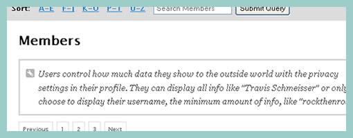
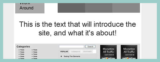
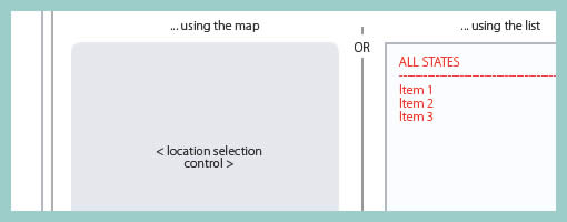
While designing, it’s not rare that at times detailing is avoided and more rapid exploration is favoured. This very much applies to wireframing as well and in particular content or section areas. When wanting to document such an area or content reference quickly, I fell into the habit of using the less than and greater than signs to suggest generic labels or variables. Using these signs allows to visually distinguish real content from the labels. In addition, this technique also allows for more granular fidelity in design documentation as some things are more detailed while others are left undefined. In a way then, using such generic labels moves wireframing one step closer toward sketching by allowing for such incompleteness.
A couple of years ago Dan Brown has also written about such different content representation techniques and also created a nice summary poster. It would be interesting however to see some stronger visual language or styling to help distinguish all of Dan’s different content representation types: actual, dummy, labelled, symbolic, and lipsum.
Credits: Jakub Linowski
Tags: agility, content, linowski, sketch, wireframe
Posted in Samples | 5 Comments »
February 4th, 2009

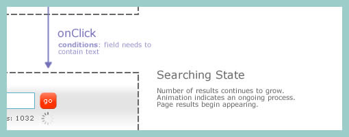
How do we document states changes when the page gives way to richer interaction? Here is one sample of my own work where I began to document state changes in a separate document away from the wireframes. Having access to detailed visual samples I cropped parts of the interface and layered flow arrows to represent these interactions. Typically however, these would not be so stylistically detailed and would probably be more wireframe like, or even sketched if speed mattered more.
Now to the meat of this sample. There are at least two things that I find useful which come to mind when documenting such interactivity in detail. First of all, transitions matter. Bill Buxton recently mentioned in his latest book, Sketching User Experiences, that interaction designers have too much focused on the states and not enough about what is in the space between them. To fill the states gap I personally find it interesting to seek inspiration about transition possibilities from JavaScript events such as the ones provided by jQuery. There are quite a bit of these events available and they range from key presses to double clicks, to mouse scrolls. Secondly, I sometimes complement events with conditions. Conditions are basically some form of written logic which applies to the event. For example: sometimes a state does not change on a mouse click alone, the mouse click has to be held down for more than 3 seconds and only then the new state kicks in. To represent these conditions, I put them right under the events in a smaller font. This is just one way of doing it. If you have other ways, please don’t hesitate to submit.
A word of caution. This one can be considered a form of a detailing technique where it’s really up to your best judgement when to perform. I definitely don’t do this for all parts of an interface. As others have mentioned in the past, sometimes things like this are best resolved through dialogue with the developers while the prototype is being built. Sometimes however, when the user experience can really be affected by how these states transition, it really helps to put it on paper.
Here is also an interesting article on the same technique.
Credits: Jakub Linowski
Tags: activity, events, linowski, states, user flow
Posted in Samples | 5 Comments »


