June 23rd, 2009
Petra has been exploring the idea of using Microsoft Excel for prototyping purposes. Introductory documentation on how to create such a prototype along with the real sample has also been posted online. At first glance, it appears like such a prototype is more suitable for complex data transformations than for GUI design which can be more easily achieved with stronger drawing applications. However, personally I have very little experience with such an approach and it would be interesting to see what others think.
Petra writes:
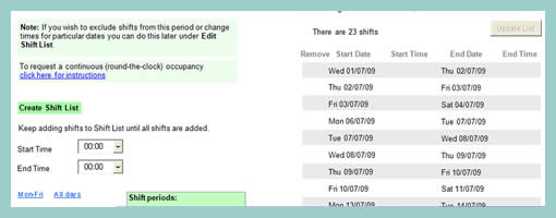
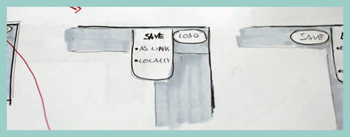
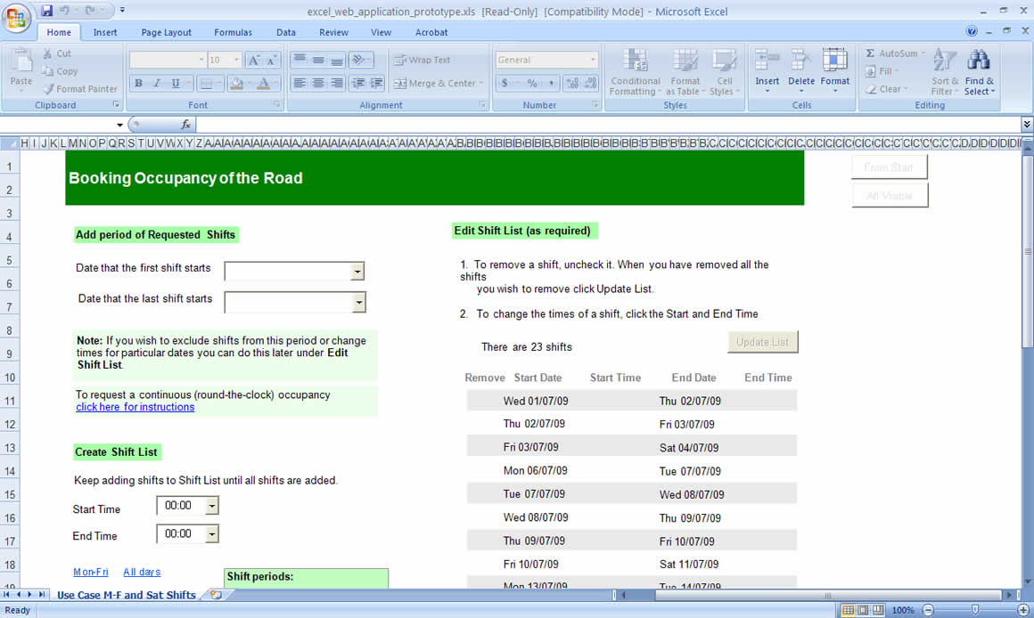
I created a paper prototype guided by Carolyn Snyder’s excellent book, Paper Prototyping: The Fast and Easy Way to Design and Refine User Interfaces, for a web application used to book occupancy of the road to do maintenance work, etc. It was a lot of fun testing it on my colleagues and a couple of genuine local users but when it got to testing remote users I thought perhaps I’d try to create an online prototype. I started with PowerPoint but found the macros deficient and a couple of things I wanted to do I couldn’t. I then ordered Effective Prototyping with Excel by Bergen et al, expecting that their prototypes would involve some basic coding but was disappointed to find they didn’t. A programming colleague showed me a couple of very basic code statements in Excel and I realised that with the Control Toolbox widgets, .Visible = True and .Visible = False statements, a couple of If statements, a little googling and a little recording of macros to figure out some code, I could create a pretty workable prototype, albeit only able to handle very specific use cases.
Credits: Petra Liverani
Tags: forms, prototype
Posted in Samples | 1 Comment »
June 18th, 2009
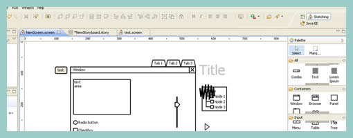
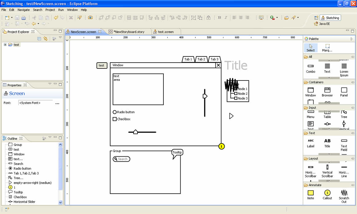
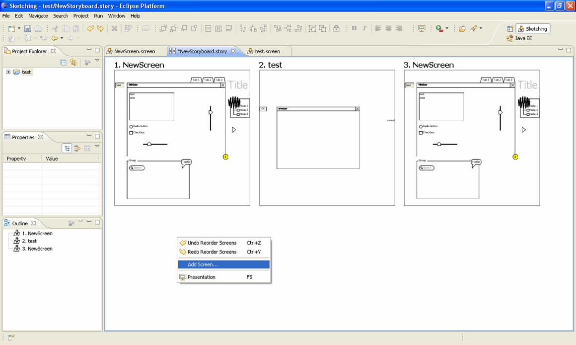
WireframeSketcher is a plugin for the popular Eclipse development platform and allows for the creation of quick wireframes. This tool comes with a wide palette of draggable user interface elements, widgets, sliders, and icons as most user interface designers would expect. The latest version also supports states for certain form elements allowing to specify such things as disabled, selected or enabled modes.
What sets WireframeSketcher apart is definitely the storyboard mode (as seen on the second screen). Basically, drawn screens can be organized in a linear fashion into presentable stories. This features is an interesting exploration of the communicative role of prototyping which many UI tools fall short on. Another unique feature of this program is how it handles masters. With WireframeSketcher users do not have to worry about defining masters up front (at the time when it still it is not known which elements are to be shared across). Instead, pages are simply created and if a user wishes to reuse a page as a master, the page is inserted as a “Master Screen” object anywhere on a new page. What is also interesting is that in this way, users can also combine multiple master pages, providing even more flexibility. Overall, this one is a very interesting tool.
Download it and try it from here.
Posted in Tools | 2 Comments »
June 16th, 2009
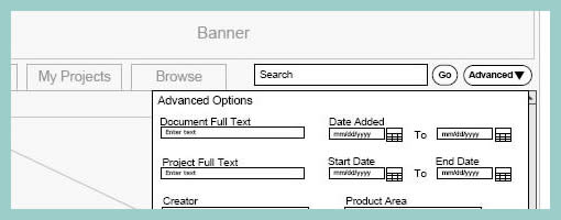
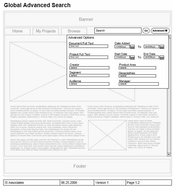
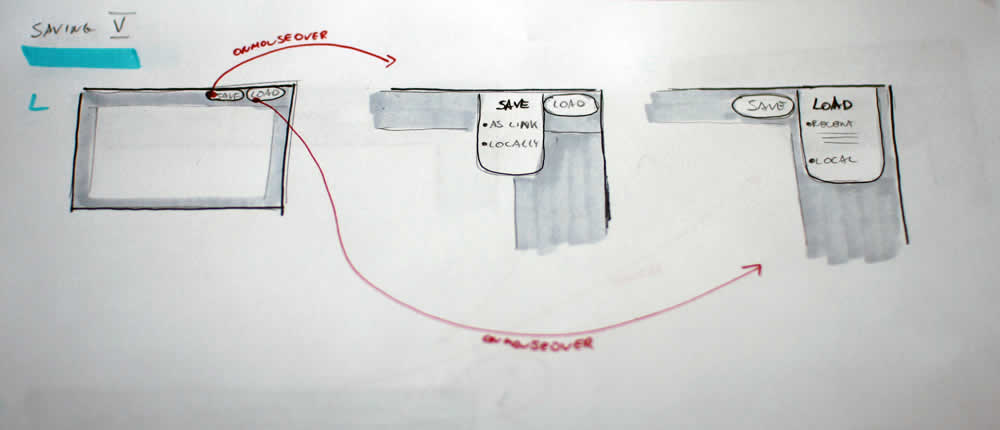
Page dimming is another visual tactic which can be used to focus attention away from what is less important toward what really matters. Here is one example from Rebecca, of an overlay being used in a wireframe in combination with the background page becoming more grey and faded. I’m not exactly sure how it was technically implemented here, however often all that is required is a drawn rectangle with a see through opacity. The elements which require more attention (such as the overlay in this case) are then brought up above all layers. This approach provides another way of emphasizing certain interface elements for users of the interface, and also for readers of design documentation.
Credits: Rebecca M. Allen
Tags: emphasis, wireframe
Posted in Samples | 6 Comments »
June 11th, 2009
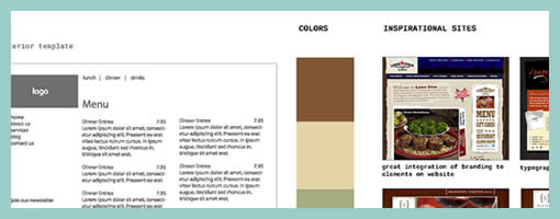
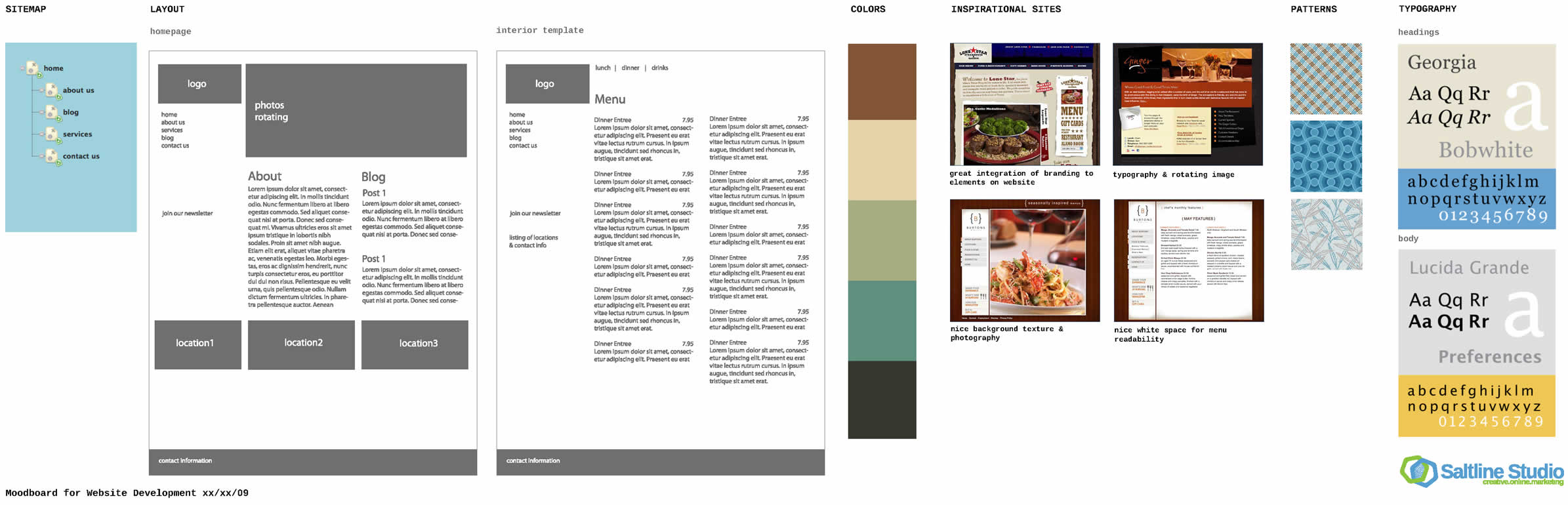
A wireframe alongside a moodboard might stir some controversy for traditional information architects. Fonts, colours, styles have been considered a thing of the later phases of a design process, elevating the flow of activity in importance. Perhaps Chris’ work which combines stylistic exploration with the exploration of interactivity, challenges this traditional waterfall view. Similar thoughts have been surfacing and emerging in earlier posts and samples, as visible here and here. Perhaps this interplay between user experience and emotion is an important one. Perhaps it’s only natural if interaction designers or information architects work in parallel with visual designers opening up more room for dialogue.
TIP: To see the full image you can drag around with the mouse while in the full size mode of the popup.
Chris writes:
I’ll do my Wireframes in illustrator after I have met with the client and they have filled out my website questionnaire (another blog post for that) – after we have hashed out the sitemap on Writemaps (another great product) I will create this over all scheme that includes Fonts, Colors, Inspiration, textures or patterns and takes care of the Wireframing side making sure what will live on each page. For this example I have done a very simple layout – just a homepage template and interior page template. If this was a large site I may have done out 8 template Wireframes in illustrator.
Credits: Chris Gillis & David Perel
Tags: colour, wireframe
Posted in Samples | 14 Comments »
June 9th, 2009
Recently in my sketches I began relying quite heavily on little frames which is one of my favourite techniques. However I also noticed that this approach has a limitation. As a flowing interaction is being sketched out, often I need to zoom in a little bit more on the details to show what I mean more clearly. Little frames are just sometimes too little.
Perhaps influenced by the wonderful isolation and referencing technique of Jonas, I began zooming in on parts of the interface where required. What I have began doing somewhat differently from Jonas’ drawings is an attempt to reference the zoomed in interface pieces more clearly. This is being attempted with the help of thicker black edge lines and corners. Drawing a thicker line around the little frame, and then creating a corner in the same style for the zoomed in piece, I hope helps a bit more in terms of relating the sketch to the edge of the screen. In the end, edge cornering extends the speed of little frames to larger sections of the interface, while still affording to draw only the bits and pieces that are relevant (leaving the obvious out of the picture).
Credits: Jakub Linowski
Tags: linowski, sketch, states
Posted in Samples | 3 Comments »
June 4th, 2009
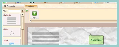
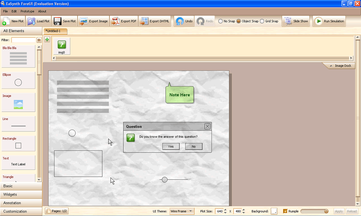
ForeUI is another recent addition to the growing number of existing prototyping tools. Some of the features it supports include drag and drop of elements; creation of customized elements; and a prototype mode that generates either a slide show or HTML. It shares a low fidelity text tool called “Bla Bla Bla” similar to the Greeked Text plugin posted earlier.
Something perhaps less seen in the other tools out there is the Rumble slider which turns the background of the prototype into a crumpled piece of paper, suggesting stronger incompletion. Another interesting approach is the accessible Image Dock area that allows the designer to populate it with images that are to be used in the prototype. Finally, ForeUI also allows to theme the prototype choosing from a selection of Wire Frame, Windows XP and Mac OS X looks.
Download it here.
Posted in Tools | 6 Comments »
June 3rd, 2009
Quick announcement. Since my graduation date is closing in this summer, I thought to make use of Wireframes Magazine to shamelessly promote myself as a user interface designer for hire. Very soon I will be looking out for freelance opportunities as an independent contractor. So please let me know if you think you might be interested in working together. Looking forward. Jakub Linowski.
Posted in Announcements | Comments Off on For Hire: User Interface Design & Evaluation Services
June 2nd, 2009
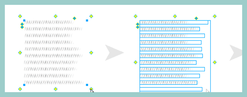
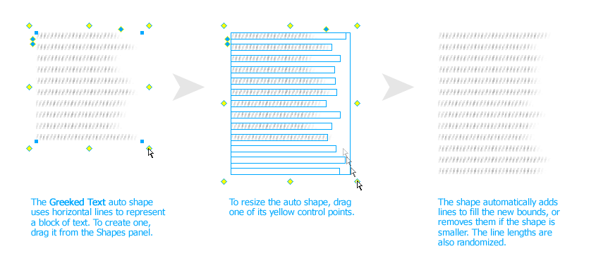
John has recently released publicly a Fireworks extension that allows designers to create a rough looking text placeholder – or “greeked” text. The extension works with the help of auto shapes and generates random line lengths of the text for a particular area. The size of the leading (or line spacing) and line height can be controlled easily as well. When rotating the text block by 90 degrees, it is also possible to use it for a quick graph like looking symbol.
This plugin is a nice addition in the rising popularity of low fidelity representations. It allows anyone to create text quickly which is very undefined and provides a nice alternative to the standard lorem ipsum approach.
Credits: John Dunning
Tags: content, sketch, wireframe
Posted in Samples | 4 Comments »
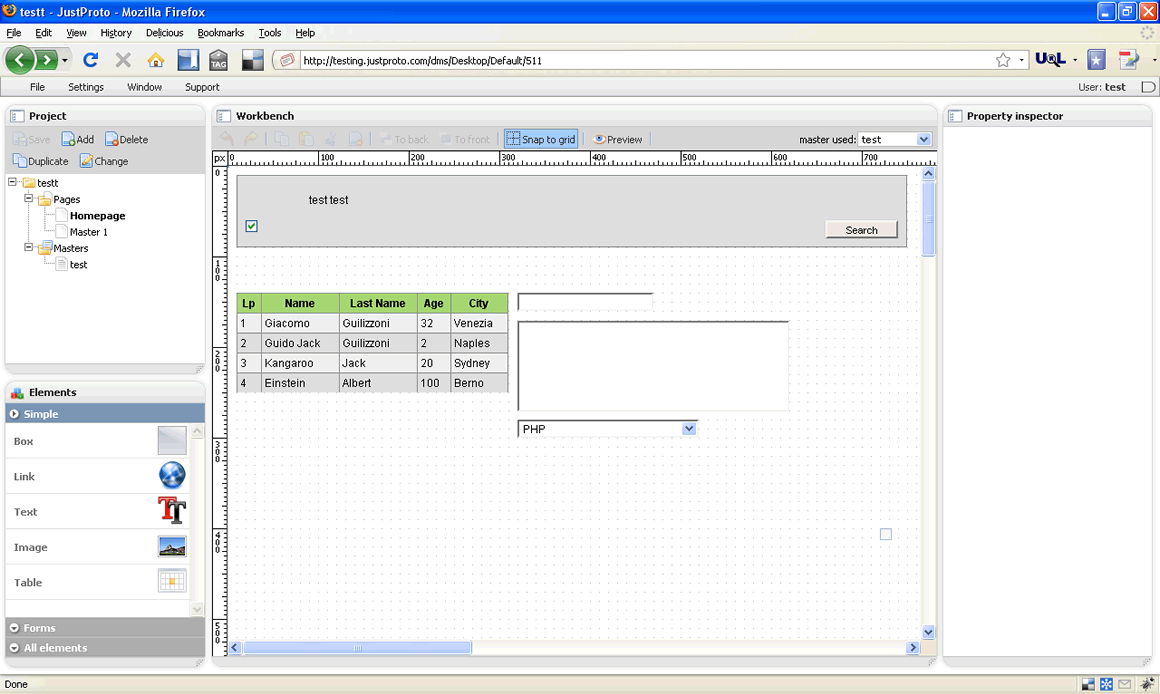
May 28th, 2009
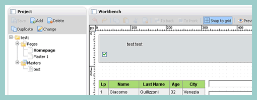
JustProto just came out recently (a month ago) with a few paid plans providing UI designers with another potential prototyping tool. The application is completely web based and allows pretty standard prototyping features such as pages and page masters; drawing of standard form elements; rich text control; grid snapping and property inspection. At least from what I’ve noticed, the tool’s event handling capabilities are pretty limited as so far the only supported event is an “onclick” allowing a potential page change. Although I haven’t seen it live in the free preview, the makers of JustProto claim a feature which allows “immediate preview of changes” which seems pretty interesting (perhaps it requires 2+ collaborators is what I think). Overall, this tool looks and feels very smooth and has quite the potential to evolve. Personally, I would like to see it stand out a bit more from the rest of the tools out there with something more unique.
Try it online here.
Posted in Tools | 5 Comments »
May 26th, 2009
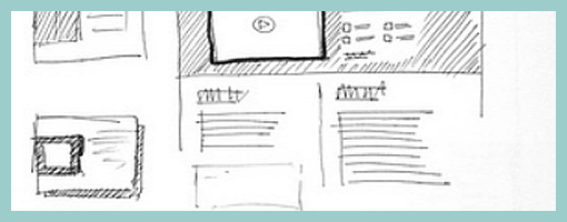
Just found these layouts on flickr belonging to James, which rely on a number of interesting emphasizing techniques. These include:
- Border thickness – thicker lines definitely are a quick way of making an element stand out.
- Tonation – darker backgrounds (in this case with the help of diagonal lines) can be used to emphasize an area (also see Matthieu’s sample).
- Isolation or incompletion – it’s very easy to draw attention to a particular element’s importance if the sketch is incomplete or only partially drawn (the sample by Jonas shows this nicely as well).
- Depth – drop shadows or three dimensional drawings are a quick way of making elements come out.
- Size – smaller sketches of course are less emphasized than bigger ones (see Little Frames).
Although not present in the above example, applying some colour to a sketch can also be a way of underlining desired elements.
Overall, emphasis is quite central to sketching as it sheds light on what is important and varies the visual priority. A sketch can also indicate its importance not only to the people being presented to, but also straight back to the original designer of the sketch. In The Reflective Practitioner, Donald Schön writes that design activity is a form of dialogue between the designer and the material of the situation. In other words, sketches, wireframes and prototypes are all things which in a way talk back to us. In this dialogue like metaphor, once an idea manifests itself in a visible form such as a sketch, it often leads to new ideas and the “conversation” continues on. Visual emphasis in sketching then plays a central role in keeping such cyclical dialogue alive.
Credits: James Bates
Tags: priority, sketch, wireframe
Posted in Samples | 4 Comments »


