Posts Tagged ‘annotation’
Monday, May 11th, 2009
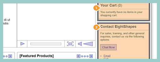
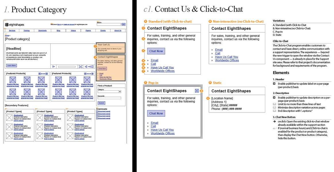
Earlier last month, EightShapes publicly released their Unify templates (for Adobe Indesign). Their systemic approach to wireframing emphasizes very modular ways to reuse elements, styles, pages and user interface components across deliverables. One thing which caught my attention is their interesting documentation technique of the components based approach which shares similarity with an the earlier post on object-oriented wireframing. Compontents are simply covered with a transparent orange overlay, are tagged with a referencing convention (“c#”) and are further elaborated and annotated on a separate page. This particular technique can be also visible in their PDF sample here.
Credits: Nathan Curtis – EightShapes
Tags: agility, annotation, states, wireframe
Posted in Samples | 3 Comments »
Wednesday, March 25th, 2009

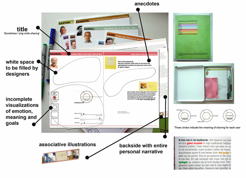
The people over at TU Delft, have come up with a persona deliverable which makes use of white space and invites interpretation in order to involve the team in the findings more closely. This is an example of participatory communication where designers begin to own the data through active co-creation as opposed to just passive reading. Similarly Johnny Holland recently wrote about personas being more about the process which immerses designers in the findings, than just being about the outcome.
Froukje in Sharing User Experiences in the Product Innovation Process writes:
Each card is laminated and the set comes in a box together with a set of non-permanent markers and a sponge. The cards invite designers to interactively structure and analyse them: they can create overview, re-arrange, select and compare the cards. The design of the cards invites designers to add their interpretations and react on the leads suggested by the researcher. Each card has plenty of white space for annotations of ideas/insights/conclusions, which can be made with the non-permanent markers, and can be wiped off with the sponge. This way, designers are stimulated to become active partners in the communication.
Credits: Froukje Sleeswijk Visser
Tags: annotation, persona
Posted in Samples | Comments Off on Personal Card Set
Friday, March 20th, 2009
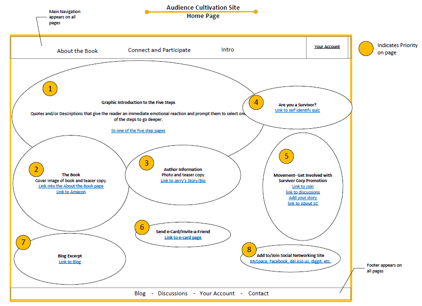
The bubble frame has stirred up some commotion on twitter the other day, and Tyesha reacted with her own variation. Her sample however sheds light on something else – the idea of prioritizing elements. She uses a very simple tactic that relies on numbered circles to denote the importance of an element. The really nice thing about communicating thoughts on priority in such abstract ways, is that it creates more flexibility for a visual designer to interpret the representation. This perhaps gives the designer more room to apply his/her own expertise as well.
I find it really interesting to see information architects thinking of such priorities behind various items on a page. There seem to be quite a few other ways in the realm of visual design which can be used to increase or decrease importance. Some less direct tactics include: the control of element size, emphasis through isolation, variance of depth (foreground, background), and of course a recent example that denotes priority with the use of tone.
Credits: Tyesha Snow
Tags: annotation, priority, referencing, wireframe
Posted in Samples | 3 Comments »
Wednesday, March 11th, 2009
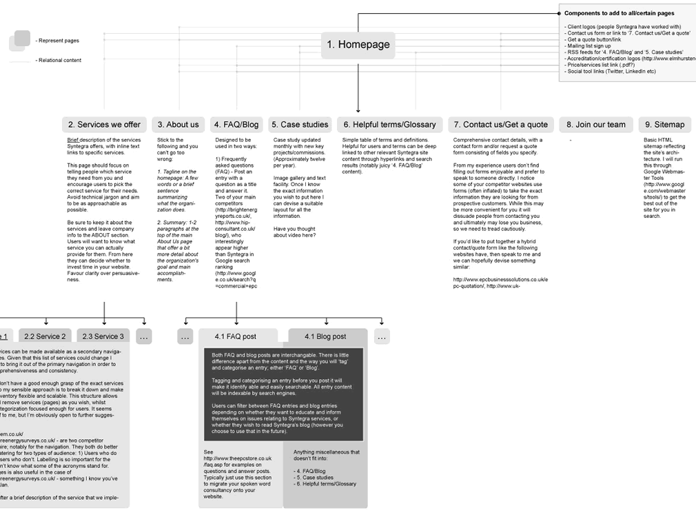
While still in a highly conceptual mode of thought during site mapping, already rough ideas begin to emerge as to how particular pages will look like or what they might contain. Often these ideas go beyond a simple one word page label. Here is an example which captures such ideas textually in more detail. This interesting view combines structural page representations with textual content descriptions – a merger of sorts between a site map and a content inventory.
Credits: Lewis Litanzios
Tags: annotation, content, sitemap
Posted in Samples | 4 Comments »
Friday, February 13th, 2009
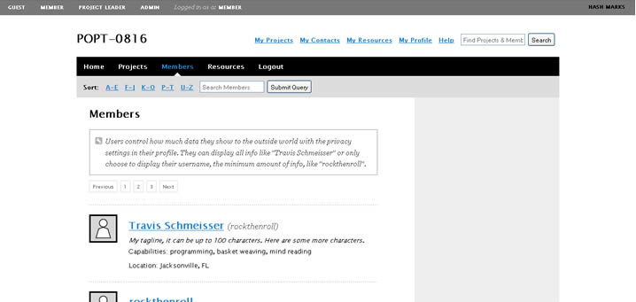
Here is another very good Polypage HTML wireframe submitted by Joey Marchy from nGen Works. Two interesting uses of Polypage make themselves visible in this sample. First, on the upper left hand side, all of the various user types have been defined. Toggling them gives a good sense of what all of the various wireframes will look like for that particular user. Secondly, Polypage has also been used to annotate the wireframes and this is accessible through the upper right corner by means of such tags as “user roles” and “hash marks”. The really nice thing about this annotation technique is that no longer are the actual annotations separated somewhere in the right hand side from the main wireframe, but instead are contextualized right in the wireframe itself. This allows people reviewing the wireframe to read the annotations quicker as opposed to having to translate number references into actual notes, as it is done traditionally.
Joey writes:
We created a functional HTML prototype to accomplish two goals: get client signoff on all application interaction and provide a roadmap for the development team building the application. We used a combination of PHP and the awesome Polypage jQuery plugin to show the myriad of states between differing user levels and application states.
Credits: nGen Works
Tags: annotation, HTML, prototype, wireframe
Posted in Samples | 2 Comments »
Friday, January 30th, 2009

This little design documentation pattern has been with us for a long time and yet it’s still worthy of mentioning. The idea of annotating wireframes using droplets or circles with one pointy edge is a nice visual technique. The coloured circle is what grabs the attention quite well, combined with the pointed edge that allows to reference a very specific area. Will Evans allowed me to post this sample and he also has an interesting write up on his wireframing process. Finally there is also a Konigi Omnigraffle Stencil which uses these droplets as well. I’d also be very much interested to see what others are doing in terms of annotation. If you have interesting visuals, please send those samples over! :)
Credits: Will Evans
Tags: annotation, colour, wireframe
Posted in Samples | 13 Comments »
Wednesday, January 21st, 2009
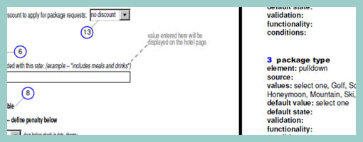
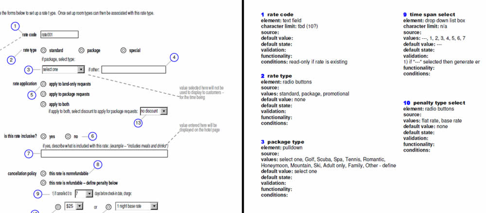
As the design process unfolds on and we begin to tend to the details, form element rules are one area which may be elaborated. From the same designer as in the previous post, comes a sample which specifies form elements in depth. Minoru documents such things as element types, multiple values, default values, character limits, validation rules, etc. Although this is not something that would be typically done in the early phases, such form considerations still can effect the user experience. Thinking about it and putting it down on paper could definitely be worth while.
Credits: Minoru Uchida & Mark Hines
Tags: annotation, forms, wireframe
Posted in Samples | 5 Comments »
Saturday, January 17th, 2009
Ben pointed me to an interesting set of HTML wireframes which use Polypage. Polypage expands HTML wireframes or mock-ups and allows for the creation of page states. Furthermore, the various states are independent of each other and can be toggled on a small top menu to affect the page view. Say for example you want to show your wireframes to your client in the “logged out” and “first time visit” states. Polypage allows you to click through all your wireframes to demonstrate such a case. Later on when you decide to demonstrate the “logged in” state, all you do is toggle it in the top menu and continue your presentation.
The technique was initially developed at Clearleft, and Richard Rutter explains how to use it better. Here are two more sets of wireframes using this technique which contain more page states to explore.
As a side note, here is also an interesting debate as to whether these things are wireframes or prototypes.
Credits: Ben Sauer
Tags: agility, annotation, HTML, prototype, states, wireframe
Posted in Samples | 5 Comments »