Posts Tagged ‘activity’

Functional Mindmaps

Tuesday, September 1st, 2009


Abstracting away from the way the interface looks, we begin to face higher level goals, functions or activities that the design ought to support. Eugenio here has done just that by using Mindmeister software to generate a high level mind map of the activities users will be able to accomplish. Thinking about functional requirements such as these before jumping into wireframing is a divergent design tactic as it allows more flexibility in interpretation. In other words, by being more ambiguous these functional mindmaps can generate a greater variety of new ideas. Comparatively, wireframes or sketches which are more concrete, are a convergent tactic which steer us in a single direction with the aim of getting us all “on the same page”. In my opinion, a design process that makes room for both divergent and convergent tactics, generates the best results. I guess, Eugenio’s sample here is a nice reminder to think a little bit bigger beyond the boundaries of the wireframe.

Credits: Eugenio Grigolon

Mixed Scale Wireflow

Thursday, August 13th, 2009


Scott’s sample shares resemblance to the previously shared wireflows posts here and here. One thing it does a bit differently however is that it combines interfaces representation which differ in size or scale. Larger screens are mixed with smaller ones. More so, this example here also represents both interface screens (or what the users see), as well as user activity (or what the user does).

Credits: Scott Dudley

Touchscreen Gesture Icons

Tuesday, April 21st, 2009


Recently, quite a few representation about human activity have been merging in with the wireframe. Similarly, here is a template which contains various possible gestures on a touchscreen. Elaine came up with interesting ways to represent: taps, double taps, drags, flicks and pinching. Unflattened PNG can be grabbed from here (Elaine says: “I’m okay with people using the images for wireframes, presentations and educational purposes, but no modifications please”).

On the same note, Dan also posted another gestural icon set over here.

Credits: Elaine Chen

Cursor Actions

Friday, April 17th, 2009


After the previous post, Sherrod reacted with his own cursor sample which aims to represent more varied mouse actions. He uses a combination of cursor icons to differentiate between clicks, mouse overs, and gestures. Taken together these all help to tell a clearer story and establish links between the different screens.

Credits: Sherrod Faulks

Cursors As State Indicators

Wednesday, April 15th, 2009


Cursors can be used inside of wireframes, or detailed visual layouts as in this case, to hint at states. Overlaying them on top of existing elements can give the viewer a stronger understanding of the multi state nature of the interface through the visibility of mouse positioning. In its most basic form a cursor can hint at an element’s onMouseOver state. In this sample I’ve used multiple such cursors on one screen to show multiple states all at once. I would assume it would also be possible to help understand other states as well (drags, resizes, etc) using cursors.

Have a look over at Konigi’s Wireframe Icon Set which now also contains cursor icons.

Credits: Jakub Linowski

Agile People

Monday, April 6th, 2009


Personas inside of wireframes? Sherrod began combining little people figures with actual interface representations. It’s interesting to see these miniature persona like icons along with their basic user stories or simplified needs trying to provide an additional layer of information about the context of use. The icons also come available as a downloadable PSD file and contain a number of unique roles.

Credits: Sherrod Faulks

UML State Charts

Monday, March 9th, 2009


Here is an interesting way of approaching state changes using UML notation, and more specifically state charting. Perhaps the learning curve of documenting such technical interactions is not the lowest. However, once the team agrees on using such an advanced notation system, the represented interactions and state changes can be explored with greater accuracy and detail. Some interesting symbols include: loops which imply refreshes; brackets which suggest conditionals; forward slashes which suggest system actions; and larger rounded area containers representing nested states which are always accessible.

Yohan also sent me two interesting UML references. One simpler PDF reference explains very well the notation used in the above example, and a second extended reference explains additional UML diagramming notations.

Credits: Yohan Creemers

Sketching Alternative and Social Activities

Friday, February 20th, 2009


Recently as I was thinking about an assignment of designing a new playlist system at work, a number of ideas collided all into one and resulted in this design sample. The desire was to explore alternatives, quickly, of high level activities, which would have to support interactions between a number of actors or people. So I jumped back into pencil, paper and marker mode. As simple or obvious as it may seem, what I think might of worked well worth noting is the use of colours to denote different (or same) people. Another thing that perhaps worked out was the use of one activity as a starting point in the center and then branching out toward alternatives.

I think this little sample was influenced by other’s work as well worthy of noting. First of all, here at TU Delft we were exposed to quite a bit of mind mapping exercises which in a way resemble the interface sketches of Jonas Löwgren. Then again, this sample also shares the high level characteristics of a user journey submitted by Steve Johnson. Finally, as I’ve written in my personal blog I’ve also began questioning the sterility of one path user flows wondering about how to explore the diversity of activities.

The sample isn’t perfect, and as is argued in Pencils before Pixels, the lower the fidelity of the sketch the harder it is to use it to communicate with others. However when I showed the sketch to others, and supported the sample verbally, it enriched the conversations.

Credits: Jakub Linowski

State Level Wireflows and Transitions

Wednesday, February 4th, 2009


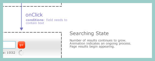
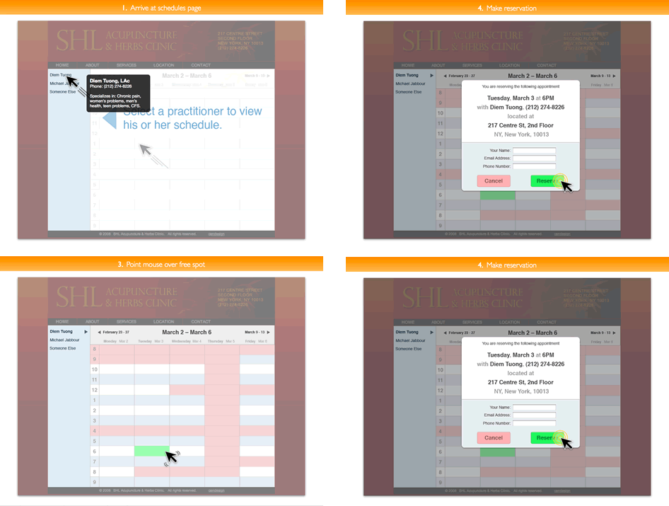
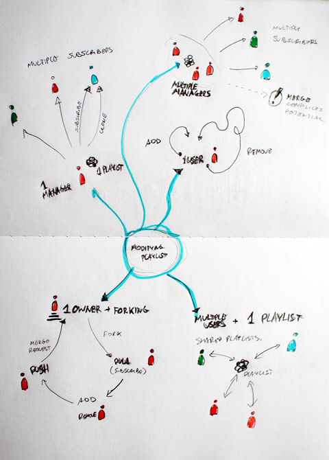
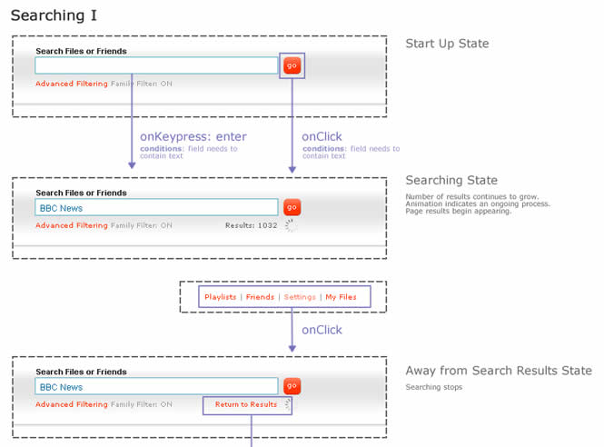
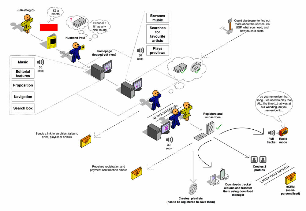
How do we document states changes when the page gives way to richer interaction? Here is one sample of my own work where I began to document state changes in a separate document away from the wireframes. Having access to detailed visual samples I cropped parts of the interface and layered flow arrows to represent these interactions. Typically however, these would not be so stylistically detailed and would probably be more wireframe like, or even sketched if speed mattered more.

Now to the meat of this sample. There are at least two things that I find useful which come to mind when documenting such interactivity in detail. First of all, transitions matter. Bill Buxton recently mentioned in his latest book, Sketching User Experiences, that interaction designers have too much focused on the states and not enough about what is in the space between them. To fill the states gap I personally find it interesting to seek inspiration about transition possibilities from JavaScript events such as the ones provided by jQuery. There are quite a bit of these events available and they range from key presses to double clicks, to mouse scrolls. Secondly, I sometimes complement events with conditions. Conditions are basically some form of written logic which applies to the event. For example: sometimes a state does not change on a mouse click alone, the mouse click has to be held down for more than 3 seconds and only then the new state kicks in. To represent these conditions, I put them right under the events in a smaller font. This is just one way of doing it. If you have other ways, please don’t hesitate to submit.

A word of caution. This one can be considered a form of a detailing technique where it’s really up to your best judgement when to perform. I definitely don’t do this for all parts of an interface. As others have mentioned in the past, sometimes things like this are best resolved through dialogue with the developers while the prototype is being built. Sometimes however, when the user experience can really be affected by how these states transition, it really helps to put it on paper.

Here is also an interesting article on the same technique.

Credits: Jakub Linowski

User Journeys

Wednesday, January 7th, 2009


Steve sent me a User Journey sample today and I thought it was pretty interesting. Besides there being an article on Boxes and Arrows on this technique, perhaps I can add my 5 cents on what I am seeing here. Other than the iconographical style, two important ideas become apparent. First, the duration of the interactions in this visual are wider than usual. Typical user flows represent quite narrow time lengths, whereas the deliverable shows interactions spanning out over the weekend, and even a month afterwards. Secondly, the computer screen is represented as only one item in a bigger context of the physical world. The little people here interact with other physical objects such as magazines, MP3 players and PDAs. Taken together I find this sample as an interesting way to think and represent activity beyond the desktop screen within a richer reality.

Here is also what Steve writes:

I have been working on creating these 3D characters for some time now to bring to life some (often boring) User Journeys for our clients.

I have used them several times in pitches and key stakeholder meetings and they seem to be well received, while at the same working as a good platform to get our ideas across. Clients seem to get things more easily when they are illustrated or drawn out in front of them. I have also found people are more likely to contribute in meetings if they see ideas detailed in this way. If I have the library of assets with me, I can easily (using omnigraffle or equivalent) add their idea to the diagram in the meeting, increasing their sense of participation.

And just because you are illustrating your User Journey it doesn’t mean you are trying to dumb the information down. Before I create a diagram like this one I make sure I sketch out my ideas with a pencil and paper before hand to ensure all bases are covered.

Credits: Steve Johnson